GUI design - what does this button do?
Recently, when going up in an elevator, I was puzzled by this picture. What do you think "Low Oil" button at the very top should do?
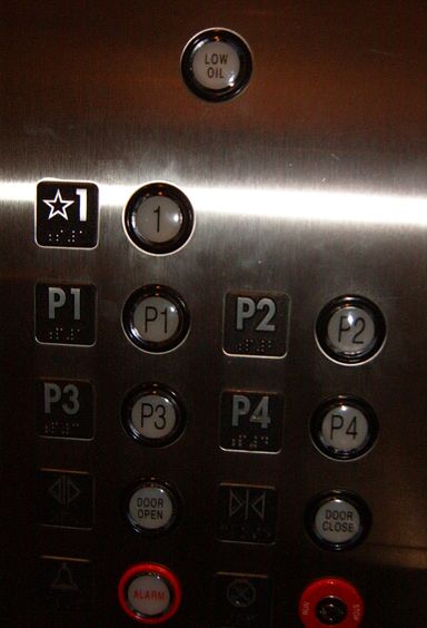
---------------------- A hint (white on white, select to see)
It's not really a button. It's just some design genius made an indicator light identical to buttons. Imagine a button on GUI, e.g. Windows form, which is not really a button, but label or icon. Pressing it does not make any sense, but it looks and feels like a button. Wouldn't that be odd?
----------------------End of hint