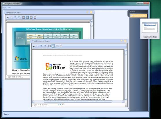
Acropolis Floating Layout Pane Sample
At my TechEd session in Orlando over the summer, I showed a version of the Acropolis Notepad sample where I plugged in an MDI-like floating layout pane and added support for viewing XPS documents. I’ve had many requests for this sample code and I am happy to report that I have finally managed to get some time this week to tidy up the code, package it up and write this short summary.
You can download the code from here, and some sample XPS documents to play with here.
The sample runs on the August CTP of Acropolis, which in turn requires Visual Studio 2008 Beta 2. There are three projects within the sample solution – the Application itself, the XPS document part & view, and the floating layout pane and its support classes. The following descriptions assume that you are starting from the Notepad sample that ships alongside the Acropolis CTP here.
Let’s walk through some of the more important parts of the code, starting with the XPS document part…
XPS Document Part & View
The XPS document part is actually very simple, thanks in part to the excellent XPS support provided by WPF. In our sample we have a document part class that’s responsible for loading the XPS document from disk, and a document part view class which is responsible for displaying the XPS document to the user.
The XPSDocumentPart class looks like this:
[DefaultView( typeof( XPSDocumentPartView ) )]
public partial class XPSDocumentPart : DocumentPartBase
{
private XpsDocument _xpsDocument;
public XPSDocumentPart()
{
InitializeComponent();
// The document is readonly so disable the Save
// and the SaveAs commands.
base.SaveCommandInternal.Enabled = false;
base.SaveAsCommandInternal.Enabled = false;
}
protected override void OnLoad( System.IO.Stream input )
{
_xpsDocument = new XpsDocument( base.FileName,
System.IO.FileAccess.Read );
Document.Value = _xpsDocument.GetFixedDocumentSequence();
}
…
}
The XPSDocumentPart class represents an XPS document within the application and so derives from DocumentPartBase. In this sample, the XPS documents are read-only so we disable the Save and SaveAs command provided by the base class. The only other thing we need to do then is to read the XPS document contents and get the fixed document sequence to expose to the view.
The XPSDocumentPartView class is responsible for displaying the document to the user. In this sample, the view class simply uses the WPF DocumentViewer control which provides a lot of functionality out of the box, allowing the user to zoom, scroll, pan and search through the XPS document. The XAML for the view class is very simple:
<Border BorderThickness="6" BorderBrush="Gray">
<DocumentViewer Document="{Binding Path=Document.Value, Mode=OneWay}"/>
</Border>
The WPF DocumentViewer control does all of the hard work of course, we only have to bind its Document property to the underlying XPS document provided by the Document connection point. You could imagine providing a custom rendering of the XPS document if you needed one, say to enable read-write creation of XPS documents using a custom editor.
The last thing we need to do is to register the XPS Document Part with the app’s document manager so it knows to associate XPS documents with it. We register the part, along with a file extension in Application.xaml like this:
<Afx:DocumentManager x:Name="DocumentManager">
<Afx:DocumentManager.Templates>
<Afx:DocumentTemplate x:Name="DocumentTemplate"
Type="{x:Type xps:XPSDocumentPart}" FileExtension=".xps" />
</Afx:DocumentManager.Templates>
</Afx:DocumentManager>
The Acropolis Notepad sample demonstrates how you can build document centric applications and extend them by registering new document types. Of course not all applications are document style applications, but the power of Acropolis lies in the ability of its modular approach to support these kinds of common patterns.
So that’s the XPS part of the sample. Let’s take a look at the (much more interesting) floating layout pane.
Floating Layout Pane
The Acropolis architecture is aimed at supporting the notion of ‘separation of concerns’. It provides a modular framework that lets you plug in or swap out different strategies for different parts of the application, like layout, navigation, authentication, etc. The floating layout pane class is an example of how to implement a custom layout strategy.
In this sample, we’re going to replace the Notepad’s default tab layout strategy with one that provides free-floating windows that we can drag around (similar to the MDI layouts of ye olde MFC). It also provides a fly-out ‘docking area’ where minimized windows are displayed along with a pre-view thumbnail.
Basic Behavior
There are a couple of additional classes in the sample that provide support for resizing, dragging and for managing the pre-view thumbnail, but the main class is the FloatingLayoutPane class. This class implements the core layout strategy and defines how our custom layout pane control interacts with the rest of the Acropolis architecture.
public partial class FloatingLayoutPane :
Microsoft.Acropolis.Windows.LayoutPane
{
…
}
The UI for the FloatingLayoutPane class essentially consists of a WPF Canvas control embedded in a grid:
<Canvas x:Name="_canvas" Grid.Row="0" Grid.Column="0"
AllowDrop="False"
PreviewMouseLeftButtonDown="CanvasPreviewMouseLeftButtonDown"
PreviewMouseMove="CanvasPreviewMouseMove"
PreviewMouseLeftButtonUp="CanvasPreviewMouseLeftButtonUp">
</Canvas>
Notice that the FloatingLayoutPane class derives from the Acropolis LayoutPane base class. This base class implements the basic behavior of all of Acropolis’ layout panes (including the SplitLayoutPane and the TabLayoutPane classes that ship with the Acropolis CTP). It provides a number of virtual methods that we will need to override in order to implement our floating pane layout strategy.
The two most important virtual methods are OnChildPaneInsertRequest and OnChildPaneRemoveRequest. These methods are called whenever the application’s navigation manager adds a new part to the current scope and wants a view for it to be added to the UI, or when a part is closed and its view is to be removed from the UI. A custom layout pane overrides these methods so that it can arrange the new child pane, using whatever strategy it implements.
In our case, when a new child pane is added to the floating layout pane, we need to add it the Canvas control, set its position and make sure that the child pane displays a chrome with a collapse button. So the first part of our OnChildPaneInsertRequest implementation looks like this:
protected override void OnChildPaneInsertRequest( object sender,
PaneCollectionItemCancelableActionEventArgs e )
{
base.OnChildPaneInsertRequest( sender, e );
Pane pane = e.Item;
Canvas.SetLeft( pane, newPanePosition.X );
Canvas.SetTop( pane, newPanePosition.Y );
pane.ShowChrome = true;
pane.ShowCollapse = true;
pane.Width = newPaneSize.Width;
pane.Height = newPaneSize.Height;
this._canvas.Children.Add( pane );
To support resizing of child panes within the floating layout pane, we also create a ResizingAdorner and attach it to the child pane. The ResizingAdorner class is an adorner that allows the user to resize the element that’s being adorned, in our case the child pane:
AdornerLayer adornerLayer = AdornerLayer.GetAdornerLayer( pane );
adornerLayer.Add( new ResizingAdorner( pane ) );
The ResizingAdorner adds a Thumb control to the bottom right hand corner of the child pane so that the user can resize it using the mouse.
Finally, to support the animated minimize effect, we subscribe to the PaneStateChanged and PaneStateChanging events and register a name with the layout pane so we can animate it:
pane.PaneStateChanged += new RoutedEventHandler( OnPaneStateChanged );
pane.PaneStateChanging += new EventHandler<PaneStateChangingCancelEventArgs>
( OnPaneStateChanging );
// Assign a unique name to the child pane.
pane.Name = String.Format( "ChildPane{0}", paneCounter++ );
this.RegisterName( pane.Name, pane );
}
Note that the LayoutPane base class includes virtual methods that are called when the user minimizes or maximizes a child pane that it is managing. Unfortunately, the current implementation does not pass a reference to the actual child pane that the event relates to. Doh! This is a bug :-). We can work around it though by subscribing directly to the events above.
The OnChildPaneRemoveRequest method is called when the user closes a child pane. We need to unsubscribe from the child pane’s events, remove the adorner, unregister its name, and finally remove it from the canvas control:
protected override void OnChildPaneRemoveRequest( object sender,
PaneCollectionItemCancelableActionEventArgs e )
{
base.OnChildPaneRemoveRequest( sender, e );
Pane pane = e.Item;
pane.Visibility = Visibility.Collapsed;
pane.PaneStateChanged -= new RoutedEventHandler( OnPaneStateChanged );
pane.PaneStateChanging -= new EventHandler<PaneStateChangingCancelEventArgs>
( OnPaneStateChanging );
AdornerLayer adornerLayer = AdornerLayer.GetAdornerLayer( pane );
adornerLayer.Remove( new ResizingAdorner( pane ) );
this.UnregisterName( pane.Name );
this._canvas.Children.Remove( pane );
}
That pretty much completes the core behavior of the floating layout pane. You can implement any number of different layout strategies by overriding the two methods described above and specifying exactly how the child panes are laid out. Of course, the actual details of the layout strategy can be quite complex, but the architecture allows you to encapsulate this complexity in a re-usable pane control that you can very likely re-use in many different types of applications.
The sample FloatingLayoutPane class implements a couple of other features that enhance the user experience – the ability for the user to drag and drop panes around the canvas, and a fly-out docking area for minimized windows. Let’s take a quick look at how these are implemented.
Child Pane Drag & Drop
The FloatingLayoutPane control allows the user to drag child panes around its canvas by clicking and dragging the child pane via its chrome area. Essentially this works by subscribing to the mouse left button up/down and mouse move events and updating the child pane’s position on the canvas control.
In the left mouse button down event handler, we first check to see if the user clicked on the child pane’s chrome area (and not any of the collapse, view or command buttons). The Pane class conveniently provides an IsDragArea method for this. Once we determined that the user has clicked on the chrome area, we just need to keep track of the mouse position and capture the mouse:
if ( pane.IsDragArea( (FrameworkElement)e.OriginalSource ) )
{
isDown = true;
startPoint = e.GetPosition( _canvas );
originalElement = e.Source as PartPane;
_canvas.CaptureMouse();
e.Handled = true;
}
In the mouse move event handler, we make sure that the mouse has moved more than the minimum amount and then start the drag operation proper by calling the DragStarted method. This method creates a DropPreviewAdorner for the child pane – in this implementation, it’s actually this adorner that we are dragging around and not the child pane itself. The DropPreviewAdorner provides a visual of the child pane that it represents (using a VisualBrush), but otherwise is just a simple adorner.
As the user continues to drag the mouse around, we update the adorner’s position:
Point currentPosition =
System.Windows.Input.Mouse.GetPosition( _canvas );
overlayElement.LeftOffset = currentPosition.X - startPoint.X;
overlayElement.TopOffset = currentPosition.Y - startPoint.Y;
When the user releases the left mouse button, we tidy up the adorner and update the position of the original child pane:
AdornerLayer.GetAdornerLayer( overlayElement.AdornedElement )
.Remove( overlayElement );
_canvas.Children.Remove( overlayElement );
if ( !canceled )
{
Canvas.SetLeft( originalElement, originalLeft + overlayElement.LeftOffset );
Canvas.SetTop( originalElement, originalTop + overlayElement.TopOffset );
}
NOTE: This implementation may not be the best way to implement drag behavior for child panes! Performance can be slow if the pane being dragged is large or complex. I am not sure why this is so yet – it needs more investigation and/or a WPF expert :-). I suspect it's something to do with using the Visual Brush...
That’s pretty much it for the dragging functionality – take a look at the code for the fine details, but it’s pretty simple thanks to WPF’s canvas control and event bubbling and tunneling.
Fly-Out Docking Area
The FloatingLayoutPane has a fly-out docking area where minimized windows are displayed. This is kind of similar to the Windows Taskbar. Essentially, it just consists of a ListBox arranged in a DockPanel that is animated when the user mouses over it:
<DockPanel Grid.Column="1" Width="17" LastChildFill="True"
Style="{StaticResource flyOutPanelStyle}">
The flyOutPanelStyle defines animation storyboards that are triggered on mouse enter and leave:
<Style x:Key="flyOutPanelStyle" TargetType="{x:Type DockPanel}">
<Style.Triggers>
<EventTrigger RoutedEvent="DockPanel.MouseEnter" >
<EventTrigger.Actions>
<BeginStoryboard>
<Storyboard TargetProperty="Width">
<DoubleAnimation To="150" Duration="0:0:0.5"
AccelerationRatio="0.33" DecelerationRatio="0.33"
AutoReverse="False"/>
</Storyboard>
</BeginStoryboard>
</EventTrigger.Actions>
</EventTrigger>
<EventTrigger RoutedEvent="DockPanel.MouseLeave" >
<EventTrigger.Actions>
<BeginStoryboard>
<Storyboard TargetProperty="Width">
<DoubleAnimation To="17" Duration="0:0:0.5"
AccelerationRatio="0.33" DecelerationRatio="0.33"
AutoReverse="False"/>
</Storyboard>
</BeginStoryboard>
</EventTrigger.Actions>
</EventTrigger>
</Style.Triggers>
</Style>
A ListBox is used to display information about the minimized windows. Data binding is used to bind the ListBox to the list of minimized windows, which is actually a list of PaneThumbnail objects. The PaneThumbnail class is used to store a preview image of the child pane and its title. The ListBox uses a data template to define how this information is displayed.
<ListBox x:Name="_tray" SelectionMode="Single"
ItemsSource="{Binding Path=MinimizedPanes}"
MouseDoubleClick="OnTrayItemDoubleClick"
SelectionChanged="OnTraySelectionChanged"
ScrollViewer.HorizontalScrollBarVisibility="Disabled"
ScrollViewer.VerticalScrollBarVisibility="Auto"
>
<ListBox.ItemTemplate>
<DataTemplate>
<StackPanel Orientation="Horizontal">
<Image Height="16" Width="16" Source="{Binding
Path=Thumbnail}" />
<TextBlock Margin="4,4,4,4" Foreground="White"
Text="{Binding Path=Title}" >
<TextBlock.ToolTip>
<StackPanel Orientation="Vertical" Margin="4,4,4,4">
<Image Height="120" Width="120"
Source="{Binding Path=Thumbnail}" />
<TextBlock HorizontalAlignment="Center"
Foreground="Black" Text="{Binding Path=Title}"
TextTrimming="CharacterEllipsis" />
</StackPanel>
</TextBlock.ToolTip>
</TextBlock>
</StackPanel>
</DataTemplate>
</ListBox.ItemTemplate>
</ListBox>
The data template uses a tooltip to display a preview image for the minimized window. This image is generated just before the child pane is minimized using the RenderTargetBitmap class within the OnPaneStateChaning event handler:
RenderTargetBitmap rtb = RenderPaneThumbnail( childPane );
PaneThumbnail thumbNail = new PaneThumbnail( childPane, rtb );
thumbnailCache.Add( childPane, thumbNail );
Once the PaneThumbnail is created, it is added to the minimized window list so it automatically shows up in the ListBox because of the data binding. When the user double clicks on a minimized window in the ListBox, the original child pane is added back to the canvas control and the pane’s thumbnail is removed from the list.
NOTE: There is a known bug in the Pane base class that prevent the child pane from being maximized programmatically when it is reinstated on the canvas. The child pane’s chrome shows up ok, but the user has to manually maximize the child pane to see its contents. Ho hum, it is a preview release after all…
Fin
There are another couple of minor features in the sample, like the animation of the child panes as they are minimized. You can take a look at the code and step through it to see how this works. The sample is not fully implemented yet though – the animation for minimize is there but not for maximize, and there is no z-order handling of the child windows. Hopefully I will get some time soon to complete these features and post an update...
I hope you find this sample interesting and useful. I wrote this to highlight how you can plug in different (and rich) layout strategies very easily without having to change the core implementation of the application. The modular separation of concerns that Acropolis supports is the magic behind this.
Thanks for your continued evaluation of Acropolis. Your feedback is very valuable to us.