Windows Logos through the years

With the upcoming General Availability release of Microsoft Windows 8 on 26th October 2012, I thought it would be fun to take a look back at how the Windows logos have changed through the years.
Back on 20th November 1985, Microsoft released Microsoft Windows 1.0 which had the following logo with the 4 panes of a single colour:
![]()
When Windows 3.0 released in May 1990, the familiar red, green, blue and yellow colours were added to the panes of the window:
![]()
From that point on, the logos for Windows 95, XP, Vista and 7 have been progressions based on the four colours:
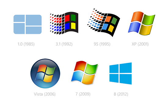
Now we have the new Windows 8 logo, which in some ways goes back to the single colour simplicity of the very first windows logo:
For other fun posts on product logos, have a look at:
Hope you found this interesting.
David
PS: I had not seen the original Windows 1.0 logo before I researched this article. Thanks to Minimally Minimal to reminding us.