Dynamics GP Developer Insights: The Evolution of the Silverlight PushButton

Hi, I'm Kurt Larson, a software development engineer on Dynamics GP. Despite my friends' dire warnings I moved to Fargo a couple years ago to work for Microsoft and haven't regretted it for a second. (I like to stay inside most of the time anyways to play Guitar Hero and tabletop games.)
At Microsoft I've worked on SRS reports, SRS deployment, and Business Portal virtual lists, and now I'm excited to be on the GP web client – this article explains some of the work that's gone into the web client UI and what we've learned about Silverlight along the way.
Converting a Dexterity form to Silverlight is a tricky process for many reasons, not the least of which is that many Dexterity controls behave differently from their Silverlight counterparts or don’t even have a direct counterpart out of the box. So one of our development efforts for the GP web client has been a set of custom Silverlight controls so we can convert everything on a Dexterity form as accurately as possible.
We thought it might be interesting to share some details on this work to give insight into our design and learning process; Dexterity’s PushButton is a good example of a custom control that has evolved as we’ve learned more advanced Silverlight techniques and fleshed out the web client design.
Introduction to the Button
PushButton is Dexterity’s basic clickable button control, and the most common control in GP’s core dictionary. You can put text and images on the button in one of a few defined layouts: Text Only, Graphic Only, Text on Right, Text on Left, Text Above, and Text Below. And of course you can hook up scripts to the button.

The default Button control in Silverlight is functionally very similar, just without such specific content layouts. The web client front end needs logic to render converted PushButtons with the right content layouts since the Silverlight Button control doesn’t do this out of the box.
Custom Control
Our first thought was to make a custom control – that is, a class descended from Control, with custom events and properties, plus potentially a custom control template for any customized visual aspects.
For PushButton we made both – the custom control template made sure our button had placeholders for the image and text elements and a Grid to hold them, while the custom control class extended Button and added new dependency properties (viz. Caption, ImageSource, ButtonStyle), plus logic to rearrange the Grid for each possible layout. This let us use most of the built-in Button behavior and look and feel without having to reinvent anything.
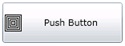
<wccontrols:PushButton Caption="Push Button" ImageSource="Images/PixelBoxes.jpg"
ButtonStyle="TextOnRight" Click="PushButton_Click"
Width="150" Height="50" />
Data Templates
Ultimately we needed to hook up our custom control to a data template – this is the key part of the conversion and rendering layer that knows how to bind the data in the ViewModel (VM) to an actual visual control. But data templates can also do a lot of the same things as our custom control – specifically handling the button’s image and text layouts – only with a lot less code.
So with an eye towards easier maintenance, we replaced the custom control and control template with six data templates, one for each possible layout – data templates are just xaml without any logic, so the rendering layer also needs separate code to pick the right data template for a given layout. Doing all the content arrangement in xaml was simpler, and it was nice getting rid of the custom control template, which was a big block of xaml mostly duplicated from the original Button xaml.
<DataTemplate x:Key="PushButtonDataTemplateTextOnRight">
<Button Width="{Binding Path=Size.Width}" Height="{Binding Path=Size.Height}">
<Grid Width="{Binding Path=Size.Width, Converter={StaticResource PushButtonGridSizeConverter}}"
Height="{Binding Path=Size.Height, Converter={StaticResource PushButtonGridSizeConverter}}">
<Grid.ColumnDefinitions>
<ColumnDefinition Width="Auto"/>
<ColumnDefinition Width="*"/>
</Grid.ColumnDefinitions>
<Image Source="{Binding Path=Image}" Stretch="None"/>
<TextBlock Text="{Binding Path=Caption}"
HorizontalAlignment="{Binding Path=HorizontalContentAlignment}"
VerticalAlignment="Center" Grid.Column="1"/>
</Grid>
</Button>
</DataTemplate>
The only problem with this approach was having six data templates that were mostly the same – each data template had to have all the same elements and bindings (except for the few things that change based on layout). The xaml code above is a simplified data template with only a few of the many properties we’d eventually have to bind to, so it’d end up being a lot of duplication and a big pain to maintain in the end.
Value Converters
This led us to our last design change of using value converters – an extra parameter on the databinding that takes the binding’s source data and converts it into different data for the binding target. In our case we take each layout property (e.g. grid dimensions) and bind them to the VM’s layout property, and the value converter picks the right value for the target layout.
<DataTemplate x:Key="PushButtonDataTemplate">
<Button HorizontalAlignment="Left" VerticalAlignment="Top" Margin="{Binding Path=Location}"
FontSize="{Binding Path=FontSize}" FontStyle="{Binding Path=FontStyle}"
FontWeight="{Binding Path=FontWeight}" Height="{Binding Path=Height}"
Width="{Binding Path=Width}" IsTabStop="{Binding Path=IsTabStop}"
ToolTipService.ToolTip="{Binding Path=Tooltip}" Opacity="{Binding Path=Opacity}"
TabIndex="{Binding Path=TabIndex}" Cursor="{Binding Path=Zoom}"
IsEnabled="{Binding Path=IsEnabled}" BorderThickness="{Binding Path=Border}"
Background="{Binding Path=BackColor}" Foreground="{Binding Path=FontColor}"
Template="{Binding Path=IsReadOnly, Converter={StaticResource ReadOnlyConverter}}">
<Grid Width="{Binding Path=Width, Converter={StaticResource GridSizeConverter}}"
Height="{Binding Path=Height, Converter={StaticResource GridSizeConverter}}">
<Grid.RowDefinitions>
<RowDefinition Height="{Binding Path=Style, Converter={StaticResource LayoutConverter}, ConverterParameter=TopRowHeight}"/>
<RowDefinition Height="{Binding Path=Style, Converter={StaticResource LayoutConverter}, ConverterParameter=BottomRowHeight}"/>
</Grid.RowDefinitions>
<Grid.ColumnDefinitions>
<ColumnDefinition Width="{Binding Path=Style, Converter={StaticResource LayoutConverter}, ConverterParameter=LeftColumnWidth}"/>
<ColumnDefinition Width="{Binding Path=Style, Converter={StaticResource LayoutConverter}, ConverterParameter=RightColumnWidth}"/>
</Grid.ColumnDefinitions>
<TextBlock Text="{Binding Path=Caption}" Visibility="{Binding Path=CaptionVisibility}"
HorizontalAlignment="{Binding Path=HorizontalContentAlignment}"
VerticalAlignment="Center" TextDecorations="{Binding Path=FontUnderline}"
Grid.Row="{Binding Path=Style, Converter={StaticResource LayoutConverter}, ConverterParameter=CaptionRow}"
Grid.Column="{Binding Path=Style, Converter={StaticResource LayoutConverter}, ConverterParameter=CaptionColumn}"/>
<Image Source="{Binding Path=Image}" Stretch="None"
Grid.Row="{Binding Path=Style, Converter={StaticResource LayoutConverter}, ConverterParameter=ImageRow}"
Grid.Column="{Binding Path=Style, Converter={StaticResource LayoutConverter}, ConverterParameter=ImageColumn}"
Visibility="{Binding Path=ImageVisibility}"/>
</Grid>
</Button>
</DataTemplate>
The variability of different layouts then is moved out of the xaml so we can have just one data template and not have to duplicate all the bindings. Value converters are C# classes, so the layout logic is back to being C# instead of xaml; however, it’s still simpler than having a whole custom control class and custom control template.
It’s also worth noting that some data conversions can and should be done in the VM instead of a value converter class, especially more complex conversions. But for PushButton the value converter works quite well and lets us centralize the layout logic.
In the end none of these different implementations really look or behave different for a user – the benefits are all reduced complexity and easier maintenance down the road. Obviously it took time to redesign PushButton through each of these iterations, but the important part is we’ve solidified our approach for future custom controls, even if they aren’t always technically “custom controls” at all.
Kurt Larson
For other posts in this series go to: https://blogs.msdn.com/b/developingfordynamicsgp/archive/tags/developer+insights/
// Copyright © Microsoft Corporation. All Rights Reserved.
// This code released under the terms of the
// Microsoft Public License (MS-PL, https://opensource.org/licenses/ms-pl.html.)