Retemplating a Standard Control (Including VisualStateManager Stuff)
This example demonstrates how to give a Button new visuals and visual state by re-templating. It also includes what to do with all of the existing VisualStateManager stuff, but first it discusses various ways of modifying existing controls.
There are a few different ways of modifying an existing Control, with varying degrees of depth and difficulty. Let's take a quick look at them.
Simple tweaks to a few controls
It is possible to modify the properties of a control to change its appearance. You will be constrained by the existing visual design, but you will be able to tweak things a bit. This is as simple as changing the Background and font properties on a Button:
<Button Content="Button" Background="Green" FontFamily="Verdana" FontSize="20" Width="100" Height="30"/>

This is fine if you don't have to do it very often. But imagine if you have set the FontFamily and FontSize of all of the Buttons on your page, and you want to change them. It would be nice not to have to change them everywhere.
Common value for a property used in multiple controls
You can use application-wide values to centralize the control of your common parameters. One way to do that is to use resources. I have added the "commonFontSize" resource to my application's Resources section:
 <Application xmlns="https://schemas.microsoft.com/winfx/2006/xaml/presentation"
             xmlns:x="https://schemas.microsoft.com/winfx/2006/xaml"
             xmlns:sys="clr-namespace:System;assembly=mscorlib"
             x:Class="RetemplatedButtonApp.App">
    <Application.Resources>
        <sys:Double x:Name="commonFontSize">20</sys:Double>
    </Application.Resources>
</Application>
The FontSize property is of type Double, so that's what I've created. I can use it like this:
<Button Content="Button" Background="Green" FontFamily="Verdana" FontSize="{StaticResource commonFontSize}" Width="100" Height="30"/>
The Button will look the same. The StaticResource reference will look for a resource named "commonFontSize" and attempt to set the FontSize property to it. Notice how the "sys" xmlns prefix was added so that an object of type Double could be created.
Common values for lots of properties on lots of controls
Let's say that you want all of the Buttons in your app to have the same look, and there are lots of properties that you want to set. Setting them all to their values is a maintenance nightmare, and even using resources to centralize the actual values is painful, because you have to set a bunch of properties on each Button.
One way to make this easy is to use Styles. This centralizes not only the values but setting the properties. Here's an example of a Style that can be applied to Borders:
 <Application xmlns="https://schemas.microsoft.com/winfx/2006/xaml/presentation"
             xmlns:x="https://schemas.microsoft.com/winfx/2006/xaml"
             x:Class="RetemplatedButtonApp.App">
    <Application.Resources>
        <Style x:Name="commonBorderStyle" TargetType="Border">
            <Setter Property="Margin" Value="2"/>
            <Setter Property="BorderThickness" Value="4"/>
            <Setter Property="CornerRadius" Value="4"/>
            <Setter Property="BorderBrush" Value="Black"/>
            <Setter Property="Background">
                <Setter.Value>
                    <LinearGradientBrush StartPoint="0.7,0" EndPoint="0.7,1">
                        <GradientStop Color="White" Offset="0" />
                        <GradientStop Color="Red" Offset="0.35" />
                        <GradientStop Color="Blue" Offset="0.35" />
                        <GradientStop Color="White" Offset="1" />
                    </LinearGradientBrush>
                </Setter.Value>
            </Setter>
        </Style>
    </Application.Resources>
</Application>
To use this style, it must be set in each Border:
<Border Style="{StaticResource commonBorderStyle}" Width="100" Height="50"/>
This produces this Border that is so lovely that it will undoubtedly soon be seen in all of the coolest Silverlight apps. Well, maybe not, but it was a useful example.
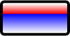
Note that for properties that have types that can be set with a simple string value converter, the Value is set as an attribute. For other properties, the property element syntax can be used. The Background property is an example of this, because a LinearGradientBrush can't be defined with a string, the way a SolidColorBrush can be (see the BorderBrush property in just above the Background.)
Your Style could also use Resources:
 <Application xmlns="https://schemas.microsoft.com/winfx/2006/xaml/presentation"
             xmlns:x="https://schemas.microsoft.com/winfx/2006/xaml"
             x:Class="RetemplatedButtonApp.App">
    <Application.Resources>
        <LinearGradientBrush x:Name="bkBrush" StartPoint="0.7,0" EndPoint="0.7,1">
            <GradientStop Color="White" Offset="0" />
            <GradientStop Color="Red" Offset="0.35" />
            <GradientStop Color="Blue" Offset="0.35" />
            <GradientStop Color="White" Offset="1" />
        </LinearGradientBrush>
        <Style x:Name="commonBorderStyle" TargetType="Border">
            <Setter Property="Margin" Value="2"/>
            <Setter Property="BorderThickness" Value="4"/>
            <Setter Property="CornerRadius" Value="4"/>
            <Setter Property="BorderBrush" Value="Black"/>
            <Setter Property="Background" Value="{StaticResource bkBrush}"/>
        </Style>
    </Application.Resources>
</Application>
Subclassing a control
It is easy to subclass controls in Silverlight. Let's say that you want to keep a control the way it is, but add some additional PME (properties, methods and events) to it. For example, if you wanted to associate some data with a RadioButton, that was different from its Content, you could just use the Tag property. But if you wanted strongly-typed data, you could some properties.
Here's the code for a simple RadioButton subclass:
 using System;
using System.Windows;
using System.Windows.Controls;

namespace RetemplatedButtonApp
{
    public class MyRadioButton : RadioButton
    {
        public MyRadioButton()
        {
            FontFamily = new System.Windows.Media.FontFamily("Verdana");
            FontSize = 20;
        }

        public int Count { get; set; }
    }
}
Note that this example sets some properties in the constructor. This is another way to set the properties of your elements, but if all you want to do is set some properties the same, styling is a better option. When you set properties like this, they can't be styled, because a locally-set value will override a styled value.
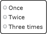
To use this in XAML, you have to add an xmlns prefix for the namespace, and then use that prefix to instantiate the element:
 <UserControl x:Class="RetemplatedButtonApp.Page"
    xmlns="https://schemas.microsoft.com/winfx/2006/xaml/presentation"
    xmlns:x="https://schemas.microsoft.com/winfx/2006/xaml"
    xmlns:local="clr-namespace:RetemplatedButtonApp">
    <Grid x:Name="LayoutRoot" Background="White">
        <Border BorderThickness="2" BorderBrush="Black" CornerRadius="8" HorizontalAlignment="Center" VerticalAlignment="Center" Padding="8">
            <StackPanel>
                <local:MyRadioButton Content="Once" Count="1"/>
                <local:MyRadioButton Content="Twice" Count="2"/>
                <local:MyRadioButton Content="Three times" Count="3"/>
            </StackPanel>
        </Border>
    </Grid>
</UserControl>
This produces a Border with custom RadioButtons like this:
Subclassing with re-templating
The most complete overhaul of a control is to subclass it and re-template it. The re-templating is generally done by adding a generic.xaml file to your project, and putting a new default style in it. You will also need to define a DefaultStyleKey in your ctor. I won't do a full example of this, but here are the steps to ensure that your control will be templated with your new visuals. Note that putting a Style and ControlTemplate in generic.xaml doesn't do you any good unless you also subclass. This topic deserves a post by itself, but briefly, here are the steps:
- Create the file generic.xaml in your project.
- Make sure that its Build Action is set to "Resource". Nothing else will work.
- The root element of generic.xaml is a ResourceDictionary. It should have xmlns prefixes for all of the namespaces of the controls you are subclassing and retemplating.
- The children of the ResourceDictionary are Styles. Make sure that there is a Style with a TargetType set to the type of your subclassed control. You'll have to put the appropriate xmlns prefix on the type.
- One of the Setters in the Style should be a ControlTemplate. You'll have to set the TargetType on that, too.
- In your subclassed control's ctor, set the DefaultStyleKey to your subclassed type, otherwise it will get the built in style from the base class.
Re-templating without subclassing
If you want to overhaul the visuals of a control, and give it a new appearance when it changes state, you can retemplate without subclassing. In this example, we'll build a new ControlTemplate for a button. I want a bold Button with a circular border that I can put Paths into. I also want it to grow when the mouse is over it. But in all other respects, I want it to be an ordinary Button. This is how I envision it in use, as the button in the upper-right:

The first thing that I will do is create a project, and put a Button in it. Here's what the XAML will start off like:
 <UserControl x:Class="EllipseButton.Page"
    xmlns="https://schemas.microsoft.com/winfx/2006/xaml/presentation"
    xmlns:x="https://schemas.microsoft.com/winfx/2006/xaml">
    <Grid x:Name="LayoutRoot" Background="White">
        <Button Width="40" Height="40"/>
    </Grid>
</UserControl>
It doesn't look very elliptical yet:

The next thing to do is get the built-in Style from generic.xaml. I used Reflector [note: this link was dead when I tried it, but hopefully it is a temporary glitch], but David Anson also has a utility that you can use. Take the built-in style for your control, and add it to your XAML in your page's Resources. Make your existing Button use the new Style. I also added the xmlns prefix for "vsm". I'm omitting the contents of the Style of the template because it is pretty long, but here's the rest of it:
 <UserControl x:Class="EllipseButton.Page"
    xmlns="https://schemas.microsoft.com/winfx/2006/xaml/presentation"
    xmlns:x="https://schemas.microsoft.com/winfx/2006/xaml"
    xmlns:vsm="clr-namespace:System.Windows;assembly=System.Windows">
    <UserControl.Resources>
        <Style x:Name="EllipseButtonStyle" TargetType="Button">
            <!-- contents not shown -->
        </Style>
    </UserControl.Resources>
    <Grid x:Name="LayoutRoot" Background="White">
        <Button Style="{StaticResource EllipseButtonStyle}" Width="40" Height="40"/>
    </Grid>
</UserControl>
If you have done your typing and pasting correctly, you should get the exact same appearance when you run your app.
The next thing to do is to get rid of just about everything except for the root Grid, the VisualStateManager elements (get rid of the Storyboards) and the ContentPresenter. Your XAML will now look like this:
 <UserControl x:Class="EllipseButton.Page"
    xmlns="https://schemas.microsoft.com/winfx/2006/xaml/presentation"
    xmlns:x="https://schemas.microsoft.com/winfx/2006/xaml"
    xmlns:vsm="clr-namespace:System.Windows;assembly=System.Windows">
    <UserControl.Resources>
        <Style x:Name="EllipseButtonStyle" TargetType="Button">
            <Setter Property="Template">
                <Setter.Value>
                    <ControlTemplate TargetType="Button">
                        <Grid>
                            <vsm:VisualStateManager.VisualStateGroups>
                                <vsm:VisualStateGroup x:Name="CommonStates">
                                    <vsm:VisualStateGroup.Transitions>
                                    </vsm:VisualStateGroup.Transitions>
                                    <vsm:VisualState x:Name="Normal" />
                                    <vsm:VisualState x:Name="MouseOver">
                                    </vsm:VisualState>
                                    <vsm:VisualState x:Name="Pressed">
                                    </vsm:VisualState>
                                    <vsm:VisualState x:Name="Disabled">
                                    </vsm:VisualState>
                                </vsm:VisualStateGroup>
                                <vsm:VisualStateGroup x:Name="FocusStates">
                                    <vsm:VisualState x:Name="Focused">
                                    </vsm:VisualState>
                                    <vsm:VisualState x:Name="Unfocused">
                                    </vsm:VisualState>
                                </vsm:VisualStateGroup>
                            </vsm:VisualStateManager.VisualStateGroups>

                            <ContentPresenter
                                  Content="{TemplateBinding Content}"
                                  ContentTemplate="{TemplateBinding ContentTemplate}"
                                  HorizontalContentAlignment="{TemplateBinding HorizontalContentAlignment}"
                                  Padding="{TemplateBinding Padding}"
                                  TextAlignment="{TemplateBinding TextAlignment}"
                                  TextDecorations="{TemplateBinding TextDecorations}"
                                  TextWrapping="{TemplateBinding TextWrapping}"
                                  VerticalContentAlignment="{TemplateBinding VerticalContentAlignment}"
                                  Margin="4,5,4,4"/>
                        </Grid>
                    </ControlTemplate>
                </Setter.Value>
            </Setter>
        </Style>
    </UserControl.Resources>
    <Grid x:Name="LayoutRoot" Background="White">
        <Button Style="{StaticResource EllipseButtonStyle}" Width="40" Height="40"/>
    </Grid>
</UserControl>
If you try to run your app now, you will get nothing on the screen, although if you give the Button some Content, you will see it. This isn't a very useful Button. If you click on the Content, the Click event will be raised, but the Button itself has no visuals, and it there is no visual response to user actions.
Let's leave the VisualStateManager stuff alone for right now, since we really need to do the visuals first. We'll add this Ellipse just before the ContentPresenter, so it will be drawn behind the ContentPresenter:
<Ellipse Fill="{TemplateBinding Background}" Stroke="{TemplateBinding Foreground}" StrokeThickness="2"/>
Let's also add an Ellipse after the ContentPresenter, so that it will be drawn on top. This will be used to wash the colors out when the Button is disabled, but we'll give it an Opacity of 0 for now:
<Ellipse x:Name="disabledEllipse" Fill="White" Opacity="0"/>
Let's also change the Button to give it some Content and a Background color:
<Button Style="{StaticResource EllipseButtonStyle}" Width="40" Height="40" Content="Hello" Background="#4b2"/>
If you don't want to hardcode values (such as colors) in your control, it is important that you use TemplateBindings wherever it is appropriate. In the Ellipse that we added, I've made sure that its Stroke and Fill will be set to whatever values are set on the control. Controls with hardcoded values are not as flexible and useful as controls that use TemplateBindings and properties to control appearance and/or behavior. If I wanted to be consistent with that principle, I might subclass Button so that I could also bind the Ellipse's StrokeThickness, but I don't want to subclass for this example.
Here's what it looks like now:

Now we're looking elliptical. You can see the Button, and it raises the Click event when you click on it, but it always looks the same. Time to start plugging StoryBoards into the VisualStates.
If you look at the VisualStateGroups and VisualStates, you can see how Button is organized. Internally, Button keeps track of a bunch of state, and then figures out which VisualState in each VisualStateGroup it should be in, and calls VisualStateManager.GoToState for each state. By putting Storyboards in the VisualStates, we can make this Button start to react to input.
The first VisualStateGroup is the "CommonStates" group; the first state in that is "Normal". By convention, the "Normal" is what the control will look like if it is enabled but is not being interacted with by the user. Its appearance is assumed to be the appearance as specified by the template XAML, so we have already defined the "Normal" state. Because of the way VisualStateManager uses the animation system, we don't need to specify any Storyboards for the "Normal" state.
The VisualStates Storyboards represent the steady state animations of the particular state. Usually, there aren't any steady state animations once a control is in a particular state, so all of the animations have their Duration properties set to 0. We want the control to expand when the user moves the mouse over it, so add a ScaleTransform to the root Grid, set the Grid's RenderTransformOrigin to .5,.5:
 <Grid RenderTransformOrigin=".5,.5">
    <Grid.RenderTransform>
        <ScaleTransform x:Name="zoom"/>
    </Grid.RenderTransform>
and add a StoryBoard to the "MouseOver" state:
 <vsm:VisualState x:Name="MouseOver">
    <Storyboard>
        <DoubleAnimation To="2" Storyboard.TargetName="zoom" Storyboard.TargetProperty="ScaleX" Duration="0"/>
        <DoubleAnimation To="2" Storyboard.TargetName="zoom" Storyboard.TargetProperty="ScaleY" Duration="0"/>
    </Storyboard>
</vsm:VisualState>
Now, when you run it, when you move the mouse over the button, it grows. When you click on it, it goes back down to its original size. This works really well if you don't move the mouse between pressing the button and releasing it, you can just keep clicking and everything is fine, but things get finicky if you move the mouse (after mouse down but before mouse up) into the region that is in the expanded size, but outside of the original size. You can't just keep clicking. That might be OK, but let's try to make things a bit nicer. What we want to do is to define the "Pressed" state. The Storyboards for the individual VisualStates should have no relation to each other. In other words, all other states can be ignored, and all you have to do is to add animations to set the values relative to the XAML in the template (which as you may remember is considered to be the "Normal" state.)
So copy the Storyboard that you added to the "MouseOver" state and paste it into the "Pressed" state. Now, when you click on the Button, it does not shrink, but neither is there any indication that something is happening. So let's add another ScaleTransform, to the ContentPresenter this time, and give it a RenderTransformOrigin, too (try leaving the RenderTransformOrigin off and seeing what happens):
 <ContentPresenter
        Content="{TemplateBinding Content}"
        ContentTemplate="{TemplateBinding ContentTemplate}"
        HorizontalContentAlignment="{TemplateBinding HorizontalContentAlignment}"
        Padding="{TemplateBinding Padding}"
        TextAlignment="{TemplateBinding TextAlignment}"
        TextDecorations="{TemplateBinding TextDecorations}"
        TextWrapping="{TemplateBinding TextWrapping}"
        VerticalContentAlignment="{TemplateBinding VerticalContentAlignment}"
        Margin="4,5,4,4"
        RenderTransformOrigin=".5,.5">
    <ContentPresenter.RenderTransform>
        <ScaleTransform x:Name="contentZoom"/>
    </ContentPresenter.RenderTransform>
</ContentPresenter>
And let's add some more animations to the "MouseOver" state:
 <vsm:VisualState x:Name="Pressed">
    <Storyboard>
        <DoubleAnimation To="2" Storyboard.TargetName="zoom" Storyboard.TargetProperty="ScaleX" Duration="0"/>
        <DoubleAnimation To="2" Storyboard.TargetName="zoom" Storyboard.TargetProperty="ScaleY" Duration="0"/>
        <DoubleAnimation To=".5" Storyboard.TargetName="contentZoom" Storyboard.TargetProperty="ScaleX" Duration="0"/>
        <DoubleAnimation To=".5" Storyboard.TargetName="contentZoom" Storyboard.TargetProperty="ScaleY" Duration="0"/>
    </Storyboard>
</vsm:VisualState>
Since we are doubling the size of the Button's visuals when we animate the "zoom" transform, if we halve them in the "Pressed" state by animating the "contentZoom" ScaleTransform, the Content will go back to its normal size and we'll get a nice press effect.
Let's also add a Storyboard for the "Disabled" state:
 <vsm:VisualState x:Name="Disabled">
    <Storyboard>
        <DoubleAnimation To=".4" Storyboard.TargetName="disabledEllipse" Storyboard.TargetProperty="Opacity" Duration="0"/>
    </Storyboard>
</vsm:VisualState>
For the focus visuals, let's insert another Ellipse immediately before the ContentPresenter (so that it will not be drawn over the Content). It has a RadialGradient to give the Button a little glow when it is focused:
 <Ellipse x:Name="focusEllipse" Opacity="0">
    <Ellipse.Fill>
        <RadialGradientBrush Center="0.5,0.4" GradientOrigin="0.25,0.4">
            <RadialGradientBrush.GradientStops>
                <GradientStop Color="White" Offset="0.0" />
                <GradientStop Color="Black" Offset="1" />
            </RadialGradientBrush.GradientStops>
        </RadialGradientBrush>
    </Ellipse.Fill>
</Ellipse>
Animate it in the "Focused" state just like the "Disabled" state:
 <vsm:VisualState x:Name="Focused">
    <Storyboard>
        <DoubleAnimation To=".4" Storyboard.TargetName="focusEllipse" Storyboard.TargetProperty="Opacity" Duration="0"/>
    </Storyboard>
</vsm:VisualState>
We don't need to do anything in the "Unfocused" state, because the Opacity of the "focusEllipse" is set to 0 in the XAML.
So now we have a Button that does all the right things: it has nice mouse over and click effects, and can respond to being disabled and focused. The only problem is that the effects are rather jarring--they simply jump to their values. We should smooth things out. We can do this by adding a default VisualTransition in the CommonStates, like this:
 <vsm:VisualStateGroup x:Name="CommonStates">
    <vsm:VisualStateGroup.Transitions>
        <VisualTransition Duration="0:0:0.1"/>
    </vsm:VisualStateGroup.Transitions>
This means that all transitions will take 0.1 seconds, which is quick enough to be responsive, but still smooth. Add a similar VisualTransition to the "FocusState" VisualStateGroup, and the focus visuals will also be smooth.
Here's our final XAML:
 <UserControl x:Class="EllipseButton.Page"
    xmlns="https://schemas.microsoft.com/winfx/2006/xaml/presentation"
    xmlns:x="https://schemas.microsoft.com/winfx/2006/xaml"
    xmlns:vsm="clr-namespace:System.Windows;assembly=System.Windows">
    <UserControl.Resources>
        <Style x:Name="EllipseButtonStyle" TargetType="Button">
            <Setter Property="Template">
                <Setter.Value>
                    <ControlTemplate TargetType="Button">
                        <Grid RenderTransformOrigin=".5,.5">
                            <Grid.RenderTransform>
                                <ScaleTransform x:Name="zoom"/>
                            </Grid.RenderTransform>
                            <vsm:VisualStateManager.VisualStateGroups>
                                <vsm:VisualStateGroup x:Name="CommonStates">
                                    <vsm:VisualStateGroup.Transitions>
                                        <VisualTransition Duration="0:0:0.1"/>
                                    </vsm:VisualStateGroup.Transitions>
                                    <vsm:VisualState x:Name="Normal" />
                                    <vsm:VisualState x:Name="MouseOver">
                                        <Storyboard>
                                            <DoubleAnimation To="2" Storyboard.TargetName="zoom" Storyboard.TargetProperty="ScaleX" Duration="0"/>
                                            <DoubleAnimation To="2" Storyboard.TargetName="zoom" Storyboard.TargetProperty="ScaleY" Duration="0"/>
                                        </Storyboard>
                                    </vsm:VisualState>
                                    <vsm:VisualState x:Name="Pressed">
                                        <Storyboard>
                                            <DoubleAnimation To="2" Storyboard.TargetName="zoom" Storyboard.TargetProperty="ScaleX" Duration="0"/>
                                            <DoubleAnimation To="2" Storyboard.TargetName="zoom" Storyboard.TargetProperty="ScaleY" Duration="0"/>
                                            <DoubleAnimation To=".5" Storyboard.TargetName="contentZoom" Storyboard.TargetProperty="ScaleX" Duration="0"/>
                                            <DoubleAnimation To=".5" Storyboard.TargetName="contentZoom" Storyboard.TargetProperty="ScaleY" Duration="0"/>
                                        </Storyboard>
                                    </vsm:VisualState>
                                    <vsm:VisualState x:Name="Disabled">
                                        <Storyboard>
                                            <DoubleAnimation To=".4" Storyboard.TargetName="disabledEllipse" Storyboard.TargetProperty="Opacity" Duration="0"/>
                                        </Storyboard>
                                    </vsm:VisualState>
                                </vsm:VisualStateGroup>
                                <vsm:VisualStateGroup x:Name="FocusStates">
                                    <vsm:VisualStateGroup.Transitions>
                                        <VisualTransition Duration="0:0:0.1"/>
                                    </vsm:VisualStateGroup.Transitions>
                                    <vsm:VisualState x:Name="Focused">
                                        <Storyboard>
                                            <DoubleAnimation To=".4" Storyboard.TargetName="focusEllipse" Storyboard.TargetProperty="Opacity" Duration="0"/>
                                        </Storyboard>
                                    </vsm:VisualState>
                                    <vsm:VisualState x:Name="Unfocused">
                                    </vsm:VisualState>
                                </vsm:VisualStateGroup>
                            </vsm:VisualStateManager.VisualStateGroups>

                            <Ellipse Fill="{TemplateBinding Background}" Stroke="{TemplateBinding Foreground}" StrokeThickness="2"/>

                            <Ellipse x:Name="focusEllipse" Opacity="0">
                                <Ellipse.Fill>
                                    <RadialGradientBrush Center="0.5,0.4" GradientOrigin="0.25,0.4">
                                        <RadialGradientBrush.GradientStops>
                                            <GradientStop Color="White" Offset="0.0" />
                                            <GradientStop Color="Black" Offset="1" />
                                        </RadialGradientBrush.GradientStops>
                                    </RadialGradientBrush>
                                </Ellipse.Fill>
                            </Ellipse>

                            <ContentPresenter
                                    Content="{TemplateBinding Content}"
                                    ContentTemplate="{TemplateBinding ContentTemplate}"
                                    HorizontalContentAlignment="{TemplateBinding HorizontalContentAlignment}"
                                    Padding="{TemplateBinding Padding}"
                                    TextAlignment="{TemplateBinding TextAlignment}"
                                    TextDecorations="{TemplateBinding TextDecorations}"
                                    TextWrapping="{TemplateBinding TextWrapping}"
                                    VerticalContentAlignment="{TemplateBinding VerticalContentAlignment}"
                                    Margin="4,5,4,4"
                                    RenderTransformOrigin=".5,.5">
                                <ContentPresenter.RenderTransform>
                                    <ScaleTransform x:Name="contentZoom"/>
                                </ContentPresenter.RenderTransform>
                            </ContentPresenter>

                            <Ellipse x:Name="disabledEllipse" Fill="White" Opacity="0"/>

                        </Grid>
                    </ControlTemplate>
                </Setter.Value>
            </Setter>
        </Style>
    </UserControl.Resources>
    <Grid x:Name="LayoutRoot" Background="White">
        <Button Style="{StaticResource EllipseButtonStyle}" Width="40" Height="40" Content="Hello" Background="#4b2" Click="Button_Click"/>
    </Grid>
</UserControl>
Here's how the focused Button looks now (unfocused, it looks the same as above):

So here's basically what to do:
- Create a project with an instance of the control you want to retemplate
- Copy over the built-in style from generic.xaml
- Remove most of the visuals and all of the Storyboards from the ControlTemplate
- Add visuals
- Add Storyboards to the VisualStates
Now that you have a Style with this ControlTemplate, you can put it in your Application.Resource section for use throughout your application, or you could create a subclass for this control and put the Style in the generic.xaml of the control's assembly.