Silverlight Layout Fundamentals Part 2 - Layout Containers
In Layout Fundamentals Part 1, I started slowly, and demonstrated the need for a layout system. I touched on what it can do for you, and layout containers and properties. This post covers the layout containers and some layout concepts in a bit more detail. I will touch on some properties that affect layout; those will be examined in more depth in Part 3.
Canvas
Canvas, the most basic layout container, was present in Silverlight 1.0. It should not be used in most layout scenarios, as for the most part, it makes you do everything yourself. It lets its children be as big as they want to be, and positions them according to the Canvas.Left and Canvas.Top attached properties. It is "boundless" and does not clip by default. In Layout Fundamentals Part 1, the first examples showed how much "fun" it can be to position elements on a Canvas.
Border
Border is a very simple layout container. It does not derive from Panel, and can have only one child, which is centered by default. In addition to the Background property, Border has the BorderBrush, BorderThickness, CornerRadius, and Padding properties.
BorderBrush specifies the brush that will be used to draw the border of the Border. This is analogous to the Stroke property on a Rectangle. BorderThickness determines how many pixels thick each side of the Border will be, and CornerRadius determines the curve on each corner. The Padding property is used to put space between the border and the content. Note that the CornerRadius is used for rendering only. Only the BorderThickness property is used for layout calculations. This means that although it is possible to make a Border that looks like a circle, it is also possible to have the content overlapping the rounded corners of the border.
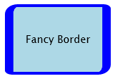
This XAML:
 <Border Height="100" Width="150" BorderBrush="Blue" BorderThickness="12,4" CornerRadius="12,4,12,4" Background="LightBlue">
    <TextBlock Text="Fancy Border" HorizontalAlignment="Center" VerticalAlignment="Center"/>
</Border>
produces a fancy Border like this:
I said that the Border centers its children by default, but it isn't really the Border that does that, but rather the default values for HorizontalAlignment and VerticalAlignment on its child that do the centering. You'll notice that I specified the alignment of the TextBlock. TextBlock is special; it will take up all the space that is given to it, and render itself in the top-left, unless explicitly told to do otherwise. Also note that I specified the Width and Height of the Border. That is always an option, but you can let the Border figure out for itself how big it should be. In this case, it would first determine how big its child (the TextBlock) is, then add the Padding and BorderThickness properties.
 <Border BorderBrush="Blue" BorderThickness="12,4" CornerRadius="12,4,12,4" Background="LightBlue">
    <TextBlock Text="Fancy Border" HorizontalAlignment="Center" VerticalAlignment="Center"/>
</Border>

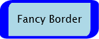
The Border is just a bit too tight around the text, so let's add some Padding:
 <Border BorderBrush="Blue" BorderThickness="12,4" CornerRadius="12,4,12,4" Background="LightBlue" Padding="4">
    <TextBlock Text="Fancy Border" HorizontalAlignment="Center" VerticalAlignment="Center"/>
</Border>

The Padding property is used in addition to the Margin property, which will be discussed below. If we put a Margin on the TextBlock, then we get this:
 <Border BorderBrush="Blue" BorderThickness="12,4" CornerRadius="12,4,12,4" Background="LightBlue" Padding="4">
    <TextBlock Text="Fancy Border" HorizontalAlignment="Center" VerticalAlignment="Center" Margin="8"/>
</Border>
Now there are 12 pixels between the TextBlock and the inside of the Border. It doesn't really matter how many of those pixels are the Border's Padding, or the TextBlock's Margin.
And now, I have a confession to make. I've been cheating. All of the XAML that I've been using actually includes a UserControl and a Canvas:
 <UserControl x:Class="LayoutPt2.Page"
    xmlns="https://schemas.microsoft.com/winfx/2006/xaml/presentation"
    xmlns:x=https://schemas.microsoft.com/winfx/2006/xaml>
    <Canvas>
        <Border BorderBrush="Blue" BorderThickness="12,4" CornerRadius="12,4,12,4" Background="LightBlue" Padding="4">
            <TextBlock Text="Fancy Border" HorizontalAlignment="Center" VerticalAlignment="Center" Margin="8"/>
        </Border>
    </Canvas>
</UserControl>
This is because if the Border was the child of the UserControl instead of the Canvas, it would take up the entire available space, which in this case would be the plugin space, because the default value for the HorizontalAlignment and VerticalAlignment are Stretch, which will cause the element to take up all of the available space. Often, this is exactly what you want, but for this example, I wanted to show what the Border would look like if it was not doing that. Here's what things would looks like without the Canvas:
 <UserControl x:Class="LayoutPt1.Page"
    xmlns="https://schemas.microsoft.com/winfx/2006/xaml/presentation"
    xmlns:x=https://schemas.microsoft.com/winfx/2006/xaml>
    <Border BorderBrush="Blue" BorderThickness="12,4" CornerRadius="12,4,12,4" Background="LightBlue" Padding="4">
        <TextBlock Text="Fancy Border" HorizontalAlignment="Center" VerticalAlignment="Center" Margin="8"/>
    </Border>
</UserControl>
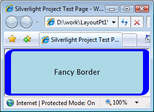
This fill behavior is typical, and is the result of an element being given more space than it actually needs. Unless the width and height have been set or constrained (e.g. by the MaxWidth and/or MaxHeight properties) or the HorizontalAlignment and/or VerticalAlignments set to a value other then Stretch, most elements will expand to fill the space assigned to them. The Margin and Padding properties have an effect on the minimum size only.
If an element in a layout container requires more space than is given to it, it is automatically clipped. Here's some XAML that specified the width of the Border, to make it narrower than the text requires:
 <Canvas>
    <Border BorderBrush="Blue" Width="100" BorderThickness="12,4" CornerRadius="12,4,12,4" Background="LightBlue" Padding="4">
        <TextBlock Text="Fancy Border" HorizontalAlignment="Center" VerticalAlignment="Center" Margin="8"/>
    </Border>
</Canvas>
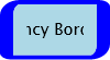
You can see that the text does not go all the way up to the edge. That is because of the Margin and Padding. Those properties are applied before the content is clipped.
StackPanel
The StackPanel will place its children in either a column (default) or row. This is controlled by the Orientation property. A vertical StackPanel can have its width and height specified; if the width is not specified, it will be as wide as its widest child (or it will stretch to fit its parent), if the height is not specified it will take up as much space vertically as is required to fit all of its children. An unconstrained horizontal StackPanel will be as wide as necessary to hold all of its children, and as tall as the tallest child. Here is some XAML for a vertical StackPanel with its Width specified:
 <StackPanel Background="Aquamarine" HorizontalAlignment="Center" VerticalAlignment="Center" Width="150">
    <Button Width="100" Content="Width=100" Margin="2"/>
    <Button Width="auto" Content="Width=auto" Margin="2"/>
    <Button Width="200" Content="Width=200" Margin="2"/>
</StackPanel>
This looks like:
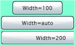
The StackPanel has its Width set to 150. The first Button, which has its Width set to 100, is centered. The second button, which has its width set to "auto" (which is the same as not setting it) expands to fill the width of the StackPanel. The third Button, which has a Width of 200, is clipped, and is not centered. Note that all Buttons, whether they fit, were stretched to fill the StackPanel, or clipped, have their Margin property applied. If the alignment properties of the StackPanel are set to "Stretch", and the width is unconstrained, what happens? Here the XAML:
<UserControl x:Class="LayoutPt1.Page"
xmlns="https://schemas.microsoft.com/winfx/2006/xaml/presentation"
xmlns:x="https://schemas.microsoft.com/winfx/2006/xaml"Loaded="UserControl_Loaded">
<StackPanel Background="Aquamarine"HorizontalAlignment="Stretch"VerticalAlignment="Stretch">
<ButtonWidth="100"Content="Width=100"Margin="2"/>
<ButtonWidth="auto"Content="Width=auto"Margin="2"/>
<ButtonWidth="200"Content="Width=200"Margin="2"/>
</StackPanel>
</UserControl>
Here's the result:
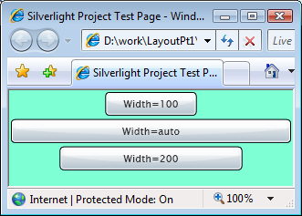
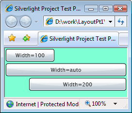
The StackPanel fills up the entire plugin space. The Buttons with their widths specified are centered; the Button with its Width set to "auto" is stretched fill the entire width. The bottom of the StackPanel is empty. There is no way to get the items in a vertical StackPanel to build from the bottom of the StackPanel; likewise a horizontal StackPanel's items will always be on the left. The VerticalAlignment property of a vertical StackPanel and the HorizontalAlighnment of a horizontal StackPanel are ignored. However, the HorizontalAlignment of an element in a vertical StackPanel, and the VerticalAlignment of an element in a horizontal StackPanel, will be honored. Here an example:
 <StackPanel Background="Aquamarine" HorizontalAlignment="Stretch" VerticalAlignment="Stretch">
    <Button Width="100" Content="Width=100" Margin="2" HorizontalAlignment="Left"/>
    <Button Width="auto" Content="Width=auto" Margin="2"/>
    <Button Width="200" Content="Width=200" Margin="2" HorizontalAlignment="Right"/>
</StackPanel>
Here's what that looks like:
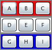
To emphasize the point about nested layout containers, here are some horizontal StackPanels inside of a vertical StackPanel:
 <StackPanel Background="Gray" HorizontalAlignment="Center" VerticalAlignment="Center">
    <StackPanel Orientation="Horizontal" Background="Red" Margin="2">
        <Button Margin="2" Width="30" Content="A"/>
        <Button Margin="2" Width="30" Content="B"/>
        <Button Margin="2" Width="30" Content="C"/>
    </StackPanel>
    <StackPanel Orientation="Horizontal" Background="White" Margin="2">
        <Button Margin="2" Width="30" Content="D"/>
        <Button Margin="2" Width="30" Content="E"/>
        <Button Margin="2" Width="30" Content="F"/>
    </StackPanel>
    <StackPanel Orientation="Horizontal" Background="Blue" Margin="2">
        <Button Margin="2" Width="30" Content="G"/>
        <Button Margin="2" Width="30" Content="H"/>
        <Button Margin="2" Width="30" Content="I"/>
    </StackPanel>
</StackPanel>
This looks like:
Grid
The Grid is the most powerful layout container provided in Silverlight 2. It can have multiple children, and acts rather like a spreadsheet. The cells are not explicitly defined; you specify the rows and columns, and those define the cells. A row is the same height and a column is the same width across the entire Grid, but elements can be made to span multiple cells. Cells can contain more than one item.
The placement of an element in the Grid is specified using attached DependencyProperties that are set on the children of the Grid: Grid.Row, Grid.Column, Grid.RowSpan and Grid.ColumnSpan.
The size of rows and columns may be specified exactly, set to "auto", or use "star-sizing". If a row or column is set to "auto", it will be just as tall or wide as its tallest or widest child. Star-sizing is very powerful but a bit more complicated, so it will be discussed below.
Let's just launch right into it, and bring back the example from the first post in this series. I've modified it a little bit to make it more interesting.
 <UserControl x:Class="LayoutPt1.Page"
    xmlns="https://schemas.microsoft.com/winfx/2006/xaml/presentation"
    xmlns:x="https://schemas.microsoft.com/winfx/2006/xaml" Loaded="UserControl_Loaded">
    <Grid Background="Beige">
        <Grid.RowDefinitions>
            <RowDefinition Height="auto"/>
            <RowDefinition Height="*"/>
            <RowDefinition Height="auto"/>
        </Grid.RowDefinitions>
        <Grid.ColumnDefinitions>
            <ColumnDefinition Width="100"/>
            <ColumnDefinition Width="*"/>
        </Grid.ColumnDefinitions>

        <StackPanel Grid.Row="0" Grid.Column="1" Orientation="Horizontal" Background="Coral">
            <Button Content="New" Width="50" Margin="2" HorizontalAlignment="Left"/>
            <Button Content="Open" Width="50" Margin="2"/>
        </StackPanel>

        <Grid Grid.Row="2" Grid.Column="1" Background="CornflowerBlue">
            <Grid.ColumnDefinitions>
                <ColumnDefinition Width="*"/>
                <ColumnDefinition Width="auto"/>
            </Grid.ColumnDefinitions>
            <TextBlock Grid.Column="0" Text="Status text" VerticalAlignment="Center"/>
            <Button Grid.Column="1" Content="Help" Width="50" Margin="2"/>
        </Grid>

        <StackPanel Grid.Row="0" Grid.Column="0" Grid.RowSpan="3" Background="LightGreen">
            <Button Content="Command 1" Margin="2" HorizontalAlignment="Left"/>
            <Button Content="Command 2" Margin="2" HorizontalAlignment="Left"/>
            <Button Content="Command 3" Margin="2" HorizontalAlignment="Left"/>
        </StackPanel>
    </Grid>
</UserControl>
This looks like:
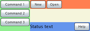
Let's examine the XAML. There are two Grids, and two StackPanels. The first Grid, the "outer" one, has a RowDefinition section like this:
 <Grid.RowDefinitions>
    <RowDefinition Height="auto"/>
    <RowDefinition Height="*"/>
    <RowDefinition Height="auto"/>
</Grid.RowDefinitions>
This means that this Grid has three rows. These are numbered starting from 0, but in the definitions section, the number is implicit. The first definition is row 0, the next is row 1, etc. The only attribute a row has is its height. This is controlled by its Height, MinHeight and MaxHeight properties. When the Height is set to "auto", the row will only be as tall is it has to be to contain its children or to make an orderly Grid. The second Row has a size of " * ". This means that the row will take up all left-over space. So if the Height of the Grid ends up being 100, and the first and last rows each take up 25, then the second row will be 50 high. It gets a little more complicated when more than one row or column is star-sized. The only item of note in the ColumnDefinition section is that the first column has a fixed size of 100.
The elements are placed in the Grid cells using the Grid.Row and Grid.Column properties.
Star-sizing in a Grid is a very powerful way of allocating relative amounts of space. The algorithm is pretty complicated (it has to deal with auto- and star-sized rows and columns, spanning, etc.) but the principle is simple: whatever space is left over from fixed- and auto-sized columns is allocated to all of the columns with star-sizing, according to the proportion of stars. Let's consider these ColumnDefinitions:
 <Grid Background="Beige" Width="300">
    <Grid.ColumnDefinitions>
        <ColumnDefinition Width="100"/>
        <ColumnDefinition Width="*"/>
    </Grid.ColumnDefinitions>
The Grid has a width of 300. Column 0 has a width of 100, and there is one star-sized column, so the star-sized column gets all of the space left over (200). If the definitions looked like this:
 <Grid.ColumnDefinitions>
    <ColumnDefinition Width="100"/>
    <ColumnDefinition Width="*"/>
    <ColumnDefinition Width="*"/>
</Grid.ColumnDefinitions>
Then columns 1 and 2 would gets widths of 100 each. But with these definitions:
 <Grid.ColumnDefinitions>
    <ColumnDefinition Width="100"/>
    <ColumnDefinition Width="*"/>
    <ColumnDefinition Width="3*"/>
</Grid.ColumnDefinitions>
the space is allocated differently. The total of the multipliers on the stars is 4 (the 1 on "*" is implicit.) So each star is now width 4 / 200 = 50. Column 1 will be 1 * 50 wide and column 2 will be 3 * 50 wide. Real numbers can also be used:
 <Grid.ColumnDefinitions>
    <ColumnDefinition Width="100"/>
    <ColumnDefinition Width=".5*"/>
    <ColumnDefinition Width="1.5*"/>
</Grid.ColumnDefinitions>
This ends up allocating the same amount of space in the previous example, because I chose nice numbers. The sum of the star multipliers is 2, so each star is worth 100 (in case you had forgotten the Grid is 300 wide, and the first column is 100 wide, so 200 will be divided up among the star-sized columns.) Column 1 is therefore .5 * 100 = 50 wide, and column 2 is 1.5 * 100 = 150 wide.
Column and row spanning are controlled by the Grid.ColumnSpan and Grid.RowSpan properties. When one of these is set on the child of a Grid, it will cover more than one column or row. In the example above, the StackPanel has a Grid.RowSpan of 3:
 <StackPanel Grid.Row="0" Grid.Column="0" Grid.RowSpan="3" Background="LightGreen">
    <Button Content="Command 1" Margin="2" HorizontalAlignment="Left"/>
    <Button Content="Command 2" Margin="2" HorizontalAlignment="Left"/>
    <Button Content="Command 3" Margin="2" HorizontalAlignment="Left"/>
</StackPanel>
This causes the StackPanel to cover all three rows of the Grid, starting from the row specified by its Grid.Row property.