Silverlight Layout Fundamentals Part 1 - What is Layout?
This is the first part of a series of articles on Silverlight 2's layout system. I'm going to start off slowly, and demonstrate the need for a layout system, then explain some more about what "layout" actually is and what the Silverlight 2 layout system can do.
Silverlight 1.0 did not have layout functionality. Silverlight 2 does. But why is that a big deal? And what does "layout" mean, anyway? In generic terms, when you "lay something out" you are positioning things in a space. You could lay out a garden, a housing development, a grocery store, anything where you have some space to fill up, and things to fill it up with. This obviously includes placing visual elements on a computer screen.
In the first examples below, we'll ignore the fact that Silverlight 2 has a layout system, and do all of our layout the hard way.
Putting a button on the screen
Let's take the simple case of wanting to make a button by putting a TextBlock inside of a Rectangle in the top-left corner of the area occupied by the Silverlight plugin. (Let's ignore the fact that Silverlight 2 has a Button, so you wouldn't really need to make your own.)
Let's start with the Rectangle:
 <UserControl x:Class="LayoutPt1.Page"
    xmlns="https://schemas.microsoft.com/winfx/2006/xaml/presentation"
    xmlns:x=https://schemas.microsoft.com/winfx/2006/xaml>
    <Rectangle Height="20" Width="100" Stroke="Black" Fill="Beige"/>
</UserControl>
So far, so good. (Note: I will not include the UserControl in subsequent examples, but it is still there.) Now, let's put the TextBlock in:
 <Canvas>
    <Rectangle Height="20" Width="100" Stroke="Black" Fill="Beige"/>
    <TextBlock Text="Open"/>
</Canvas>
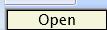
But this doesn't look so good. The text isn't in the right spot:

But how do you know where to put it? One way to do it would be use trial and error, and change the Canvas.Top and Canvas.Left properties of the TextBlock until it looks OK. But it seems like maybe this wonderful computer thingy could do that for you. Of course it can, but it will take some code.
 <Canvas>
    <Rectangle x:Name="button" Height="20" Width="100" Stroke="Black" Fill="Beige"/>
    <TextBlock x:Name="buttonText" Text="Open"/>
</Canvas>
 using System;
using System.Windows;
using System.Windows.Controls;
using System.Windows.Shapes;

namespace LayoutPt1
{
    public partial class Page : UserControl
    {
        public Page()
        {
            InitializeComponent();
        }

        private void UserControl_Loaded(object sender, RoutedEventArgs e)
        {
            Canvas.SetLeft(buttonText, (button.Width - buttonText.ActualWidth) / 2);
            Canvas.SetTop(buttonText, (button.Height - buttonText.ActualHeight) / 2);
        }
    }
}
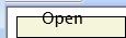
(Note: In subsequent examples, I am only going to include the interesting bits of the code rather than the entire UserControl subclass file.) The text inside of the Rectangle looks better, but there is still something wrong. The whole thing is slammed up in the corner of the browser:
It would look nicer with some more room, so let's change the XAML.
 <Canvas>
    <Rectangle x:Name="button" Canvas.Left="8" Canvas.Top="8" Height="20"
               Width="100" Stroke="Black" Fill="Beige"/>
    <TextBlock x:Name="buttonText" Text="Open"/>
</Canvas>
Oops. That doesn't look so good:
Looks like we should change the code to account for the fact the the Rectangle is no longer at 0,0.
 Canvas.SetLeft(buttonText, Canvas.GetLeft(button) + (button.Width - buttonText.ActualWidth) / 2);
Canvas.SetTop(buttonText, Canvas.GetTop(button) + (button.Height - buttonText.ActualHeight) / 2);
Much better:
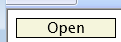
So now, we have some XAML and some code that will center a TextBlock inside of a Rectangle at 8,8.
Adding more buttons
Now that we have one button on the screen, let's add another. Where should we put it? Well, we forgot some white space around the button last time, so let's not forget it this time. The first button is at 8,8 and it is 100 wide and 20 high, and if we want a space of four pixels between the buttons for the margin, we should put the next button at 8 + 20 + 4 = 32. We should be able to copy, paste and modify our code to center the text.
 <Canvas>
    <Rectangle x:Name="button1" Canvas.Left="8" Canvas.Top="8" Height="20"
               Width="100" Stroke="Black" Fill="Beige"/>
    <TextBlock x:Name="buttonText1" Text="Open"/>
    <Rectangle x:Name="button2" Canvas.Left="8" Canvas.Top="32" Height="20"
               Width="100" Stroke="Black" Fill="Beige"/>
    <TextBlock x:Name="buttonText2" Text="Save"/>
</Canvas>
 Canvas.SetLeft(buttonText1, Canvas.GetLeft(button1) + (button1.Width - buttonText2.ActualWidth) / 2);
Canvas.SetTop(buttonText1, Canvas.GetTop(button1) + (button1.Height - buttonText2.ActualHeight) / 2);
Canvas.SetLeft(buttonText2, Canvas.GetLeft(button2) + (button2.Width - buttonText2.ActualWidth) / 2);
Canvas.SetTop(buttonText2, Canvas.GetTop(button2) + (button2.Height - buttonText2.ActualHeight) / 2);
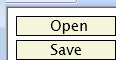
Hah. Got it right the first try:
Now it gets complicated
But now, let's add some more buttons, which should be just like adding the "Save" button. But by the way, we want a "New" button to be on top, so we have to move everything down. And we also want our little stack of buttons in the bottom-right corner instead of the top left. We could do that by changing all of the Canvas.Left and Canvas.Top values. A little laborious, but not too bad. But what if we wanted to change the plugin size? Well, we could type in the numbers again. But what it the plugin was sized not absolutely, but as a percentage of the browser size, and we wanted our buttons to always be in the bottom right as the user resized the browser? Then we'd have to do this:
 <Canvas>
    <Rectangle x:Name="button0" Height="20" Width="100" Stroke="Black" Fill="Beige"/>
    <TextBlock x:Name="buttonText0" Text="New"/>
    <Rectangle x:Name="button1" Height="20" Width="100" Stroke="Black" Fill="Beige"/>
    <TextBlock x:Name="buttonText1" Text="Open"/>
    <Rectangle x:Name="button2" Height="20" Width="100" Stroke="Black" Fill="Beige"/>
    <TextBlock x:Name="buttonText2" Text="Save"/>
    <Rectangle x:Name="button3" Height="20" Width="100" Stroke="Black" Fill="Beige"/>
    <TextBlock x:Name="buttonText3" Text="Save as..."/>
</Canvas>
 void Content_Resized(object sender, EventArgs e)
{
    const double bigMargin = 8;
    const double smallMargin = 4;

    double right = Application.Current.Host.Content.ActualWidth - bigMargin;
    if (right < 0) return;

    double bottom = Application.Current.Host.Content.ActualHeight - bigMargin;

    PositionButton(button3, buttonText3, smallMargin, right, ref bottom);
    PositionButton(button2, buttonText2, smallMargin, right, ref bottom);
    PositionButton(button1, buttonText1, smallMargin, right, ref bottom);
    PositionButton(button0, buttonText0, smallMargin, right, ref bottom);
}

private void PositionButton(Rectangle r, TextBlock t, double margin, double right, ref double bottom)
{
    double left = right - r.Width;
    double top = bottom - r.Height;

    Canvas.SetLeft(r, left);
    Canvas.SetTop(r, top);
    Canvas.SetLeft(t, left + (r.Width - t.ActualWidth) / 2);
    Canvas.SetTop(t, top + (r.Height - t.ActualHeight) / 2);

    bottom -= r.Height + margin;
}
And it looks wonderful, and moves when the browser changes size:
But it was painful, and it was a lot of code to write just to move put four buttons where we wanted them. And even though things are nicely factored for putting a stack of buttons in the bottom right, imagine a screen full of buttons and such. And while you are designing, you'd add and remove elements, try different elements, move elements, etc. so you'd constantly be changing code to move things around. Yuck.
Layout to the rescue
So if you had never really thought about it before, it is easy to see why something that would do all of the dirty work for you would be nice.
That "something" in Silverlight 2 is the layout system. Silverlight 2 adds layout container elements. These layout container elements define how their children will be sized and positioned. A simple and very useful layout container is the Border element, which is similar to a Rectangle in many ways, but it has a single child that it centers inside of it by default.
This XAML will put our single "button" in the right spot in the upper left like we did above, but no code is necessary (obviously Silverlight is working away behind the scenes, but that's it):
 <Canvas>
    <Border BorderBrush="Black" BorderThickness="1" Background="Beige" Height="20" Width="100" Margin="8">
        <TextBlock Text="New" HorizontalAlignment="Center" VerticalAlignment="Center"/>
    </Border>
</Canvas>
Another simple layout container is the StackPanel. By default, this puts its children in a vertical stack, just like we did. Here's what that XAML looks like, again without having to write any code:
 <Canvas>
    <StackPanel Margin="6">
        <Border BorderBrush="Black" BorderThickness="1" Background="Beige" Height="20" Width="100" Margin="2">
            <TextBlock Text="New" HorizontalAlignment="Center" VerticalAlignment="Center"/>
        </Border>
        <Border BorderBrush="Black" BorderThickness="1" Background="Beige" Height="20" Width="100" Margin="2">
            <TextBlock Text="Open" HorizontalAlignment="Center" VerticalAlignment="Center"/>
        </Border>
        <Border BorderBrush="Black" BorderThickness="1" Background="Beige" Height="20" Width="100" Margin="2">
            <TextBlock Text="Save" HorizontalAlignment="Center" VerticalAlignment="Center"/>
        </Border>
        <Border BorderBrush="Black" BorderThickness="1" Background="Beige" Height="20" Width="100" Margin="2">
            <TextBlock Text="Save as..." HorizontalAlignment="Center" VerticalAlignment="Center"/>
        </Border>
    </StackPanel>
</Canvas>
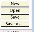
This looks exactly the same as our upper-left button stack. There are some more attributes in the XAML, but that's a small price to pay. The XAML for the bottom-right stack of buttons looks like this:
 <Border>
    <StackPanel Margin="6" HorizontalAlignment="Right" VerticalAlignment="Bottom">
        <Border BorderBrush="Black" BorderThickness="1" Background="Beige" Height="20" Width="100" Margin="2">
            <TextBlock Text="New" HorizontalAlignment="Center" VerticalAlignment="Center"/>
        </Border>
        <Border BorderBrush="Black" BorderThickness="1" Background="Beige" Height="20" Width="100" Margin="2">
            <TextBlock Text="Open" HorizontalAlignment="Center" VerticalAlignment="Center"/>
        </Border>
        <Border BorderBrush="Black" BorderThickness="1" Background="Beige" Height="20" Width="100" Margin="2">
            <TextBlock Text="Save" HorizontalAlignment="Center" VerticalAlignment="Center"/>
        </Border>
        <Border BorderBrush="Black" BorderThickness="1" Background="Beige" Height="20" Width="100" Margin="2">
            <TextBlock Text="Save as..." HorizontalAlignment="Center" VerticalAlignment="Center"/>
        </Border>
    </StackPanel>
</Border>
By replacing the Canvas (which doesn't really participate in layout) with a Border, and setting the horizontal and vertical alignments on the StackPanel, we now have a stack of buttons in the bottom-right of the plugin, that will automatically reposition itself if the plugin changes size. Did I mention that this example contains no code?
What does the Silverlight 2 layout system do?
The Silverlight 2 layout system has two main tasks:
- Figure out how big elements are
- Figure out where to put them
To do this, it relies on the fact that all elements that can have children know how to position their children. It introduces layout elements that have specific positioning behavior:
The Border has one child, that is centered by default.
The StackPanel can have any number of children, and arranges them in either a column (the default) or a row.
The Grid can have any number of children, and it arranges them sort of like a spreadsheet does. You can define rows and columns, and specify which rows and columns your elements can go into.
It is also possible to define your own layout containers, but that is an advanced topic.
Silverlight 2 also has a number of properties that layout uses, such as Margin, HorizontalAlignment, VerticalAlignment, MinWidth, MaxWidth, MinHeight, MaxHeight, etc.
The power of layout is demonstrated when you put layout containers inside of layout containers. For the next example, let's say that you want your Silverlight 2 app to look like a Windows app, with a row of buttons across the top, a line for status information on the bottom, and a row of buttons down the left side.
This could be done a number of ways, but when you start dividing the screen into rows and columns, a Grid is the natural way to think of things. I'll dive into the Grid more in subsequent posts. This is how your app would look (and I'm going to use real Buttons this time):
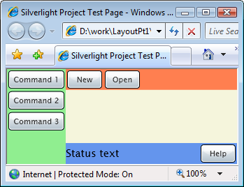
This is the XAML:
 <UserControl x:Class="LayoutPt1.Page"
    xmlns="https://schemas.microsoft.com/winfx/2006/xaml/presentation"
    xmlns:x="https://schemas.microsoft.com/winfx/2006/xaml" Loaded="UserControl_Loaded">
    <Grid Background="Beige">
        <Grid.RowDefinitions>
            <RowDefinition Height="auto"/>
            <RowDefinition Height="*"/>
            <RowDefinition Height="auto"/>
        </Grid.RowDefinitions>
        <Grid.ColumnDefinitions>
            <ColumnDefinition Width="auto"/>
            <ColumnDefinition Width="*"/>
        </Grid.ColumnDefinitions>

        <StackPanel Grid.Row="0" Grid.Column="1" Orientation="Horizontal" Background="Coral">
            <Button Content="New" Width="50" Margin="2" HorizontalAlignment="Left"/>
            <Button Content="Open" Width="50" Margin="2"/>
        </StackPanel>

        <Grid Grid.Row="2" Grid.Column="1" Background="CornflowerBlue">
            <Grid.ColumnDefinitions>
                <ColumnDefinition Width="*"/>
                <ColumnDefinition Width="auto"/>
            </Grid.ColumnDefinitions>
            <TextBlock Grid.Column="0" Text="Status text" VerticalAlignment="Center"/>
            <Button Grid.Column="1" Content="Help" Width="50" Margin="2"/>
        </Grid>

        <StackPanel Grid.Row="0" Grid.Column="0" Grid.RowSpan="3" Background="LightGreen">
            <Button Content="Command 1" Margin="2" Width="80" HorizontalAlignment="Left"/>
            <Button Content="Command 2" Margin="2" Width="80" HorizontalAlignment="Left"/>
            <Button Content="Command 3" Margin="2" Width="80" HorizontalAlignment="Left"/>
        </StackPanel>

    </Grid>
</UserControl>