Building an interactive calendar view with PowerApps
PowerApps has many built-in facilities to help you work with dates and calendars (click these links to learn more about the DatePicker control and the Date and DateTime functions 1, 2, 3).
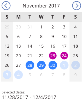
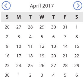
For some scenarios, however, you might want to customize the look and feel of those experiences beyond what is available out of the box. This article will walk you through the creation of an app with a customized calendar that shows a month view, highlights special days (holidays and weekends) and allows for interactive date range selection by tapping. Here is what it will look like:
- Get the template (open the link, press Ctrl+C, then paste onto your app)
- Download the sample app (you will need PowerApps - get started at https://powerapps.microsoft.com)
Since this example uses only built-in PowerApps controls such as TextBoxes, Circles, Rectangles and Galleries, you can take this further and customize it in endless ways for your own needs. Even if you have no interest in building a calendar control, this article can still help you learn a little bit more about PowerApps:
- Using Galleries and the WrapCount property
- How to find the control you want when your app has several on top of each other
- Using context variables
- Tricks for improving your app’s performance
Introduction and strategy
Let’s outline the plan before we start executing it.
The main piece of this calendar control will be a Gallery, where each gallery item is a day in the month. The gallery template will need a TextBox to show the day number (1 – 31), and a Circle behind the text to show if that day is special (holidays will show a purple circle; selected days will show a blue circle). We will add other controls as we go.
Some calendar math: Note that we need up to 6 weeks to fit all possible months. The extreme case is a 31-day month that starts on the last day of the week (look at July 2017 for example). For our purposes, we will always show 6 weeks in our view, even if a month could fit in fewer (5 or 4) weeks. This is done for multiple reasons:
- Our calendar will always occupy the same screen space regardless of the selected month. You won’t need to worry about adapting the rest of your app UI for months that take up more or less weeks
- It is consistent with the Windows 10 Clock / calendar control (click the clock on your system tray and navigate between July/2017 to August/2017 to see this in action)
- It is easier to build
Win-win-win (that said, you can change this behavior if you want since, again, we are using only PowerApps primitive controls).
We also need the Left / Right arrows to switch months, and they must do something that will affect the gallery. We will use Context Variables for this.
Finally, we want to be able to select dates by tapping on them. Remember that all controls in PowerApps have an OnSelect action that is executed when the control is tapped, and we will use the OnSelect action of the TextBox to update some Context Variables in this case.
Before we begin – A trick for selecting controls
To select a specific control, a very convenient way is to use the “Advanced” pane on the right-hand side:
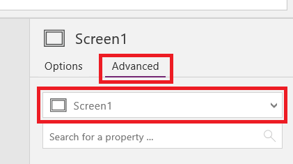
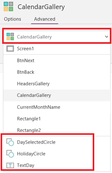
- To select a top-level control, select it from the drop-down indicated above
- To select a control that is inside a gallery, first select the gallery, then click the drop-down again and you will see all controls that exist within the gallery listed below a divider line. At the end of this exercise, you will have something like this:
Initialization
Select your screen, click on "Action" on the ribbon --> "On visible". Paste the expression below in the formula bar. This is setting up some context variables that we will use next.
[LOCALE NOTICE] Depending on the regional settings of your device, you may have to adjust the formulas provided on this blog post slightly. You may have to replace all semicolons ( ; ) with double semicolons ( ;; ), and all commas ( , ) with semicolons ( ; ). Learn more about Languages and globalization in PowerApps.
 Screen1.OnVisible =
If(!_initialized,
  UpdateContext({_today:Today()});
  UpdateContext({_firstDayOfMonth:DateAdd(_today,1-Day(_today),Days)});
  UpdateContext({_firstDayInView:DateAdd(_firstDayOfMonth,-(Mod(Weekday(_firstDayOfMonth)-2,7)+1),Days)});
  UpdateContext({_holidays:Table({HolidayDate:Date(2016,12,25)},
                                 {HolidayDate:Date(2017,1,1)},
                                 {HolidayDate:Date(2017,1,16)},
                                 {HolidayDate:Date(2017,2,20)},
                                 {HolidayDate:Date(2017,5,29)},
                                 {HolidayDate:Date(2017,7,4)},
                                 {HolidayDate:Date(2017,9,4)},
                                 {HolidayDate:Date(2017,11,23)},
                                 {HolidayDate:Date(2017,11,24)},
                                 {HolidayDate:Date(2017,12,25)}
                                )
                });
  UpdateContext({_initialized:true})
)
Note: I am using names with a leading underscore like _this for context variables to distinguish them from other entities in PowerApps such as control names and collections. You don’t have to do this, but it helps keep things organized.
- _firstDayOfMonth will have a Date corresponding to the first day of the current month. We do this by taking today’s date, and subtracting (current day - 1) or, equivalently, adding –(current day – 1) = (1-current day). For example, if today were February 7th, we would do (February 7th) + (1 - 7) = (February 7th) – 6 = February 1st.
- _firstDayInView is a little bit trickier. It represents the first day that shows up at the top left of the gallery, which is the first Sunday before _firstDayOfMonth. We leverage the function Weekday to do this, which returns a number from 1 (Sunday) to 7 (Saturday) for the given date. We then do some math and use the Mod function, which gives the remainder of a number by a divisor (7 in this case because a week has 7 days).
- _holidays is a list of records, where each record has a single field called HolidayDate and whose value is the date of a holiday. You could also pull this data from an external connection using Custom API’s, or embed an Excel data source to achieve the same. Set the holidays that are meaningful to your business and / or your country by modifying this list.
- _initialized is a variable that indicates whether initialization was already done or not. This helps the user experience if your app involves navigating between Screens. When your user comes back to this screen, they will see things as they left them thanks to this context variable. If you prefer to reset everything each time a user navigates to your screen, you can remove this variable and the If check at the top.
Making the initialization formula execute
Because you typed the OnVisible expression just now, it is ready to be executed when you navigate to this screen, but you need to do that at least once or it won’t have run. You only need to do this now because your OnVisible expression wasn’t there when PowerApps first showed your screen. From now on, if you save your app and open it again (or share with your colleagues), the OnVisible formula will execute as soon as your app starts, so you won’t have to do this again.
To force this to run now, do this:
- Add another screen to your app (click "Insert" on the ribbon --> "New screen").
- Navigate back to the first screen by clicking on it on the left side.
- Delete the new screen you just added. It has now served its purpose.
The main gallery
- Back in your first Screen, add a Vertical Gallery and rename it to CalendarGallery:
 CalendarGallery.TemplateSize =  50
CalendarGallery.Items =
[ 0, 1, 2, 3, 4, 5, 6, 7, 8, 9,
 10,11,12,13,14,15,16,17,18,19,
 20,21,22,23,24,25,26,27,28,29,
 30,31,32,33,34,35,36,37,38,39,
 40,41]
CalendarGallery.WrapCount =  7
- Add a TextBox inside CalendarGallery (make sure to select the gallery template first, then add the TextBox). Rename it to TextDay.
TextDay.Text = Day(DateAdd(_firstDayInView,ThisItem.Value,Days))
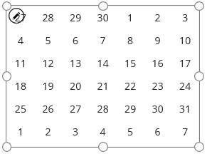
At this point you should be seeing something like this:
Switching months
- Add Back and Next icons outside the gallery (click "Insert" in the ribbon --> "Icon") and place them above the gallery. Name them BtnBack and BtnNext
 BtnBack.OnSelect =
UpdateContext({_firstDayOfMonth:DateAdd(_firstDayOfMonth,-1,Months)});
UpdateContext({_firstDayInView:DateAdd(_firstDayOfMonth,-(Mod(Weekday(_firstDayOfMonth)-2,7)+1),Days)})

BtnNext.OnSelect =
UpdateContext({_firstDayOfMonth:DateAdd(_firstDayOfMonth,1,Months)});
UpdateContext({_firstDayInView:DateAdd(_firstDayOfMonth,-(Mod(Weekday(_firstDayOfMonth)-2,7)+1),Days)})
Notice that the second line of each formula is the same as what we did during OnVisible Given the first day of the newly selected month, this will calculate what is the first Sunday before it.
Showing the current month
- Add a TextBox, rename it to CurrentMonthName and place it between the back / next buttons that you added above.
CurrentMonthName.Text = Text(_firstDayOfMonth,"mmmm yyyy")
Showing the weekday header (Sunday, Monday, Tuesday, …)
- Add a Horizontal Gallery , make it about 60 pixels tall and as wide as your CalendarGallery. Name it HeadersGallery and place it just above CalendarGallery.
 HeadersGallery.Items           =  ["S","M","T","W","T","F","S"]
HeadersGallery.TemplatePadding =  CalendarGallery.TemplatePadding
HeadersGallery.TemplateSize    =  CalendarGallery.TemplateWidth
HeadersGallery.Fill            =  RGBA(0, 0, 0, 0.1)
- Add a TextBox inside the new gallery and name it WeekDayHeader.
 WeekDayHeader.Text       =  ThisItem.Value
WeekDayHeader.Align      =  Center
WeekDayHeader.FontWeight =  Bold
At this point you should have something like this:
Showing holidays
- Select the CalendarGallery template by clicking on the first item of this gallery
- Add a circle ("Insert" in the ribbon --> "Icons" --> "Circle") and rename it to HolidayCircle
HolidayCircle.Visible =  DateAdd(_firstDayInView,ThisItem.Value,Days) in _holidays

HolidayCircle.Fill =
ColorFade(
    RGBA(192,0,160,1),
    If( Month(DateAdd(_firstDayInView,ThisItem.Value,Days))=Month(_firstDayOfMonth),
        0,
        80%)
)
The Fill formula deserves some further consideration. This is adjusting the color of the circle depending on whether the day is part of the current month or not (ColorFade is a function that transforms a color. It makes things lighter if you pass a positive value and darker if you pass a negative value: 100% would make it white, and -100% would make it black. We are using 80%, which will make the purple lighter but still visible).
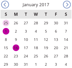
Here is what you should see now if you go to January 2017. Notice how December 25th 2016 has a light purple circle, because it is a holiday but not in the current month. Also, note that the dark text is hard to read on top of the purple circle. We will fix that next.
Adjusting the text color for better contrast
- Select the TextBox TextDay by clicking on the first item of the main gallery. Then set this formula:
 TextDay.Color =
ColorFade(
    If( HolidayCircle.Visible,
        RGBA(255,255,255,1),
        RGBA(47,41,43,1)),
    If( Month(DateAdd(_firstDayInView,ThisItem.Value,Days))=Month(_firstDayOfMonth),
        0,
        80%)
)
This is similar to what we did for the HolidayCircle fill, except that now we are controlling 2 things at the same time:
- The color is white if the day is a holiday and dark otherwise
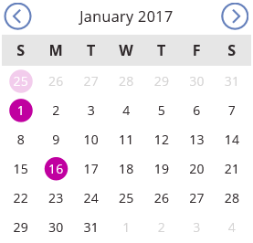
- We make it 80% lighter if the day is not in the currently selected month. This is how we make days that are not in the current month appear dimmed, as shown below:
Hopefully you would agree that this is starting to look much better.
Allowing date range selection by tapping - Strategy
Here is the behavior we want to build:
- Clicking on a date selects it
- Clicking on a date after having selected another date, selects the range between those 2 dates
- Clicking an already-selected day clears the selection
This is an intuitive model that your users will be able to quickly understand by clicking around and exploring your app. Here is the strategy that we will use to build this:
- 3 new context variables:
- _selectedCount: number of clicks in the selection. It starts at zero, goes to 1 when a day is selected, goes to 2 if another day is selected and back to 0 when the range is cleared
- _selectionStart: The date in the selection (the selected range is FROM this value)
- _selectionEnd: The last date in the selection (the selected range is UP TO AND INCLUDING this value)
- One new circle in the gallery to show selections
- New OnSelect formula on the TextDay TextBox to update the new context variables
Adding the OnSelect formula to handle taps
- Select the TextBox TextDay by clicking on the first item of the main gallery. Then set this formula:
 TextDay.OnSelect =
If( Month(DateAdd(_firstDayInView,ThisItem.Value,Days))<>Month(_firstDayOfMonth),
    0,

    _selectedCount > 0
    && DateAdd(_firstDayInView,ThisItem.Value,Days) >= _selectionStart
    && DateAdd(_firstDayInView,ThisItem.Value,Days) <= _selectionEnd,
    UpdateContext({_selectedCount: 0}),

    _selectedCount = 1,
    UpdateContext({_selectionStart: Min(_selectionStart, DateAdd(_firstDayInView,ThisItem.Value,Days)),
                   _selectionEnd:   Max(_selectionStart, DateAdd(_firstDayInView,ThisItem.Value,Days)),
                   _selectedCount:  2}),

    UpdateContext({_selectionStart: DateAdd(_firstDayInView,ThisItem.Value,Days),
                   _selectionEnd:   DateAdd(_firstDayInView,ThisItem.Value,Days),
                   _selectedCount:  1}))
Let’s go through this in pieces. We first check if the current day is in the current month. If it isn’t, we simply say 0 and do nothing. The return value of an action formula such as OnSelect is irrelevant, and we are using 0 just because it is the shortest syntactically valid option.
Otherwise (i.e. the clicked day is in the current month), then we go through a series of conditions:
- Is the clicked date part of a current selection range? We see if there is a selection (_selectedCount > 0) and the clicked date is at or after the beginning of the range and at or before the end of the range. If so, we clear the selection (UpdateContext({_selectedCount: 0}))
- Was a single day already selected? We check this via _selectedCount=1. If so, we update the start to be the lesser of the clicked date and the previously selected date, and similary set the end of the selection to be the greater of the two. We also update _selectedCount to 2, indicating that a range of multiple dates is selected.
If none of the above (i.e. the clicked day is in the current month and it is not part of a selection), then set the current day as the only selected date.
Showing the current selection
We have everything in place to select dates and ranges, but we aren’t showing it to your users yet. Let’s address that that now.
- Select the CalendarGallery template by clicking on the first item of this gallery
- Add a circle ("Insert" in the ribbon --> "Icons" --> "Circle") and rename it to DaySelectedCircle
 DaySelectedCircle.Visible =
_selectedCount > 0
&& DateAdd(_firstDayInView,ThisItem.Value,Days) >= _selectionStart
&& DateAdd(_firstDayInView,ThisItem.Value,Days) <= _selectionEnd

DaySelectedCircle.Fill =
ColorFade(
    RGBA(48,128,255,1),
    If( Month(DateAdd(_firstDayInView,ThisItem.Value,Days))=Month(_firstDayOfMonth),
        0,
        80%)
)
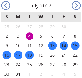
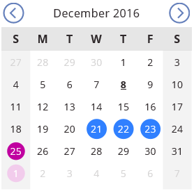
Here is what you should see at this point if you select a date range.
Notice that again the dark text is hard to read on top of selected dates. We already fixed that for holidays, so we now need to modify TextDay.Color as follows:
 TextDay.Color =
ColorFade(
    If( HolidayCircle.Visible  || DaySelectedCircle.Visible,
        RGBA(255,255,255,1),
        RGBA(47,41,43,1)),
    If( Month(DateAdd(_firstDayInView,ThisItem.Value,Days))=Month(_firstDayOfMonth),
        0,
        80%)
)
Notice that now we are using white if the day is a holiday OR if it is selected (we only added the || DaySelectedCircle.Visible condition).
Finishing touches
- Add 2 rectangles and place them behind the main gallery on the left and on the right to indicate weekend.
- To place them behind the gallery, click “Home” in the ribbon à “Reorder” à “Send to back”
- Set the Fill property to RGBA(0,0,0,0.05). This is a very light shade of gray
- Make your DaySelectedCircle slightly larger than HolidayCircle and send it to back
- This will allow your users to select a day even if it is a holiday, and they will be able to see selected holidays
- Highlight Today’s date by making it Bold and underlined:
TextDay.FontWeight =
If(IsToday(DateAdd(_firstDayInView,ThisItem.Value,Days)),FontWeight.Bold,FontWeight.Normal)

TextDay.Underline =  IsToday(DateAdd(_firstDayInView,ThisItem.Value,Days))
We are using the IsToday function, which does exactly what its name indicates. Here is what you should get:
Wrapping up
Congratulations if you made it this far, and hopefully you had some fun while learning a thing or two. Keep sending us feedback and interacting with us on our forums. Tell us what you like and don’t like, and together we will keep pushing the boundaries of what is possible.
That’s all for today. See you next time.