SQL Reporting "How to" – Conditional Color 4/4: Charts & Multi-Dimensional analysis
Part 4 of 4: Continuous Color functions for Multi-Dimensional analysis (in charts)
This "How to" guide provides ideas & code samples on using color to improve your users understanding of the data in your reports. It includes using gradients of color in your tables & charts. It also covers using color to represent a second dimension &/or multiple levels of data in a hierarchy.
Applies to: SQL Server Reporting Services 2005 & SQL 2008 (I’ve not tested it on SQL 2000, nor the version to follow SQL2008, but I expect it will work ok, too.)
In Part 1. I covered simple ways to select from a fixed set of colors & how to assign them to the Color & Backcolor Properties of a Report Item (ie: report textbox), Plus a few other tips.
In Part 2. I cover the algorithm logic & provide many samples you might choose to use as is, or as a basis to enhance. This should give you sufficient info to get them working in most report items, ie Tables, Textboxes etc. The focus is on routines that progress thru different colors.
In Part 3. Is a continuation of Part 2, showing how to progress from Light to Dark of a specific color.
In Part 4. I expand on Part 2 & 3 by looking at special needs of charting & multidimensional grouping. I consider using color to display multiple dimensions / levels / measures.
We will look at four common uses.
- Displaying multiple measures in a single chart, where both measures are of a similar scale.
- Displaying multiple measures in a single chart, where both measures are of a different scales. The length of a bar is one measure/fact ie: Sales Revenue & the color of the bar is a second measure, ie: YOY % Change.
- Displaying belonging, multiple levels in a hierarchy
- Displaying multiple levels with the child's contribution to a parent's contribution to a total.
Overview
In this part we cover how to add color to chart, some examples below. I’ve tried to display examples that you can do in both 2005 & 2008. Given 2008 is vastly superior in its charting ability that reduced some of the things I could show. If you are using it, consider applying these ideas to other areas of the chart, to the gauges & rich text &/or combining these ideas with the transparency capability. Of course it also runs much faster.


Contents - Part 4: Using Color for Charts & Multi-Dimensional analysis
The Basics – How do I get color into my chart?
How do I use color effectively in my business?
- Multiple measures – Similar Scale
- Multiple measures – Very different Scales
- Showing Hierarchal Grouping
- Showing Hierarchal Groups contribution to the total
Pie Charts: Fixing bad HabitsCharts: Showing 2 levels of a dimension; the parents & their children.
ColorTwoLevelShade
ColorGroups
The Basics – How do I get color into my chart?
Step 1: Right click on the chart & select Chart Properties
Step 2: Select the Data Tab. Then the Edit… button for the Values:
Step 3: In the Edit Chart Value dialog, Select the Appearance Tab. Then click the Series Style … button.

Step 4: In the Style Properties dialog, Select the Fill Tab. Then enter your expression or click the Fx button
Step 5: Enter you report expression to call your color function.
Note: You must specify the scope. In a Chart it is often the value of the category group.
=code.ColorTwoLevelShade(Fields!RegionID.Value, CountRows("chart3_CategoryRegion"),RowNumber("chart3_CategoryRegion"))


How do I use color effectively in my business?
Everyone suffers from information overload. As a report author, you can greatly improve their ability to assimilate the information. Before you slap another chart into a report there are four common scenarios that deserve special thought.
-
- Multiple measures – Similar Scale
- Multiple measures – Very different Scales
- Showing Hierarchal Grouping
- Showing Hierarchal Groups contribution to the total
Note: I’m not saying “this is the best way to present your data”, merely presenting you with some alternatives you might consider.
Displaying multiple measures in a single chart, where both measures are of a similar scale.
Examples: Sales/Revenue vs Target. Actual vs Budget or Forecast. Current period vs Prior period, Plan vs Production
Commonly this is displayed 2 series displayed side by side in a column chart. This works well with small numbers of bars. As the number of items increase it takes longer to spot the anomalies. The following charts look at understanding two series of numbers; Actual & Forecast, both are US$ & should be of a similar magnitude.
A work around is to subtract one from the other & display the difference. This draws your attention to the gap but the downside is you tend to lose perspective as to the relative size on the target. eg: $1 million over budget may be a disaster if your budget was $100K, but perhaps acceptable if the budget was $10 Trillion.
Similarly you could show the difference as percent of total. But you risk overlooking the important shortfalls, eg: 1% of $100 stationary budget, is less interesting than 1% of $100Mill Sales target. eg: In the chart below, Turkey & UK are both a similar percentage below forecast, but UK’s $716M shortfall, is likely to impact the parent company much more then Turkey missing its number by $63.7M.
NB: For both the charts above I used a simple formula to color the negative values red.
=iif( (Fields!Actual.Value/Fields!Forecast.Value –1) < 0, "Red", "Black")Colors draw your attention to the poor performing areas, while at the same time shows the magnitude so you can prioritize the significance of those issues.


Displaying multiple measures in a single chart, where both measures are of a different scales.
Examples: Sales vs %YearOnYearChange. Subsidiary Revenue vs %Profit Contribution. Annual Profit vs Headcount for past 15 years. Units Shipped vs Units Returned Faulty. Tons delivered vs Injury/hrs worked
Commonly this type of information is displayed as either a Bar-Line chart or a Bar chart with 2 Y-axis.
Tip: Dual Y axis: Support for charts with 2 Y-Axis was added in SQL 2008. In SQL2005, you need to purchase the Dundas Reporting Services Chart add-in to get that capability. Or adjust the scale (multiply & add an offset) to one of the data series so they can both plot acceptably on the same axis.Tip: Like the Pie chart the Line chart is often misused. The line shows a trend, best used where their is some relationship or implicit order in the X-Axis, eg: Change in Headcount over 10 yrs. If the items in the X-Axis are independent (ie All countries in the world) then using a line is inappropriate. Why? Because if you arbitrarily change the order of the X-Axis items you get a new slope in your line. It is more appropriate to change the line to something else like color. If you must, try using Markers & make the line invisible. (I’ve left the line in these examples purely to demonstrate how it relates to color &/or what you are used to, normally I’d remove it.)


Both of the above charts were created with SQL2008. While I must admit I do like the chart on the left, if you were scanning thru a lot of charts & data, I’m confident that you are less likely to overlook the the big bars, especially if they are red.

Note: Charts are a good use of transition thru Black, the above used ColorBack to draw attention to the colored bars while painting those On-Target countries as black.Tip: If you are using a color scheme in a chart, use the X Axis title to explain what the colors mean. eg: Black: On or near target, Green: Over Target, Red: Under target. It is also good to have the data in a table nearby OR use point labels to show the real value.

Displaying belonging (membership & grouping) or multiple levels in a hierarchy.
Reporting Services does a good job at displaying the children grouped by their parent. As you can see the Group label of the parent sits below its children. You can order the groups Alphabetically, or by the group with the largest child. You can then sort the children within each group. Adding color improves the look but probably does little to improve your understanding of the data.


Where color does make a difference is when you want to compare or sort all the children & yet show their group membership. In the chart below I use color to indicate the parent group. I’ve also put the parent group as an X axis label, just to help you imagine what a pain it is without color. Normally I would show the country in the X-Axis label & not in the data label.

NB: The code to do this is exactly the same as a Pie chart below. I just swapped the chart type, removed the Parent group & changed the “Order By” clause in the Dataset query.
Note: Unless you need to see the same data sorted in different ways in your report. It is usually more efficient to get the the data source to deliver it in sorted order. Why? The database might already have it sorted in an index. But Reporting Services will need memory & CPU to sort it.


Displaying multiple levels with the child's contribution to a parent's contribution to a total.
Pie Charts: Fixing bad Habits.
Anyone who has studied data presentation will tell you that the Pie Chart is most often misused. It is great for showing "Percentage contributions to a total" or "Relative Proportions". Unfortunately it loses its effectiveness with more than 5 items. Why?, the more slices, the less likely humans interpret it correctly. So your choice is to move to a Column/Bar chart or Visually group the children.
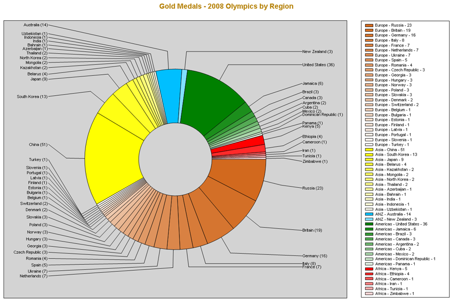
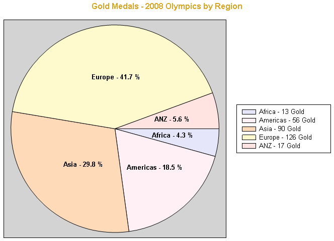
Example of Good: 5 Regions showing relative number of Olympic Gold Medals won in 2008 groups by global region. (NB: ANZ= Australia New Zealand)
Example of Sucks: Attempting to show Olympic Gold Medals won in 2008 by each country.
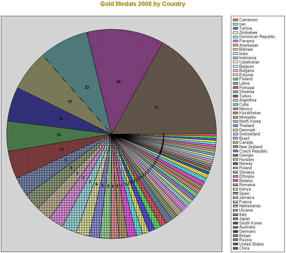
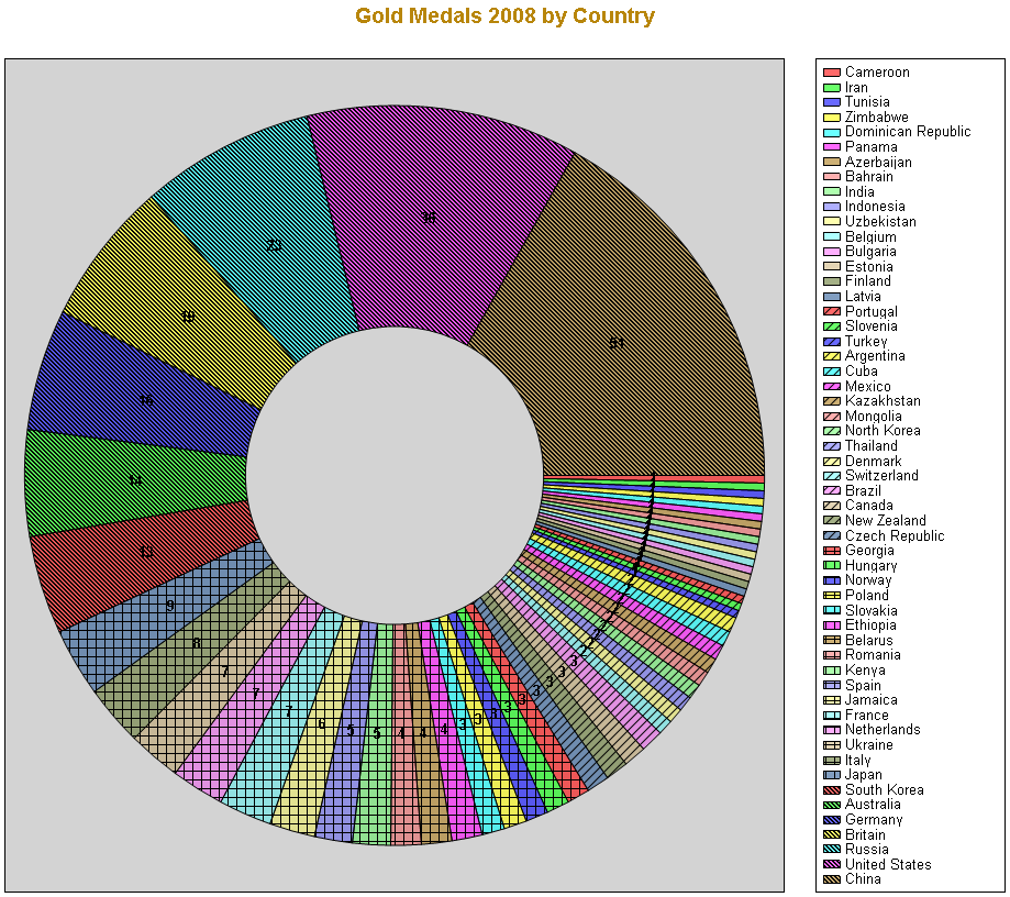
Tip: If you insist on displaying many small segments. A Doughnut chart moves the default location of the labels out a little from the centre, improving the chances that the labels will readable & not overlap. Also leaves a hole where you can put some text, perhaps the title. But in this case, it still sucks.
Tip: Some will argue "but my point is that we are a big slice & all our competitors are tiny". Sounds logical, but unless your slice is really dominant, say over 50%, a Bar/Column chart is probably more effective to communicate that point. You could consider combining many of the thin slices into an "Other" Slice so you only display 5-6 slices. If you are concerned that doing that will highlight that your slice is really only a small percentage of the total market, again a Pie Chart is wrong for you. Most readers will quickly see that no slice is dominant & you’re only a minor contribution to the total.
But might work it you are trying to say “I’m only a small, part of the problem”.Tip: Some people have a strong preference between either Pie Chart or Doughnut Chart. Even though it is really easy to swap between the two, ensure you get your end user to sign off on their preference. I've used Doughnut for the following examples purely because it is less common.
Charts: Showing 2 levels of a dimension; the parents & their children.
So what do you do if you need to display the Gold Medals for each country (the child level) & their contribution to the regional total (their parent level)? As you can see below, Reporting Services does a "best effort" to distinguish each group by introducing a pattern in addition to a color. This works ok on monochrome (B/W) output but I find it difficult to easily see the grouping in the pattern.
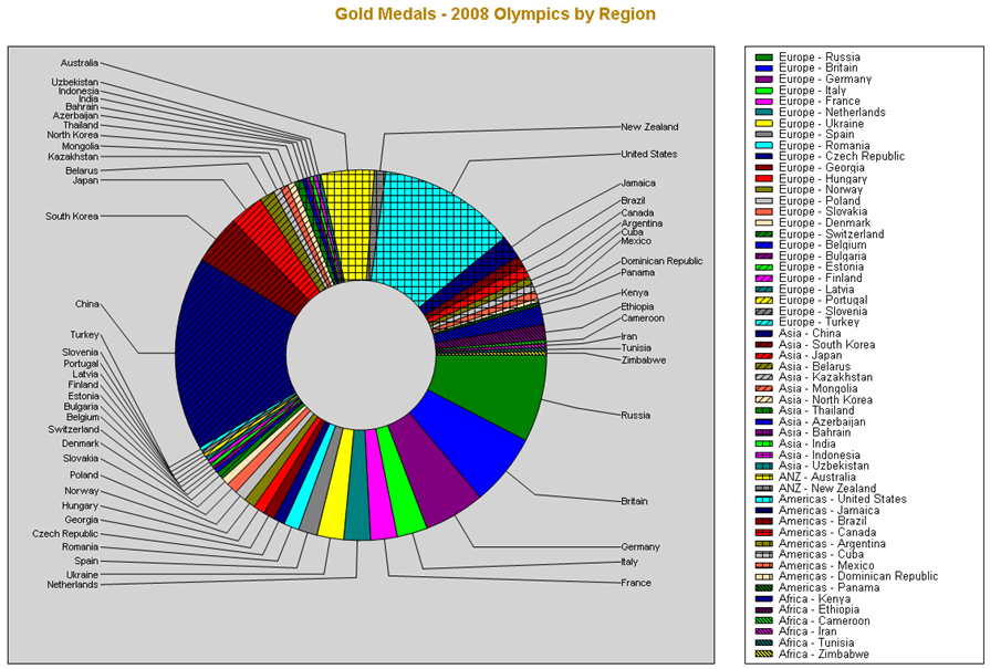
To make it better. I prefer to use a common base color for each group, eg: Yellow = Asia. And then use the different light intensities (shades) each of the children in a group.
How do you set the shades for each of the child items?
This is another example of the using Light intensity (Saturation). For details see “2. Changing the Saturation (Intensity, lightness, Shade & Tint) of a color” section of Part 3 of this blog series.
The only difference is that I call a separate routine to discover the group color.How do you do it?
In your report expression you call the ColorTwoLevelShade function (below). It refers to another function (colorgroups) to determine the color of the parent group, then with that information it creates the shading for the item in the chart it is drawing.
 Public Function ColorTwoLevelShade(ByVal iGroupID As Integer, ByVal iItemsInGroup As Integer, ByVal iItemNum As Integer) As String
    'Remarks: 1. Need to add a Reference to System.Drawing.
    '          2. Need to also copy the Function called ColorGroups

    ' Call ColorGroups to find the color of the parent
    Dim BaseColor As System.Drawing.Color = System.Drawing.Color.FromName(ColorGroups(iGroupID))

    Dim iRed As Integer = BaseColor.R
    Dim iGreen As Integer = BaseColor.G
    Dim iBlue As Integer = BaseColor.B

    Dim iRedInc As Integer = iRed + Int((256 - iRed) / iItemsInGroup * (iItemNum - 1))
    Dim iGreenInc As Integer = iGreen + Int((256 - iGreen) / iItemsInGroup * (iItemNum - 1))
    Dim iBlueInc As Integer = iBlue + Int((256 - iBlue) / iItemsInGroup * (iItemNum - 1))

    ColorTwoLevelShade = "#" & iRedInc.ToString("X2") & iGreenInc.ToString("X2") & iBlueInc.ToString("X2")
    'ColorShade = System.Drawing.Color.FromArgb(255, iRedInc, iGreenInc, iBlueInc)
End Function
For this method to work in your project you will need to register the .NET Class System.Drawing. To see how to do that read the section “3. Using a other .NET Classes in your Custom Code” in Part 1 of this “How To” set of articles. This is necessary for the Color.FromName method & the Color.R, Color.G & Colour.B properties.
I choose to write it that way largely because it is convenient & also because I wanted to show you a use for calling a .NET Class. An alternative would be to pass the colors as “0xFFFFFF” strings & then use substring or binary shifting to extract the Red,Green,Blue portions.
How do you set the colors for the parent level?
The current solution I use is to hard code a list of colors in the order I want. See code below.
 ''' <summary>
''' This function provides a pre-defined set of colors of your choosing, used by ColorTwoLevelShade function used for the BaseColor of a group.
''' </summary>
''' <param name="iItemNum"></param>
''' <returns>A color</returns>
''' <remarks>Not as good as picking your own colors. VB.NET you will need to change return to Color String & Add a reference to System.Drawing</remarks>
Private Function ColorGroups(ByVal iItemNum As Integer) As String
    Dim Colors() As String = {"Red", "Green", "DeepSkyBlue", "Yellow", "Chocolate", "Purple", "DarkOrange", "Brown", "Blue", "GoldenRod", "Olive", "MediumTurquoise"}
    If (iItemNum > Colors.Length) OrElse (iItemNum < 1) Then
        'Error: Default to near White
        ColorGroups = "WhiteSmoke"
    Else
        ColorGroups = Colors(iItemNum - 1)
    End If
End Function
Mediocre color picker code (Alternate version of ColorGroups)
I wanted to give you some slick algorithm that generated the perfect set of colors dispersed around the rainbow. A routine that would work with any number of inputs. The best I've thought of so far, is mediocre. It works well for some groups with an odd number of items; 7, 13, etc. But poor for numbers less than 6 & really bad for even numbers. I suspect a Hash style algorithm will be the answer. So I've included a starting point below if you want to explore this. Given that it is so easy to hard code your favourite set of colors in a list. I don't plan on spending a lot more time on this.
 ''' <summary>
''' This function picks a random set of colors, useful for producing the BaseColor of a group.
''' </summary>
''' <param name="iItemsInGroup"></param>
''' <param name="iItemNum"></param>
''' <returns></returns>
''' <remarks>Not as good as picking your own colors. VB.NET you will need to change return to Color String & Add a reference to System.Drawing</remarks>
Private Function ColorWheel(ByVal iItemsInGroup As Integer, ByVal iItemNum As Integer) As Color
    Dim maxColor As Integer = &HFFFF00  'Not White

    ColorWheel = Color.FromArgb(&HFF000000 + maxColor / iItemsInGroup * iItemNum)
    'Format(ColorWheel.ToString,"X6")
End Function
Hard Coded Approach (Alternate version of ColorGroups)
This is largely the same but some people find it more readable.Function ColorRegion(ByVal RegionName As String) As String Select Case RegionName Case "Africa" Return "Brown" Case "Americas" Return "Blue" Case "ANZ" Return "GoldenRod" Case "Asia" Return "Olive" Case "Europe" Return "MediumTurquoise" Case Else Return "Red" End Select End Function
I hope you found this series useful & that it goes someway to improving your users ability to interpret their information & make better decisions, faster.
Please give feedback. Is this series of articles useful? Did it save you time? What was good, What could be better?, Notice any errors? What would you like me to cover? All thoughts, comments, suggestions welcome.
Technorati Tags: SQL Server 2008,SQL 2008,SQL Reporting Services,SQL Server 2005,SQL 2005,SSRS,Color Coding,Colour Coding,Conditional Formating,Charts,Graphs