Defining Layout in a Windows 8 Metro Style App using CSS3, HTML and JavaScript
Overview
I have been coding a Windows 8 Metro Style App using the new Windows 8 Release Preview bits and Visual Studio Express 2012 RC. The app is going to be a retro shooter that takes advantage of HTML5 Canvas for the main game engine along with several Windows 8 Metro Style App Features. This post is going to cover how to layout the elements of your game interface on the screen.
My game’s Layout is made up of two screens: a Main Menu (which is the default screen upon loading for first time) and then an actual Game Screen where gameplay takes place. I used CSS3 (specifically floats) to align my Player Score, Name, Level and other screen elementals. Let’s dive into how each screen is set up.
Main Menu
The Main Menu displays current game version number, game title and a button to begin game play. It also includes an AppBar Menu (not shown in the screenshots below) that can be accessed at any time. Here is what the Main Menu looks like:
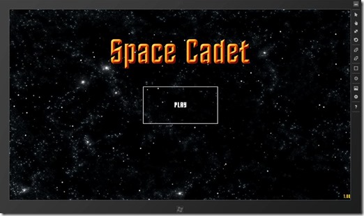
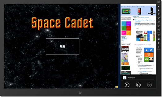
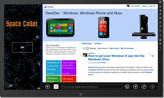
You will notice that I am playing the game along side another application (IE 10) like some of my players will most likely do. The screen can be rendered in three different states based which are named fullscreen, filled or snapped mode. I want to point out that having your application support multiple screen sizes and Viewstates is a very important feature of all Metro Style Apps. If you haven't already read it definitely check out the Scaling to Different Screens post on the official Windows 8 Blog.
Since this is such an important topic broke out this topic into two posts. We will cover layout in this post and how to detect and scale for the different Viewstates here. In the interest of simplicity this post will concentrate on just getting the elements lined up in the fullscreen mode (the default for all Metro Style Apps). Let’s take a look at how we do that:
Inside of my default.html page we see that the title image, game version and play button are just standard html elements wrapped inside a <Div> tag I call divMenu.
 <div id="divMenu">
         <img id="imgMenu" src="/images/menutitle.png" />
         <div id="txtVersion"></div>
         <button id="btnStart">PLAY</button>
  <div>
All of our custom layout occurs in a css file called space.css we reference in our default.html like so:
 <!-- App references -->
 <link href="/css/default.css" rel="stylesheet">
 <link href="/css/space.css" rel="stylesheet"/>
 <script src="/js/default.js"></script>
 <script src="/js/sound.js"></script>
 <script src="/js/ship.js"></script>
 <script src="/js/starField.js"></script>
Thanks to CSS3 Web Fonts we can easily assign different type faces to our screen elements. For my game I downloaded the Final Frontier Old Style font a royalty free font available off the web. I then tell both the version text and button text to use this font. Each of the elements I assign the maximum width and height I would like along with the text font size. imgMenu is also told to be aligned 120px down from the top of the screen.
 @font-face {
     font-family: 'Final Frontier Old Style';
     src: url( '/fonts/finalold.ttf');
 }

 #imgMenu {
     position:absolute;
     max-width: 555px;
     max-height: 118px;
     top: 120px;
 }

 #txtVersion {
     position:absolute;
     bottom:0;
     right:0;
     font-family: 'Final Frontier Old Style';
     font-size: 20px;
     color: #ffd800;
 }

 #btnStart {
     position:absolute;
     width: 300px;
     height: 150px;
     font-family: 'Final Frontier Old Style';
     font-size: 30px;
     z-index: 100;
 }
Remembering that Windows 8 devices come in all different shapes and sizes I programmatically set the menu elements up on the center of the screen at runtime. This happens in the showMenu function inside my default.js file. I calculate the exact center of the screen and then set the x and y coordinates of my elements like you see below.
 //Set Up Menu Screen UI Elements
 function showMenu(event) {
     menuEnabled = true;

     txtPlayerName.style.visibility = "hidden";
     txtScore.style.visibility = "hidden";
     imgPlayer.style.visibility = "hidden";
     imgMenu.style.visibility = "visible";
     btnStart.style.visibility = "visible";
     txtVersion.innerHTML = GAME_VERSION;
     txtVersion.style.visibility = "visible";
     txtLevel.style.visibility = "hidden";


     var menuX, btnX, btnY;
     menuX = (SCREEN_WIDTH - imgMenu.width) / 2;
     btnX = (SCREEN_WIDTH - btnStart.clientWidth) / 2;
     btnY = (SCREEN_HEIGHT - btnStart.clientHeight) / 2;

     imgMenu.style.posLeft = menuX;
     btnStart.style.posLeft = btnX;
     btnStart.style.posTop = btnY;

     musicGame.pause();
     musicMenu.play();

 }
Game Screen
The Game Screen displays the player’s score, level, name and picture. This is also where we are declaring our HTML5 Canvas tag. Similarly to the Main Menu screen it can appear in all three Viewstates but we will focus on the Fullscreen mode for this post.
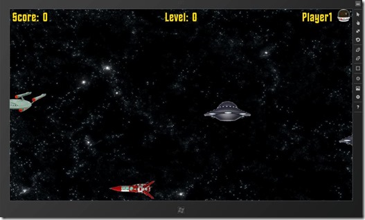
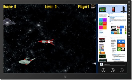
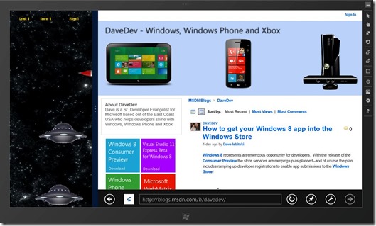
All of these elements (except for the player image) are standard <div> tags wrapped inside a main <div> tag we call divGame inside of our space.css file.
 <div id="divGame">
         <div id="txtScore">Score: 0</div>
         <div id="txtLevel">Level: 0</div>
         <div id="divPlayer">
              <div id="txtPlayerName">Player1</div>
              <img id="imgPlayer" src="/images/helmet.png" />
          </div>
 <div>

 <div id="txtNewLevel"></div>

 <div id="divRoot" data-win-control="WinJS.UI.ViewBox">
     <canvas id="canvas" ></canvas>
 </div>
Just like the Main Menu we assign the custom Font to our text elements and position them on screen using floats.
 @font-face {
     font-family: 'Final Frontier Old Style';
     src: url( '/fonts/finalold.ttf');
 }

 #txtScore {
     font-family: 'Final Frontier Old Style';
     font-size: 50px;
     color: #ffd800;
     text-align: left;
     margin-left: 10px;
 }

 #txtPlayerName {
     font-family: 'Final Frontier Old Style';
     font-size: 50px;
     color: #ffd800;
     float:left;
     margin-right:20px;
 }

 #txtLevel {
     font-family: 'Final Frontier Old Style';
     font-size: 50px;
     color: #ffd800;
     position:absolute;
     top: 0;
 }

 #divPlayer {
     position: absolute;
     top: 0;
     right: 0;
     text-align:right;
 }

 #imgPlayer {
     max-width: 100px;
     max-height: 50px;
     float:left;
     margin-right:10px;
 }

 #txtNewLevel {
     position:absolute;
     font-family: 'Final Frontier Old Style';
     font-size: 100px;
     visibility: hidden;
 }
Finally we set up all of our on screen elements through the startGame function once the player clicks on the Play button to begin.
 //Set up Game Screen UI Elements
  function startGame(event) {
      txtPlayerName.style.visibility="visible";
      txtScore.style.visibility="visible";
      imgPlayer.style.visibility = "visible";
      imgMenu.style.visibility = "hidden";
      btnStart.style.visibility = "hidden";
      txtVersion.style.visibility = "hidden";
      txtLevel.style.visibility = "visible";

      var lvlX = (SCREEN_WIDTH - txtLevel.clientWidth) / 2;
      txtLevel.style.posLeft = lvlX;

      musicMenu.pause();
      musicGame.play();

      menuEnabled = false;

  }
Game Coordinate System
The last piece we need to set up is a coordinate system for our game. This includes the size of each ship, the area of the screen they can be drawn on before appearing on the opposite side, and then the current width and height of the screen. The screen width and height will determine how big our Canvas element needs to be rendered at as well.
I use four different variables inside the default.js file for this with the ships width and height remaining constant (I created all of my ship images to be this size) and then the screen width and height to change based on the resolution of our current Windows 8 device.
 var SCREEN_WIDTH = 1366;
 var SCREEN_HEIGHT = 768;
 var SHIP_WIDTH = 190;
 var SHIP_HEIGHT = 100;
We then calculate what the size of our canvas should be during our initialize function:
 //Init Canvas
 canvas = document.getElementById("canvas");
 ctx = canvas.getContext("2d");

 //Set up Coordinates for Screen Size
 //Adjust for different screen sizes
 canvas.width = window.innerWidth;
 canvas.height = window.innerHeight;
 SCREEN_HEIGHT = canvas.height;
 SCREEN_WIDTH = canvas.width;

 //Set boundries to be one ship size
 MAX_X = canvas.width - (SHIP_WIDTH + 20);
 MAX_Y = canvas.height - (SHIP_HEIGHT + 50);
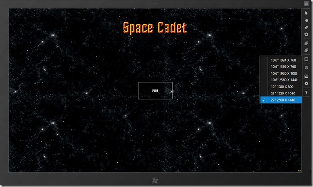
By setting up the coordinate system at run time we can support multiple resolutions and even dynamically scale to fit higher resolutions if the user changes them (for example docking a tablet and attaching a bigger monitor). Here is an example of our game running on a 1366x768 tablet size screen as well as a 2560x1440 which you would typically see in a 27” inch all in one pc.
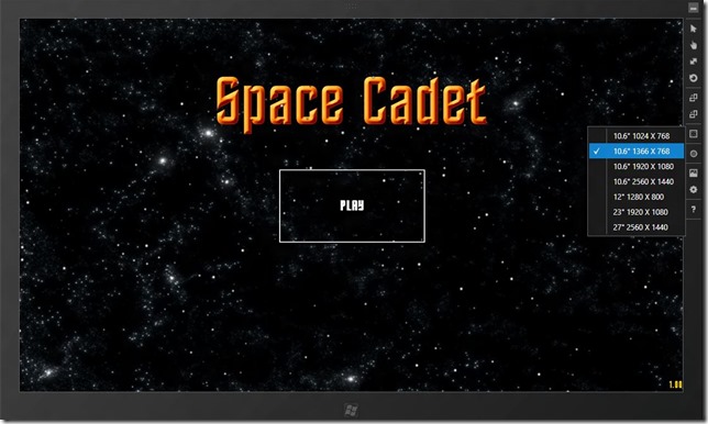
All of the elements align directly center with the version showing up in the bottom right. I also have the ability to scale up the image and button size when in a different resolution. I am not doing that in the screen shot above but will show you how using CSS3 transforms in my next post covering Viewstates.
Conclusion
I hope this post has given you an idea of how easy it is to lay out interface elements in your Metro Style App using CSS3, HTML5 and JavaScript. If you are currently working on a Windows 8 app and want to get into the Windows Store I would love to hear about it!
You may also want to check out my previous Windows 8 Metro Style Development Tips:
- Accessing the Accelerometer in a Windows 8 Metro Style App using HTML and JavaScript
- Accessing the Camera in a Windows 8 Metro Style App using HTML and JavaScript
- Using KnockoutJS in Windows 8 Metro Style Apps
- Illegal characters in path when deploying a Metro Style App
- Playing Music and Sound Effects in a Windows 8 Metro Style App using HTML and JavaScript
- Connecting to WCF RIA Services in a Windows 8 Metro Style App using Upshot.js and Knockout.js
- Help! Visual Studio 11 Beta Dark Theme incorrectly using White Background
- Adding Touch support to a Windows 8 Metro Style App using HTML and JavaScript

