Windows 8 Introduction to XAML - Part 3
Hello All,
Welcome to Windows 8, Introduction to XAML - Part 3. In the last 2 parts we covered the Blank Application, Layout, Controls, Content and some code behind. In this part I will delve a little deeper into Styles and Resources.
Styles
So what are Styles? Styles are a set of properties and attributes that are applied to your different elements. Style is an inherited value from the FrameworkElement Class, and since all elements inherit from FrameworkElement, all elements therefor have styles.
Create a new Style
So lets go ahead and add a Style named MyButton to our MainPage.xaml. Lets change the font of all of our buttons to Ahoroni. So to define a Style, you must add it to the resources within the page, like below.
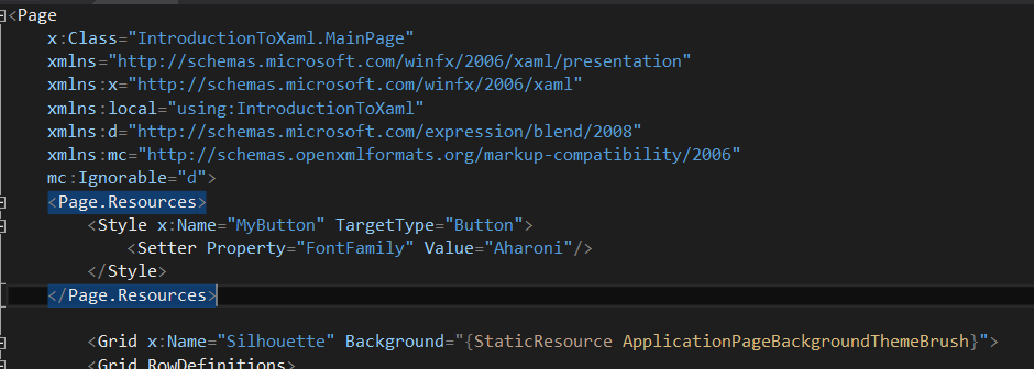
Every style must have a name and a target type defined for it. In our case, we are targeting Button elements, and the name is so that elements may reference it later. To change attributes on the button, you have access to all of the same attributes you normally do when defining a button element, so to change the font family, you define a Setter, define the property you would like to set and then the value to use. In our case, Aharoni. We will change the appearance of our button completely by the end of this.
The page resources is nothing more than an inline resource dictionary. You should be able to take anything defined within a page's resources and place it into a Resource Dictionary, so lets go ahead and give that a try.
Create a new Resource Dictionary
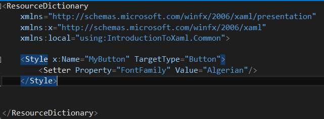
Add->New Item->Resource Dictionary. Name this dictionary IntroductionStyles.xaml. Lets take the same exact code from our MainPage's resource (above) and copy it into the new resource dictionary. Lets just change the font family to Algerian though, so that we can see a visual difference.
Ah, you can not see the difference yet. Well, just like StandardStyles.xaml we need to merge the dictionary into the Application's Resources so that it can be used.
Making the Dictionary Available
So go into App.xaml and add a new ResourceDictionary within the MergedDictionaries section just like for StandardStyles.xaml. Merged Dictionaries is where you provide relative source locations for other dictionaries. It merges them all together. Alternatively you can define styles within the Resource Dictionary section as normal. It is also important to note that within All Resources and All Resource Dictionaries, you can create a Merged Dictionaries section. This could be useful for things such as defining entire Themes.
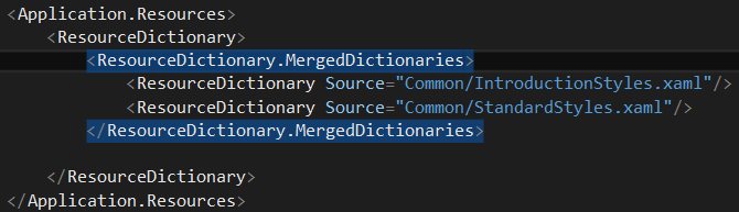
Now within our Application we have access to any resources defined in IntroductionStyles as well as StandardStyles. I would like to note that Source is the folder path relative to the Project root. So my IntroductionStyles and StandardStyles exist within a Project Folder I have named Common.
Referencing Our Style
Now that the dictionary holding our style has been merged into the application wide resource dictionary, we can now reference our style by name, "MyButton". So lets go ahead and locate every button in our application and set its style to the StaticResource MyButton.

This says "Reference the Resource that is statically available by the key or name "MyButton". But its not working? Our font is still Aharoni?!?!?!?
Style Precedence
Notice that in our local page resource dictionary we have the style named MyButton as well as in the MergedDictionaries a button style by the name MyButton. Behind the scenes, what is happening is the framework is looking for the key defined most local to your button. Once it finds a resource, it stops searching and references that XAML. So, what has happened here is the framework located the style defined in our MainPage.Resources and is using that. So lets change the name of our Style defined in MainPage and call it "MyButtonTwo". Notice how both buttons immediately have their font changed to Algerian :). Now go ahead and change the Style name back from "MyButtonTwo" to "MyButton" as we will be replacing the style in our dictionary with the new one at the end of the tutorial.
Resource Summary
Resources are the way to go for changing the look and feel of your application, pages etc on a large scale. It is far easier to change the style once and it change globally than define it in each element's XAML. This also is the starting point for defining and changing themes on the fly.
Styling Continued
Now we are going to change the way the button looks entirely. It is important to note that this can also be done from Blend. An example workflow might consist of I define a lame button style like above as a placeholder while a designer creates the actual style in Blend, and I grab the Style XAML and replace my placeholder with it. We are going to do everything from Visual Studio, though, so you have a better idea of what is happening behind the scenes.
Gradient Background
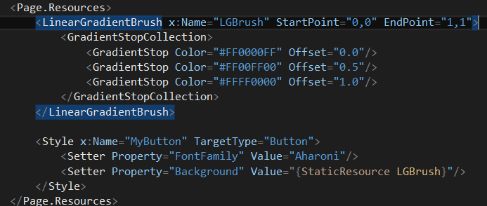
Lets start by changing the background of our Button. A background is a Brush and there are many types of brushes available to us from ImageBrush to GradientBrushes. I will demonstrate with the LinearGradientBrush. If I am coding up a style, I like to do it locally in the MainPage.xaml first and then move it, because I find that I like the instant feedback. Lets define the Brush to go from blue to green to red diagonally across buttons.
This should show in your buttons that are referencing this style using the StaticResource keywords like so:
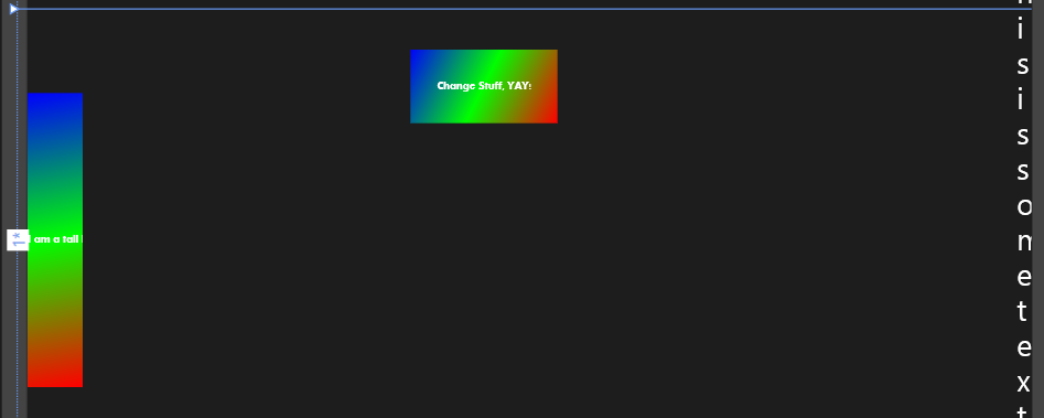
First lets talk about the important aspect here, starting with the Brush. The Brush's name is LGBrush, which as you can see in the setter property for the Background of the Button Style is used. This means that the XAML from the Brush is inserted into the value of the Background for the button. The brush is defined like most computer screens in graphics, with the top left corner is 0,0 and the bottom right is 1,1. This means the gradient's will flow from top left to bottom right since the startpoint is 0,0 and the endpoint is 1,1. You can change these points to be whatever you like. A gradient stop defines a color centered on the offset that fades into the other colors surrounding it. The offset's can be thought of as a percent. 0 is 0% from the start point, .5 is 50% from the start point and 1.0% is all the way across.
Lets talk about the Color defined here. Colors are defined as contiguous bytes in the format of A,R,G,B. where A is Alpha (transparency/opacity), and the rest is red, green, blue. The important thing to note is that for some reason, you cannot define Color separately as numerical values for each, an example would be <Color A="255" B="0" R="0" G="0"/> This results in a compilation error and is most likely a bug, though I have not verified, it just doesn't work, so for now just define your colors as above in the more confusing format.
Changing the Content Template
Most of the interesting action happens in the Content Template. Most Control and Content elements have these templates. This is where you can override anything visual about the button, you can insert images, overlay items and do any sort of interesting thing you could imagine, even add Animations. I will just demonstrate some boring normal things so you can get an idea of what you can do and how to go about doing it. Remember you can use images from say Photoshop as a brush as well. For now create a new Brush, whatever you want and call it ButtonBrush.
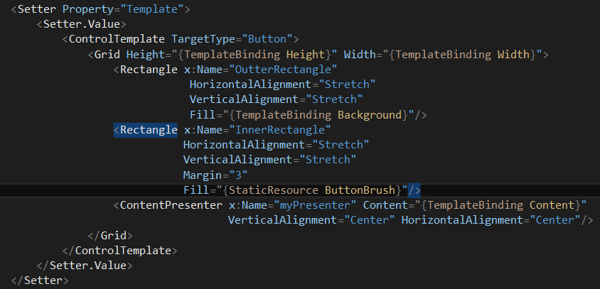
This is a basic template override. The template can only have a single item in it's visual tree, however if that item, say a grid can have multiple items, then that is fine. So I add a grid purely for the work around to add multiple items to the template, however you could checker it or whatever you want. The important things to note in this is that you treat the grid just like any normal grid, except you now have access to a few more things. You have TemplateBinding. This binds the value of the property to something previously set in the element. So if you take a look at our grid height, we do {TemplateBinding Height}. This means the height of the grid is now the height of the Button. Same with Background. This makes it easier to change the size of things or the colors by simply calling Button.Height = 5 or what have you.
The other new important thing to note is this ContentPresenter. All Controls and Content elements should have this and it essentially presents that element's content, for a button it is text.
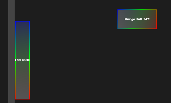
Your button should look something like below depending on how you defined your "ButtonBrush"
Adding Some Interactivity
Interactivity is an interesting area. This is where you can define what happens when somebody mouses over your button, or clicks it. Interactivity is done through the VisualStateManager as well as Animations (which will be covered in more depth in the next part). The important thing to remember here is that when you define a new VisualState, it must follow a naming convention for it to work. Names can be found here: https://msdn.microsoft.com/en-us/library/cc278069(v=vs.95).aspx Since Windows 8 has come "MouseOver" has become "PointerOver", if you use "MouseOver", it will not work. Below is the code for how to add interactivity to your button. I will describe each part of it following.
  <VisualStateManager.VisualStateGroups>
 <VisualStateGroup x:Name="CommonStates">
 <VisualState x:Name="Normal"/>
 <VisualState x:Name="PointerOver">
 <Storyboard Duration="0:00:1">
 <ColorAnimation Storyboard.TargetName="InnerRectangle" Storyboard.TargetProperty="(Rectangle.Fill).(GradientBrush.GradientStops)[0].(GradientStop.Color)" To="#FF00FF00" EnableDependentAnimation="True"/>
 <ColorAnimation Storyboard.TargetName="InnerRectangle" Storyboard.TargetProperty="(Rectangle.Fill).(GradientBrush.GradientStops)[1].(GradientStop.Color)" To="#FF33FFFF" EnableDependentAnimation="True"/>
 </Storyboard>
 </VisualState>
 <VisualState x:Name="Pressed">
 <Storyboard Duration="0:00:5">
 <ColorAnimation Storyboard.TargetName="InnerRectangle" Storyboard.TargetProperty="(Rectangle.Fill).(GradientBrush.GradientStops)[0].(GradientStop.Color)" To="#FFFFFFFF" EnableDependentAnimation="True"/>
 <ColorAnimation Storyboard.TargetName="InnerRectangle" Storyboard.TargetProperty="(Rectangle.Fill).(GradientBrush.GradientStops)[1].(GradientStop.Color)" To="#FF11C2B1" EnableDependentAnimation="True"/>
 </Storyboard>
 </VisualState>
 <VisualState x:Name="Disabled"/>
 </VisualStateGroup>
 </VisualStateManager.VisualStateGroups>
Note that this code goes inside your ControlTemplate within the grid that holds the elements it is Managing the Visual State of. So lets talk about what we are really doing here. We are just modifying the already existing VisualStateManager and basically hooking in animations based on events, very similar to how you respond to events in code behind on a button click or hover over, we are just defining it within a style in xaml from events available within the scope of our single button.
VisualStateGroups are groupings of Visual States. From the website reference above, you can see that for a standard button there are 2 state groups each with its own states. I have just altered the actions from a single state group. Notice that the x:Name property in each of my VisualState elements matches exactly with one from the referenced site. If it does not match, it will not work, except of course for PointerOver. You can end the element at the definition of the Visual State if you like, however that does not do anything interesting. To do interesting things, you must create a Storyboard for Animations. You can place as many animations within this storyboard as you like and have each of their durations last as long as you like and do all sorts of different things that we will talk about in the next part. The important thing for the context of this part is the Target and the EnableDependentAnimation properties.
Targets
Notice how I use the names of the elements I defined within the Button Style. This is how you access those elements to modify them as targets and properties. I chose to modify each of the gradient stops to demonstrate that you can modify properties of the property you wish to modify as opposed to redefining the entire property itself. Since Fill is set to a GradientBrush it has GradientStops, which can be changed. Note that attempting to animate Fill to a Yellow Brush does not work and issues a run-time error because LinearGradientBrush and ColorBrush are not compatible types. For these animations and transitions you must keep the type compatible. So I would urge you to think about alternate ways, perhaps just changing all the gradient stops to yellow, or maybe in your grid, create a yellow rectangle with opacity set to 0 and do a double animation on both rectangles for the opacity property to give the same fading effect. You can achieve many different effects utilizing this all dependent upon your creativity to mix and match.
EnableDependentAnimation
First I need to state that you should set this to true if you want your effects to work and your triggers to catch. So at the writing of this article the documentation on this thing is a bit lacking: https://msdn.microsoft.com/en-us/library/windows/apps/windows.ui.xaml.media.animation.coloranimation.enabledependentanimation.aspx It looks to be new, however I did stumble across an article that seems to make a lot of sense regarding it, which can be found here: https://blog.jerrynixon.com/2012/06/windows-8-animated-pie-slice.html The article essentially concludes that the EnableDependentAnimationProperty allows you to animate custom dependency Properties, which the GradientStops on LinearGradientBrush would be. To test his hypothesis, I created a simple button with a simple rectangle filled with a simple color and animated the color without the EnableDependentAnimation property set and it worked, which means that the magic is that this is allowing us to modify custom properties, which is really cool! This opens some interesting (and easier) implementations of complex custom controls.
Refactor your Style
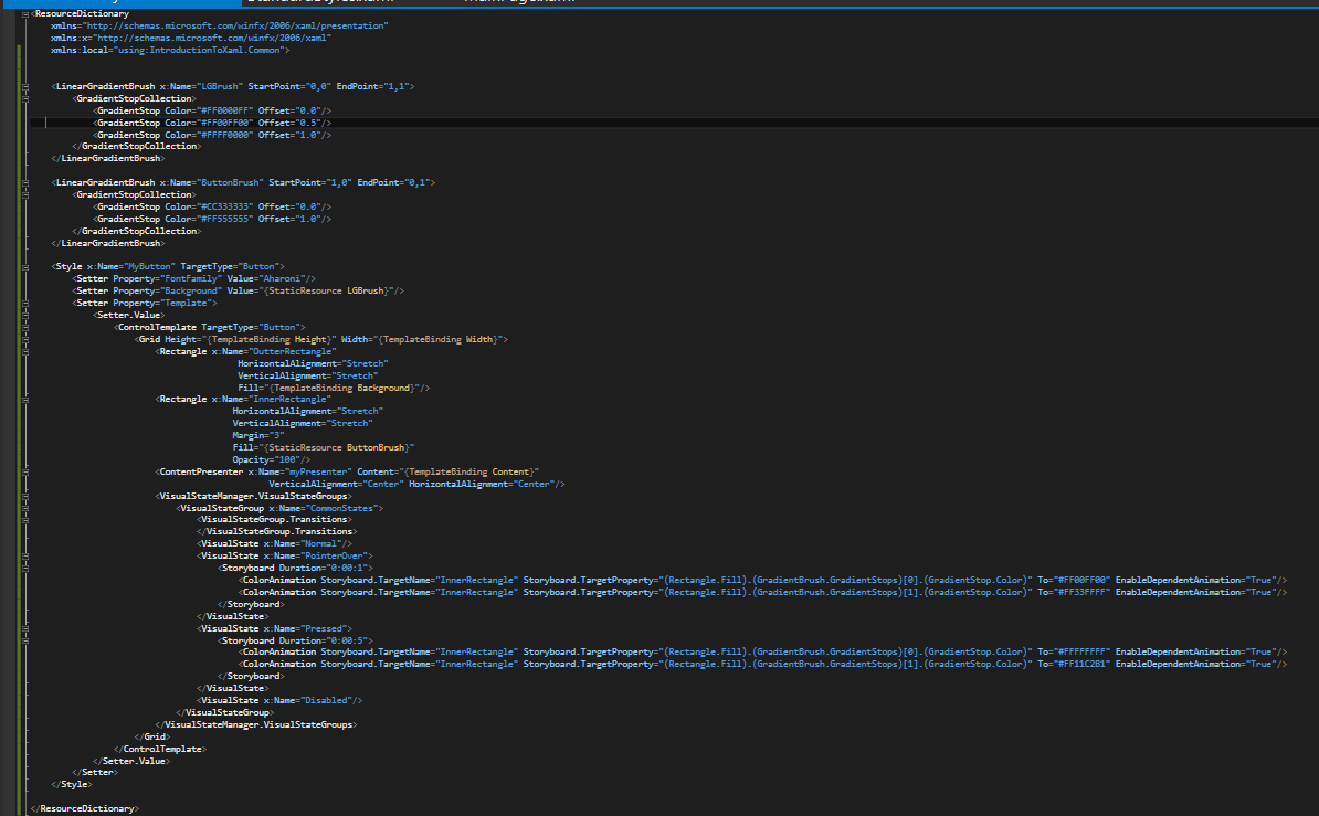
So now that you are done, you should go into IntroductionStyles.xaml and delete the "MyButton" style that exists there already. Go back into MainPage.xaml. Highlight everything between the Page.Resources element. This should be both LinearGradients and your MyButton Style. Cut this code and then navigate back to IntroductionStyles.xaml and paste it between the ResourceDictionary Element tags (where you had just deleted MyButton from earlier). Navigate back into MainPage.xaml and delete the Page.Resources element as it is no longer needed. Your code should look like below (don't hurt your eyes too much, I'll paste the code in a way you can copy at the end):
IntroductionStyles.xaml
MainPage.xaml
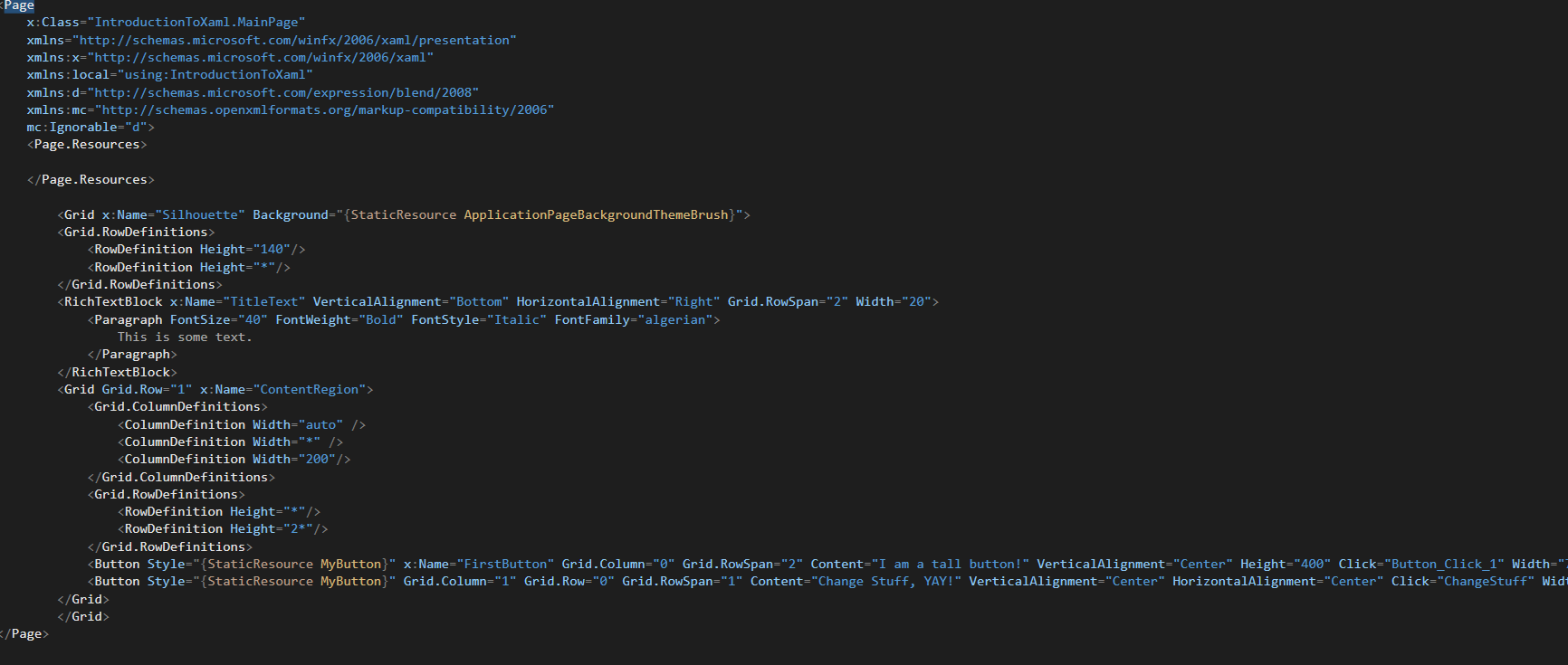
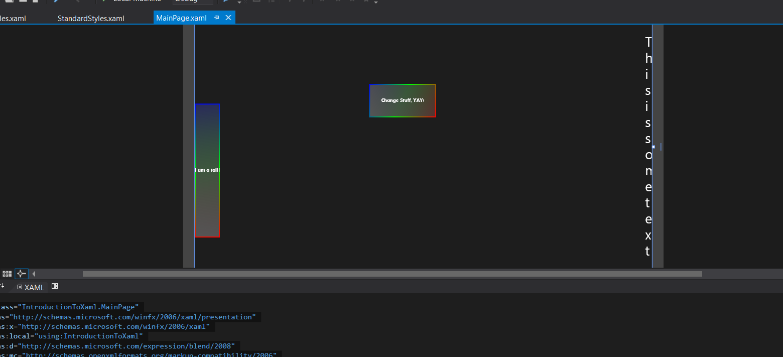
Your design view for MainPage.xaml should look like below:
Summary
So we have covered in more depth about Resources. You can move any styles, brushes or other xaml resources into resource dictionaries. We have covered the scope of these resources as well as how a control utilizing a resource looks for one starting with the closest scope and working itself up the tree and then defaulting to the regular style if not found. We have also covered how to completely restyle your buttons using backgrounds, content templates, the visual state manager and ensuring it fits to the predetermined size of the button as well as how to modify those attributes and a little bit about animations and some neat new features with winRT's EnableDependentAnimation feature. Whew, I hope you got all of that :).
Enjoy, and next Part will be the final part of this XAML series and it will be more in depth on Animation :).
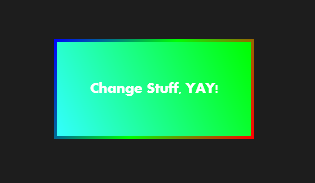
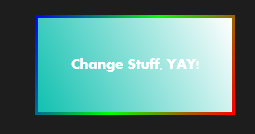
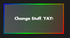
Here are some screen shots of what your buttons should look like if defined with the same gradients I have. Note they should transition slowly to these states.
When your mouse is hovering over
When you click and hold
When sitting around not being interacted with. (going back to this state will be fast)
MainPage.xaml
 <Page
 x:Class="IntroductionToXaml.MainPage"
 xmlns="https://schemas.microsoft.com/winfx/2006/xaml/presentation"
 xmlns:x="https://schemas.microsoft.com/winfx/2006/xaml"
 xmlns:local="using:IntroductionToXaml"
 xmlns:d="https://schemas.microsoft.com/expression/blend/2008"
 xmlns:mc="https://schemas.openxmlformats.org/markup-compatibility/2006"
 mc:Ignorable="d">
 <Page.Resources>

 </Page.Resources>

 <Grid x:Name="Silhouette" Background="{StaticResource ApplicationPageBackgroundThemeBrush}">
 <Grid.RowDefinitions>
 <RowDefinition Height="140"/>
 <RowDefinition Height="*"/>
 </Grid.RowDefinitions>
 <RichTextBlock x:Name="TitleText" VerticalAlignment="Bottom" HorizontalAlignment="Right" Grid.RowSpan="2" Width="20">
 <Paragraph FontSize="40" FontWeight="Bold" FontStyle="Italic" FontFamily="algerian">
 This is some text.
 </Paragraph>
 </RichTextBlock>
 <Grid Grid.Row="1" x:Name="ContentRegion">
 <Grid.ColumnDefinitions>
 <ColumnDefinition Width="auto" />
 <ColumnDefinition Width="*" />
 <ColumnDefinition Width="200"/>
 </Grid.ColumnDefinitions>
 <Grid.RowDefinitions>
 <RowDefinition Height="*"/>
 <RowDefinition Height="2*"/>
 </Grid.RowDefinitions>
 <Button Style="{StaticResource MyButton}" x:Name="FirstButton" Grid.Column="0" Grid.RowSpan="2" Content="I am a tall button!" VerticalAlignment="Center" Height="400" Click="Button_Click_1" Width="75"/>
 <Button Style="{StaticResource MyButton}" Grid.Column="1" Grid.Row="0" Grid.RowSpan="1" Content="Change Stuff, YAY!" VerticalAlignment="Center" HorizontalAlignment="Center" Click="ChangeStuff" Width="200" Height="100" />
 </Grid>
 </Grid>
 </Page>
IntroductionStyles.xaml
 <ResourceDictionary
 xmlns="https://schemas.microsoft.com/winfx/2006/xaml/presentation"
 xmlns:x="https://schemas.microsoft.com/winfx/2006/xaml"
 xmlns:local="using:IntroductionToXaml.Common">


 <LinearGradientBrush x:Name="LGBrush" StartPoint="0,0" EndPoint="1,1">
 <GradientStopCollection>
 <GradientStop Color="#FF0000FF" Offset="0.0"/>
 <GradientStop Color="#FF00FF00" Offset="0.5"/>
 <GradientStop Color="#FFFF0000" Offset="1.0"/>
 </GradientStopCollection>
 </LinearGradientBrush>

 <LinearGradientBrush x:Name="ButtonBrush" StartPoint="1,0" EndPoint="0,1">
 <GradientStopCollection>
 <GradientStop Color="#CC333333" Offset="0.0"/>
 <GradientStop Color="#FF555555" Offset="1.0"/>
 </GradientStopCollection>
 </LinearGradientBrush>

 <Style x:Name="MyButton" TargetType="Button">
 <Setter Property="FontFamily" Value="Aharoni"/>
 <Setter Property="Background" Value="{StaticResource LGBrush}"/>
 <Setter Property="Template">
 <Setter.Value>
 <ControlTemplate TargetType="Button">
 <Grid Height="{TemplateBinding Height}" Width="{TemplateBinding Width}">
 <Rectangle x:Name="OutterRectangle"
 HorizontalAlignment="Stretch"
 VerticalAlignment="Stretch"
 Fill="{TemplateBinding Background}"/>
 <Rectangle x:Name="InnerRectangle"
 HorizontalAlignment="Stretch"
 VerticalAlignment="Stretch"
 Margin="3"
 Fill="{StaticResource ButtonBrush}"
 Opacity="100"/>
 <ContentPresenter x:Name="myPresenter" Content="{TemplateBinding Content}"
 VerticalAlignment="Center" HorizontalAlignment="Center"/>
 <VisualStateManager.VisualStateGroups>
 <VisualStateGroup x:Name="CommonStates">
 <VisualStateGroup.Transitions>
 </VisualStateGroup.Transitions>
 <VisualState x:Name="Normal"/>
 <VisualState x:Name="PointerOver">
 <Storyboard Duration="0:00:1">
 <ColorAnimation Storyboard.TargetName="InnerRectangle" Storyboard.TargetProperty="(Rectangle.Fill).(GradientBrush.GradientStops)[0].(GradientStop.Color)" To="#FF00FF00" EnableDependentAnimation="True"/>
 <ColorAnimation Storyboard.TargetName="InnerRectangle" Storyboard.TargetProperty="(Rectangle.Fill).(GradientBrush.GradientStops)[1].(GradientStop.Color)" To="#FF33FFFF" EnableDependentAnimation="True"/>
 </Storyboard>
 </VisualState>
 <VisualState x:Name="Pressed">
 <Storyboard Duration="0:00:5">
 <ColorAnimation Storyboard.TargetName="InnerRectangle" Storyboard.TargetProperty="(Rectangle.Fill).(GradientBrush.GradientStops)[0].(GradientStop.Color)" To="#FFFFFFFF" EnableDependentAnimation="True"/>
 <ColorAnimation Storyboard.TargetName="InnerRectangle" Storyboard.TargetProperty="(Rectangle.Fill).(GradientBrush.GradientStops)[1].(GradientStop.Color)" To="#FF11C2B1" EnableDependentAnimation="True"/>
 </Storyboard>
 </VisualState>
 <VisualState x:Name="Disabled"/>
 </VisualStateGroup>
 </VisualStateManager.VisualStateGroups>
 </Grid>
 </ControlTemplate>
 </Setter.Value>
 </Setter>
 </Style>

 </ResourceDictionary>