Windows 8 Introduction to XAML - Part 2
Hi All,
To start, lets recap what was covered in Part 1. In Part 1, we discussed what you get out of the box in the Blank App Template from a XAML standpoint. This included MainPage.xaml, App.xaml, and StandardStyles.xaml as well as how they interact together through extensions. In this part of the series I will be covering layout, content, controls and some of their properties and attributes. So start by loading up the Blank App with the single button from the previous part, and lets start there. Be sure to save your progress as we will be using this App throughout the entirety of the series.
Layout - Info
I define a layout control as ANY XAML element that impacts where content or control elements are physically located on the screen. Almost all layout controls inherit from the Panel Class, which inherits from UI Element and from FrameworkElement. That's right, XAML elements are actually objects defined in code. As most inherit from the same base classes there are many common features about them. Important ones for our purposes include things like background, inputs, bindings, children, sizing and things of that nature. A full list can be found here: https://msdn.microsoft.com/en-us/library/windows/apps/br227511.aspx
If you are brand new to layout, I would recommend learning a bit about UX, which is out of the scope of this conversation, you can find some Windows 8 specific UX considerations here: https://msdn.microsoft.com/en-us/library/windows/apps/hh465349.aspx It is usually best to think about what layout you want first and make most of your UX considerations before beginning to do a layout, or you will likely face a significant amount of re-work. So now lets take a look at some actual layout elements. The elements that I personally use the most are Grid, Stack Panel, Scroll Viewer and the List Box.
Layout - The Grid
The Grid is probably my favorite. I feel it is the most versatile and dynamic of all the layout elements. It is exactly like it sounds, a grid, you can break it into as many columns and rows as you want and have elements span across however many you like. Brilliant for anything that has obvious rectangular or square shapes to it, which almost every app I have seen has. The Grid is so wonderful, it even came with your blank app, so we will start with that. Lets start by creating what I like to refer to as "the Windows 8 app silhouette". Most of the sample apps I have seen have a title region approximately 140 pixels in height and the rest of the area dedicated to content. So that is a two row, single column Grid. You define new rows like below:
  <Grid x:Name="Silhouette" Background="{StaticResource ApplicationPageBackgroundThemeBrush}">
 <Grid.RowDefinitions>
 <RowDefinition Height="140"/>
 <RowDefinition Height="*"/>
 </Grid.RowDefinitions>
 <Button Content="BUTTON" HorizontalAlignment="Center" Width="150" Height="100" Style="{StaticResource TextButtonStyle}"/>
 </Grid>
Doing this, you will notice that your button is immediately put into the first row centered. This is because any elements under a grid fall into the first cell unless otherwise specified. For now lets just delete our button (we can add it back in later) and focus on how we want to layout this page. We will again use my favorite layout element, Grid, to subdivide the content region, also demonstrating the hierarchical nature of XAML elements. Your entire page should look like below:
 <Page
 x:Class="IntroductionToXaml.MainPage"
 xmlns="https://schemas.microsoft.com/winfx/2006/xaml/presentation"
 xmlns:x="https://schemas.microsoft.com/winfx/2006/xaml"
 xmlns:local="using:IntroductionToXaml"
 xmlns:d="https://schemas.microsoft.com/expression/blend/2008"
 xmlns:mc="https://schemas.openxmlformats.org/markup-compatibility/2006"
 mc:Ignorable="d">

 <Grid x:Name="Silhouette" Background="{StaticResource ApplicationPageBackgroundThemeBrush}">
 <Grid.RowDefinitions>
 <RowDefinition Height="140"/>
 <RowDefinition Height="*"/>
 </Grid.RowDefinitions>
 <Grid Grid.Row="1">
 <Grid.ColumnDefinitions>
 <ColumnDefinition Width="auto" />
 <ColumnDefinition Width="*" />
 <ColumnDefinition Width="200"/>
 </Grid.ColumnDefinitions>
 <Grid.RowDefinitions>
 <RowDefinition Height="*"/>
 <RowDefinition Height="2*" />
 </Grid.RowDefinitions>
 </Grid>
 </Grid>
 </Page>
So as you can see, you can nest Grids within Grids. Something many of you might be asking about is, "I have only 2 columns in my design view" or "what is that star thing" or perhaps "what is auto?". As you can see, you can define the width or height as a pure defined pixel size or let the layout engine do some work for you utilizing the * and auto values. * is the easiest way to fit to your screen. it occupies as much space as is available to it, so if you have many different sized screens, this is a good way to ensure content expands across all of them in a predictable manner. Auto fits to what is inside the cell, so if you had a 140 pixel wide button, the cell defined as auto would be 140 pixels in width. What helps me with this is, I think of * as the optimist, always going for the most it can, while auto is a pessimist who just waits until something comes to fill it. To explore some other features of the Grid, check out MSDN: https://msdn.microsoft.com/en-us/library/system.windows.controls.grid.aspx or better put your cursor right next to grid, inside the bracket and push space and let intellisense offer up some things you can do. You can also go inside the element tags and type <Grid. and let it show you other great things you can do with the Grid.
Adding A Control
So what is a control element? A control element is essentially any element that is designed to affect and control the application on some sort of level. Some common control elements that I use on a frequent basis are the button, the checkbox, and the slider.
Ok, so lets add that button back in to demonstrate the other important aspect of the grid element and fitting content and controls into it, and that is the span Abilities. I want you to try this before cheating and grabbing my code. See if you can put the Button in the content area with a height of 400 pixels, centered vertically spanning both rows explicitly placed in the first column (remember they are zero indexed). So hopefully you ended up with this:
  <Grid x:Name="Silhouette" Background="{StaticResource ApplicationPageBackgroundThemeBrush}">
 <Grid.RowDefinitions>
 <RowDefinition Height="140"/>
 <RowDefinition Height="*"/>
 </Grid.RowDefinitions>
 <Grid Grid.Row="1" x:Name="ContentRegion">
 <Grid.ColumnDefinitions>
 <ColumnDefinition Width="auto" />
 <ColumnDefinition Width="*" />
 <ColumnDefinition Width="200"/>
 </Grid.ColumnDefinitions>
 <Grid.RowDefinitions>
 <RowDefinition Height="*"/>
 <RowDefinition Height="2*" />
 </Grid.RowDefinitions>
 <Button Grid.Column="0" Grid.RowSpan="2" Content="I am a tall button!" VerticalAlignment="Center" Height="400"/>
 </Grid>
 </Grid>
So now we are going to actually do something with this element, as it is a control, we want it to some how affect our application. So lets make it turn the background green. So we need to hook into the click event. So modify your button to be like below:
<Button Grid.Column="0" Grid.RowSpan="2" Content="I am a tall button!" VerticalAlignment="Center" Height="400" Click="Button_Click_1"/>
your project should not built when you push f6...
The Code Behind File
It is extremely important to note what I am going to show here does not follow MVVM for the sake of staying within scope of this article. I would highly recommend, however, that you look into it further: https://msdn.microsoft.com/en-us/library/gg405484(v=PandP.40).aspx it is important to note that implementing MVVM in Windows 8 is a bit different than in Silverlight and WPF due to a few key changes, and I may write an article on that later.
If you try to build now, you will receive a compilation error, this is because you need to hook your Button up to the code behind file as the compiler is looking for a function in that file with the same name as what you defined within the quotes of your Click, so "Button_Click_1". So go into your Solution Explorer and click the triangle next to MainPage.xaml to reveal MainPage.xaml.cs. This is the code behind file for MainPage.xaml. This is where your objects, your logic and your event handlers for the MainPage UI reside. You can think of MainPage.xaml and MainPage.xaml.cs as a single unit that makes up the MainPage. So lets get on to creating our click handler, the completed function (that changes the background to green).
  private void Button_Click_1(object sender, RoutedEventArgs e)
 {
 this.Silhouette.Background = new SolidColorBrush(Windows.UI.Color.FromArgb(255, 0, 255, 0));
 }
So lets talk about this a little bit. The button click event handler has to follow a certain stub pattern. This pattern is that it MUST return void, and it MUST accept object and RoutedEventArgs in that order as parameters. This.Silhouette...That is interesting, isn't that the name of the first grid we had defined? It is showing up as a valid object in the code behind? It is important to remember that ALL XAML ELEMENTS are actual code objects. x:Name property allows you to define a name for that particular instance of the object to reference again within code and make alterations to it. It is also important to note that the XAML elements defined in your UI are available only within the scope of that unit(code behind and xaml file) unless made available through other means. You can again see all of the modifiable properties of a grid in the code. Here we are setting the background to a new SolidColorBrush. Background is of type brush, so it must be set to something that inherits from Brush. There are many options, I just chose the simplest. Essentially we are creating a new Brush from alpha, red,green,blue with alpha non transparent, and green full.
Press f5 and click your button! You should notice the button changes the entire screen to green :). On your own, I want you to make the button alternate between the current brush and the green brush. This has demonstrated the tight coupling between the UI and the code behind file and how they interact together.
Content Elements
Content Elements are any element whose purpose is primarily for displaying consumable information. This can be images, text, web browser controls etc. Content Elements that I use the most are RichTextBlock, Image, Progress Ring, and Rectangles. Content elements from a Layout Perspective can be treated nearly the same as Control Elements. So I want you to make a Rich Text Block in the Title region, whose font size is 40, bold and Italic, on the right side of the screen aligned with the bottom of the title section spanning 2 rows and the font is "Algerian" and width of 20. Try your best before looking below for the solution.
  <RichTextBlock VerticalAlignment="Bottom" HorizontalAlignment="Right" Grid.RowSpan="2" Width="20">
 <Paragraph FontSize="40" FontWeight="Bold" FontStyle="Italic" FontFamily="algerian">
 This is some text.
 </Paragraph>
 </RichTextBlock>
Tying it all together
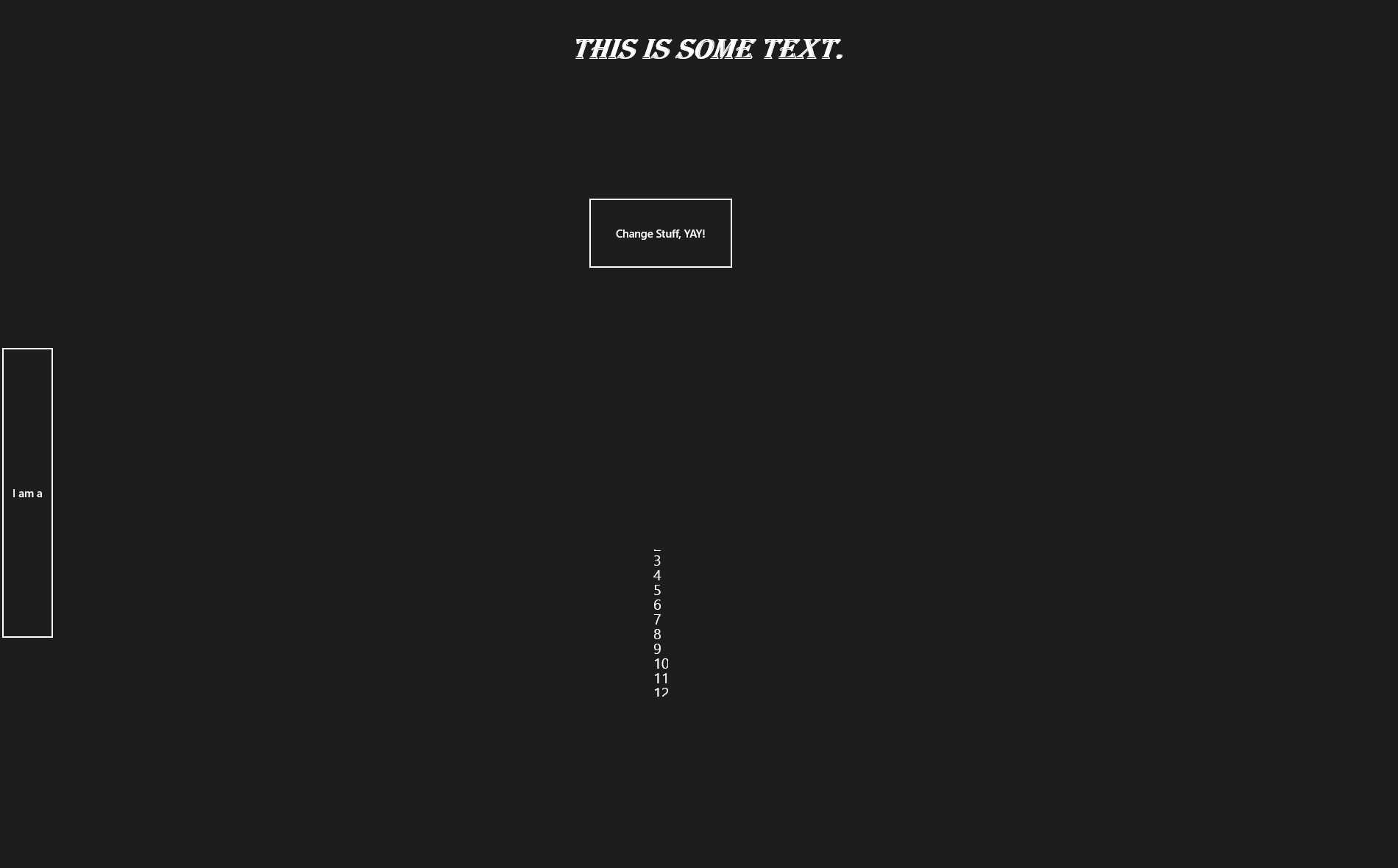
The new exercise I would like you to try is to add a second button which is centered in the middle column of the content region. When clicking this button I want it to do three things. Firstly, change the width of the first button to switch between 75 and *. Secondly, change the width of the RichTextBlock to * and have it horizontally and vertically aligned to the center and span only a single row. Thirdly I want it to add a new StackPanel inside of a scrollviewer to the second row of the second column of the content region if it does not exist and add a new textblock as a child element to that region with the number for how many times you clicked the button. This SHOULD be challenging. I find it too easy to just look at the code below when issued a challenge like this, that I often do it anyways, so, I am going to make you read "Intro to XAML Part 2 - The Answer" for the answer :P, to hopefully ensure as little cheating as possible. Make sure you make heavy use of the MSDN documentation and www.bing.com when attempting to figure this out. We also have forums on the Windows 8 Developers site.
An image of what I am looking for is below:
This third challenge should really emphasize the relationship between the code behind and the xaml file as well as let you really get a deep understanding of some of the options available to you for creating layouts, adding content and controlling that content. I really urge you to explore these topics further. A good exercise would be to incorporate the MVVM pattern and include Task.Run and the core dispatcher to ensure this process is not blocking vital UI cycle time which is essential for a responsiveness and fluidity while also modularizing your application.
Happy coding and look for the solution to be posted soon followed by part 3.