Windows 8 Introduction to XAML - part 1
Hi All,
This particular blog article series aims to get readers understanding XAML on a functional level. The primary focus will be Layout, Content, Control, Styling, Animation, Resources, a little theory and some code behind. The assumption I am making of my readers is that you know how to open Visual Studio, create a project and navigate the IDE. I am gearing this article specifically for people brand new to XAML and C#.
Part 1 covers just what you get out of the box in the Blank App and how it connects together. Part 2 we will discuss Layout, Content and Control elements as well as many of their properties and attributes. Part 3 we will discuss Styling and Resources in more depth, and Part 4 will be on Animation.
What is Xaml
Xaml is "Extensible Markup Language". What it essentially is, is the presentation layer of WPF, Silverlight, and Windows 8 C# and C++ applications. It is essentially an xml file with a .xaml extension. It is "Extensible" because you can add extensions inline, this is a typical case when providing styles from resources, which we will discuss later in the series. For more in depth information, feel free to use MSDN as a supplement: https://msdn.microsoft.com/en-us/library/ms752059.aspx
The Blank App
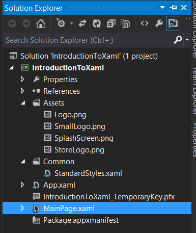
So go ahead and create a new Windows Store Blank App (XAML) under the visual C# tab. What you get when you first look at it is MainPage.xaml, App.xaml, and under the Common folder, you get StandardStyles.xaml
This basic template is a great starting point and provides some insight into how to create your own application. So lets take a look at each file in a little bit of detail.
MainPage.xaml
To really demonstrate how these files connect to each other, we need to add an element to the application. So locate the Grid Element and create a button between the two tags, like so.
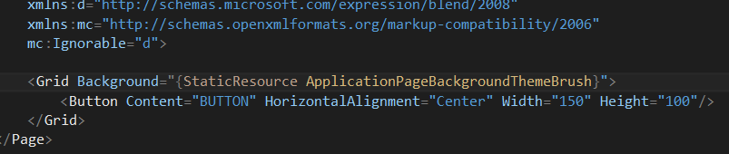
Don't worry too much about what is going on here, I will explain it all later. We just need an element to demonstrate what you are really getting out of the box. Your MainPage.xaml should look like below.
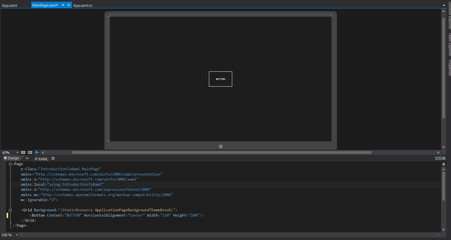
So once you have that, go ahead and push f5 to run your application and hover and un-hover over your button. You will notice that your button has a grey box appear over it and disappear when your mouse pointer leaves. You also should take note that your button has a black background, with white text of a particular font and is just a white rectangle. We will talk about this a little more when we get into the styles section of this blog series.
StandardStyles.xaml
This is a pre-built resource dictionary that comes stock with the blank app. It provides a reference on how to create style extensions that can be used within your app. So a question that comes out of this is what is a resource dictionary. A resource dictionary is used mostly for styles and templates in complex applications so that you can adjust the style of your app by changing just a few dictionary files and not digging through code. Fantastic! So lets actually look at some of the code in StandardStyles.xaml. Since we are dealing with a button, lets take a look at the Button Style that comes with it.
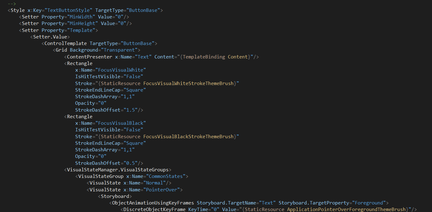
Above is a picture, it would be best if you can locate this code in your StandardStyles.xaml. Push ctrl+F and type "TextButtonStyle" and you should find it relatively quickly. All of the markup that exists within the Style element is an extension that will be placed into the style attribute of any element that references it. We will demonstrate this concept after we talk a little bit about App.xaml.
App.xaml
This is where you merge any application level resources that nearly every page in your app will need access to. Anything defined or merged in this scope is at the application level. In the Blank App example, you will notice that it references StandardStyles.xaml, this means any page within application scope has access to the markup within that file.
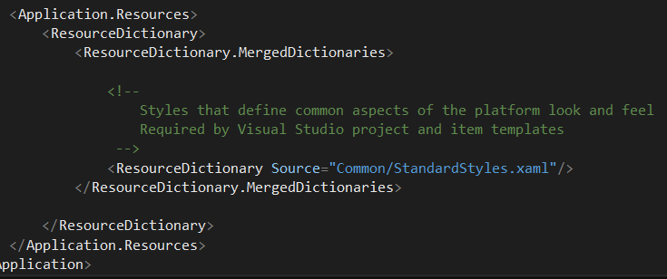
It is also important to note that you can import and merge dictionaries at different scope levels as well in the same way you do in App.xaml.
Demonstrate the Connection
So lets go back to the MainPage.xaml we are going to extend the Button's style to the style that is provided by StandardStyles.xaml. Again, do not worry too much about the syntax, we will touch on that later. This is just to demonstrate what files you get and how the files are connecting together.

Just in case that is difficult to read, feel free to copy and paste the entire element from here: <Button Content="BUTTON" HorizontalAlignment="Center" Width="150" Height="100" Style="{StaticResource TextButtonStyle}"/>
Press f5. What you should notice is the white box around your button that was previously there is no longer there and the text content of the button has been shifted to the top left of its space. The text itself will change color now instead of a grey box upon mouse over. We have extended its mark up to the button style markup in the StandardStyles.xaml file with the key "TextButtonStyle".
Summary
So we have discussed the blank app and what you get with it. The goal was to plant seeds in your head to begin understanding that you define your UI's style in a resource dictionary file, which is merged with multiple dictionary files in App.xaml and then can be accessed by any page, which is were you configure the layout of your page.
It is important to know that these files are separated out for the sake of maintainability and multiple contributors. It is good practice to define responsibilities and scope for your styles, templates, and controls to maintain scalability of your app and your development team.
Part 2 we will discuss Layout, Content and Control elements as well as many of their properties and attributes. Part 3 we will discuss Styling and Resources in more depth, and Part 4 will be on Animation.