Event Hubs / Stream Analytics / AzureML / PowerBI End-to-End demo – Part III (Enhancement and Visualization)
By Alexander Turetsky, Solution Architect
This is the final part of a series of blog posts describing a real-time prediction demo. In the previous posts I've described data ingestion and preparation process as well as consuming ML model for prediction. In this post I'll describe how to use Stream Analytics to enhance and filter data coming from ML predictions and how to visualize it in real-time using PowerBI.
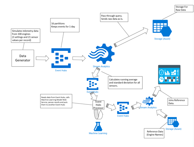
At this point we already have in the second event hub a stream of events containing an engine identifier along with predicted number of cycles of remaining useful life.
Having a numeric code as the engine identifier is not very useful for visualization – it's much better to have a text label that a user can understand. Stream Analytics offers functionality to deal with this concern. Stream Analytics provides users the ability to specify and use reference data. This could be a static (or slow changing) lookup table or some historical data (that can be used for correlations) that does not change frequently over time. Azure Blob storage is currently the only supported input source for reference data. Reference data source blobs are limited to 50MB in size (both JSON and CSV formats are supported). This article provides more details on using Reference Data in your Stream Analytics jobs, and also contains some additional useful tips on refreshing the reference data.
So in our case it is possible to define a lookup table that would map a numeric engine identifier to the associated engine label description. The table is stored as a text file in CSV format in a storage container. In our demo the lookup table is not changing at all, but in real life it might get updated for example when new airplane engines are added (or removed) to the fleet.
And the query that uses the reference table could look like this:
SELECT System.Timestamp as Time, scored.cycles, EngineNames.Name
FROM scored JOIN EngineNames on scored.id = EngineNames.id
Here the scored input is the Event hubs with a stream of predicted values and the EngineNames is our reference table. Here is an inputs section from the Stream Analytics Job definition file (JSON):
{
"name":"scored",
"properties":{
"type":"stream",
"serialization":{ "type":"JSON", "properties":{ "encoding":"UTF8" } },
"datasource":{
"type":"Microsoft.ServiceBus/EventHub",
"properties":{
"serviceBusNamespace":"<namespace>",
"sharedAccessPolicyName":"<policy name with (at least) reading access>",
"sharedAccessPolicyKey":"<policy key>",
"eventHubName":"<event hub name>"
}
}
}
},
{
"name":"EngineNames",
"properties":{
"type":"reference",
"serialization":{ "type":"CSV", "properties":{ "fieldDelimiter":"\t", "encoding":"UTF8" } },
"datasource":{
"type":"Microsoft.Storage/Blob",
"properties":{ … storage account properties … }
}
}
}
At this point the data is ready to be visualized. Stream Analytics allows you to send the incoming data directly to a Power BI dashboard. This functionality is still in preview and is not complete (for example it is missing an ability to define the output programmatically (through Azure Stream Analytics Rest APIs); also currently it is not supported in Azure Preview Portal, you can use it only in the Azure Management Portal). There is a detailed walk-through of configuring a Power BI output and dashboard available here. You would need to authorize a connection between your Stream Analytics job and your PowerBI account, and you would need to choose a name of a dataset and a table that would be created for you in your PowerBI account. Please note, you should NOT create these dataset and table in PowerBI yourself.
Once the Stream Analytics Job is started and starts producing data, you will see a newly created dataset in your PowerBI account and you can start creating visualizations. A very quick visualization for our demo could look like this:
In this chart you see the predicted number of remaining cycles for each engine and how that number goes mostly down overtime (which makes sense).
As you can see on the picture above, it shows predictions only for 10 engines and not for the entire fleet of hundred engines we are simulating. Having a hundred lines on the chart would definitely make it unreadable. You can filter the data right in your dashboard, but sometimes it makes sense to do the filtering in the Stream Analytics job. Power BI has constraints in terms of concurrency and throughput (described here). And it is your job to make sure your solution operates within these limits.
It is recommended to use TumblingWindow or HoppingWindow to ensure that data push would be at most 1 push per second (in this query I'm using 1 minute interval with a Tumbling Window):
SELECT System.Timestamp as Time, MIN(scored.cycles), EngineNames.Name
INTO PowerBI
FROM scored JOIN EngineNames on scored.id = EngineNames.id
GROUP BY TUMBLINGWINDOW(mi, 1), EngineNames.Name
Also you limit the number of engines in your query:
SELECT System.Timestamp as Time, MIN(scored.cycles), EngineNames.Name
INTO PowerBI
FROM scored JOIN EngineNames on scored.id = EngineNames.id
WHERE CAST (scored.id as bigint) < 11
GROUP BY TUMBLINGWINDOW(mi, 1), EngineNames.Name
Or you can decide to send data for visualization only when it reaches some threshold (like if the predicted number of cycles falls below some predefined value):
SELECT System.Timestamp as Time, MIN(scored.cycles), EngineNames.Name
INTO PowerBI
FROM scored JOIN EngineNames on scored.id = EngineNames.id
WHERE CAST (scored.id as bigint) < 11 AND scored.cycles < 100
GROUP BY TUMBLINGWINDOW(mi, 1), EngineNames.Name