Ask Learn
Preview
Ask Learn is an AI assistant that can answer questions, clarify concepts, and define terms using trusted Microsoft documentation.
Please sign in to use Ask Learn.
Sign inThis browser is no longer supported.
Upgrade to Microsoft Edge to take advantage of the latest features, security updates, and technical support.
Note
Access to this page requires authorization. You can try signing in or changing directories.
Access to this page requires authorization. You can try changing directories.
The majority of BI-related activities require measuring something on your business process. These measures usually relate to one of:
In almost all of these cases we need data over time to reflect how these measures progress, and be able to make decisions to drive improvements and also verify the impact of previous decisions (i.e. did adding a resource help improve satisfaction scores or TTR?).
One of the most common analyses in these cases relates to measuring the frequencies of these events happening (i.e. how often?), in order to understand the most common cases, as well as the least common ones, and ultimately the probability of a value to happen. So, counting how often the transactions happen on intervals (AKA ranges or bands) is very useful information.
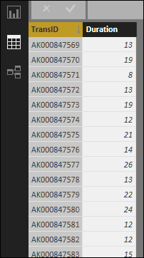
Let’s take a very simple example, in which our dataset is Transaction IDs and its time to resolution in minutes (Duration):

If we use the articles referenced at the bottom of this post, we could use those techniques to define the specific ranges we want; however, that assumes we know the data (meaning that we know min/max values and possible ranges). If we want to do a more generic analysis, we’ll have to calculate dynamically the ranges based on the input data, and the number of ranges in which we want to analyze it.
Let’s say we want to know the frequencies of these durations on intervals of 2 minutes, and see the distribution.
For that, we need to divide the range of values in equal intervals of 2 minutes. Then, we’ll count how many transactions happened on each interval. When we picture that with a bar chart with the ranges as X axis, and the count of transactions as Y, we’ll obtain the empirical distribution of that data set.
We’ll need these 4 elements:
The first measure calculates the minimum duration of the entire dataset:

With that, we can calculate a column for the range to which this transaction’s duration belongs to (this way we calculate once the MIN(Duration) and use multiple times):

Then we calculate another column for the label of the range, which we’ll use in the chart:

And finally, we calculate the measure for the frequency (i.e. how many transactions had a duration within a given range?):

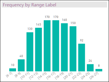
We can now create a bar chart with the Range Label in the X axis, and Frequency on the Y axis:

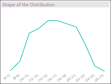
which reflects the real distribution of durations in that dataset (which I call here “empirical distribution” because it’s based on the data itself and not on any statistical distribution)… the “shape” of the bar chart reflects the actual distribution of the dataset. As over time you refresh the dataset, the ranges will recalculate and reflect the new buckets:

This information can be used to calculate the empirical probability of new values on these ranges, if conditions in the business process don’t change. [I call it “empirical” because, as mentioned above, we use the actual data and not any theoretical or statistical distribution or any kind of sampling.] If you make a decision in your business process (i.e. adding 2 people to help resolve tickets faster), then a change in the “shape” of your KPI (“Duration” in this case) would reflect the impact of this decision on the business process, and thus give you a way to assess how valuable that decision was (a topic for a future post).
Ask Learn is an AI assistant that can answer questions, clarify concepts, and define terms using trusted Microsoft documentation.
Please sign in to use Ask Learn.
Sign in