Ask Learn
Preview
Ask Learn is an AI assistant that can answer questions, clarify concepts, and define terms using trusted Microsoft documentation.
Please sign in to use Ask Learn.
Sign inThis browser is no longer supported.
Upgrade to Microsoft Edge to take advantage of the latest features, security updates, and technical support.
Note
Access to this page requires authorization. You can try signing in or changing directories.
Access to this page requires authorization. You can try changing directories.
We may have data across months, and we’d like to, at times, focus on the next 3 months, the following quarter, or the first 6 months… or similar, i.e. how many people between 20-30 years old, or 30-40, etc. How do we define these ranges, and how can we visualize them?
Let’s say we have a dataset measuring costs for projects across two years. We’d like to have ranges for:
These calculations will be needed in the “Dates” table. First we need a column to calculate the buckets (in this case, the number of months from today):

Then, another column to calculate the actual range based on the buckets (these could be combined):
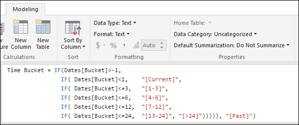
Finally, a column that we’ll use to order the ranges when we display them (on a logical order that makes sense, and not alphabetically):
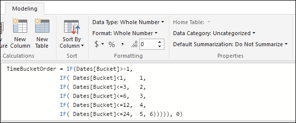
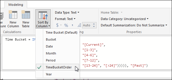
When we select the “Time Bucket” column, we can use the “Sort By Column” option to choose “TimeBucketOrder”:
Now we can create visualizations like these:
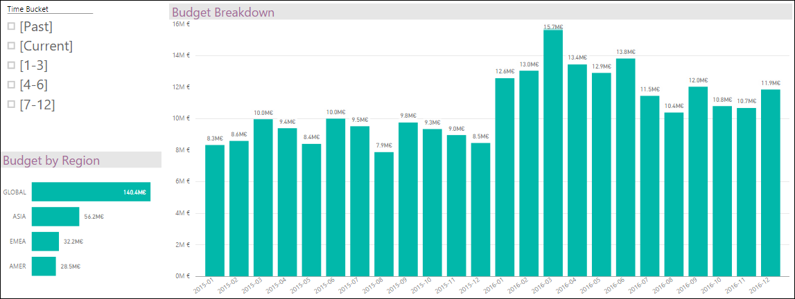
If we filter by “Past”, will take all months before the current one:
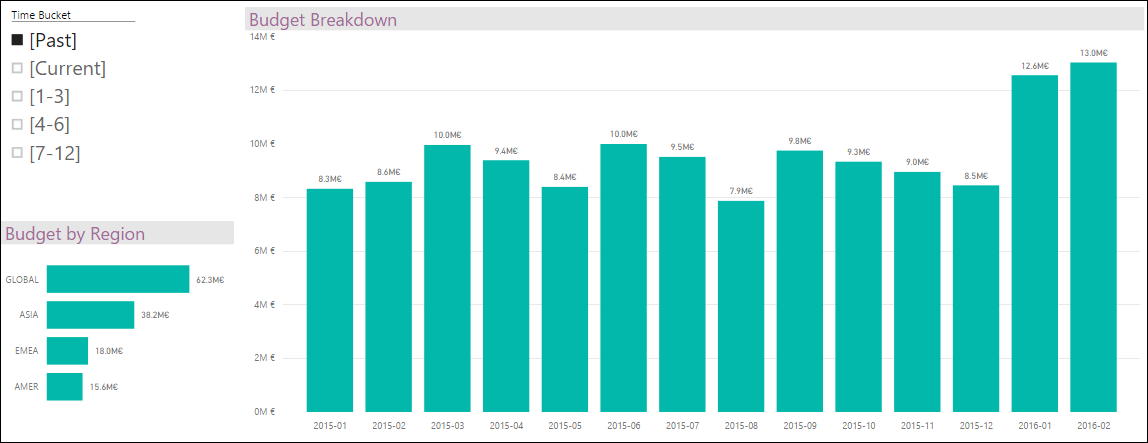
Current and next quarter:
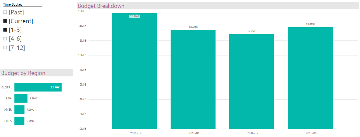
And if we select America’s region, we highlight the values for that region on the selected range of dates:
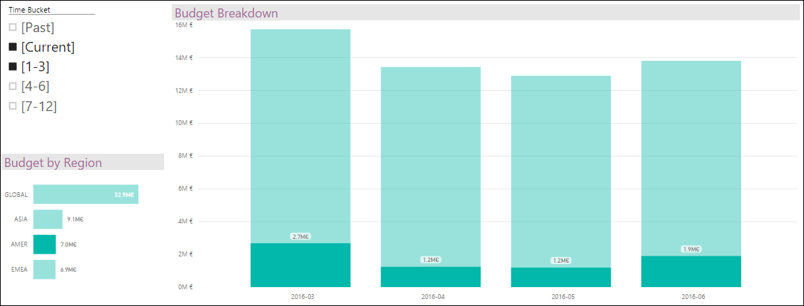
Ask Learn is an AI assistant that can answer questions, clarify concepts, and define terms using trusted Microsoft documentation.
Please sign in to use Ask Learn.
Sign in