
How does the new Dynamics 365 web client UI make you more productive?
Dynamics 365 web client has refreshed UI in July 2017 Update for Dynamics 365 (online), that increases readability and consequently productivity for our users who use the application day-in and day-out. Dynamics 365 might be one of the many applications they have to use throughout the day and a better UI is aimed at making their work easier and more manageable by being easy on the eye and more organized for quickly grasping information. The new look and feel has been carefully designed by our UX experts after considering key user feedback and gaps identified after a thorough analysis. It addresses key issues in the UI like too much of whitespace being present on forms and long labels getting cut amongst other issues.
Another factor that we have been cognizant of while designing the refreshed UI is that our users have a seamless experience while upgrading from a previous version. We have, thus, made no layout or functional changes to the existing infrastructure to allow users to sail through to the new UI with no customization effort required. Since we didn’t change any functionality there will be no training required for end users to start using this UI. In a nutshell, the new UI is like a breath of fresh air for our users and we have made sure that with no customization required, rolling it out for your organization is a piece of cake.
Below is an excerpt on how the new UI is better than the old UI in terms of key gaps that have been addressed.
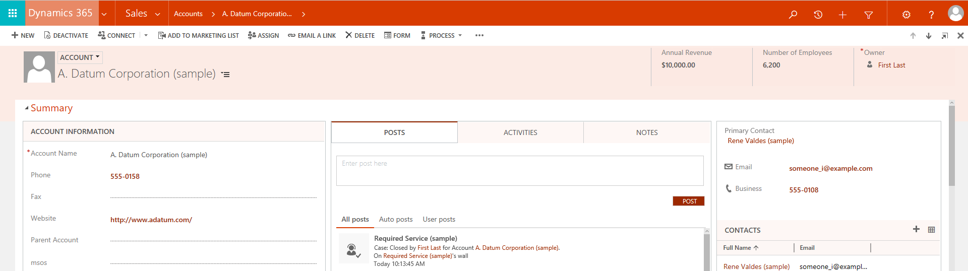
No confusing whitespace
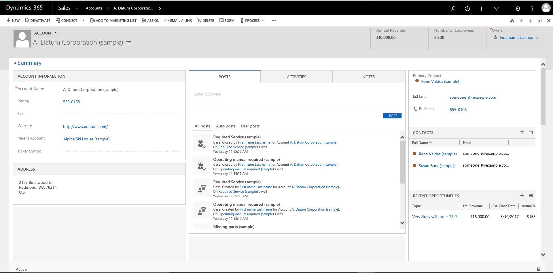
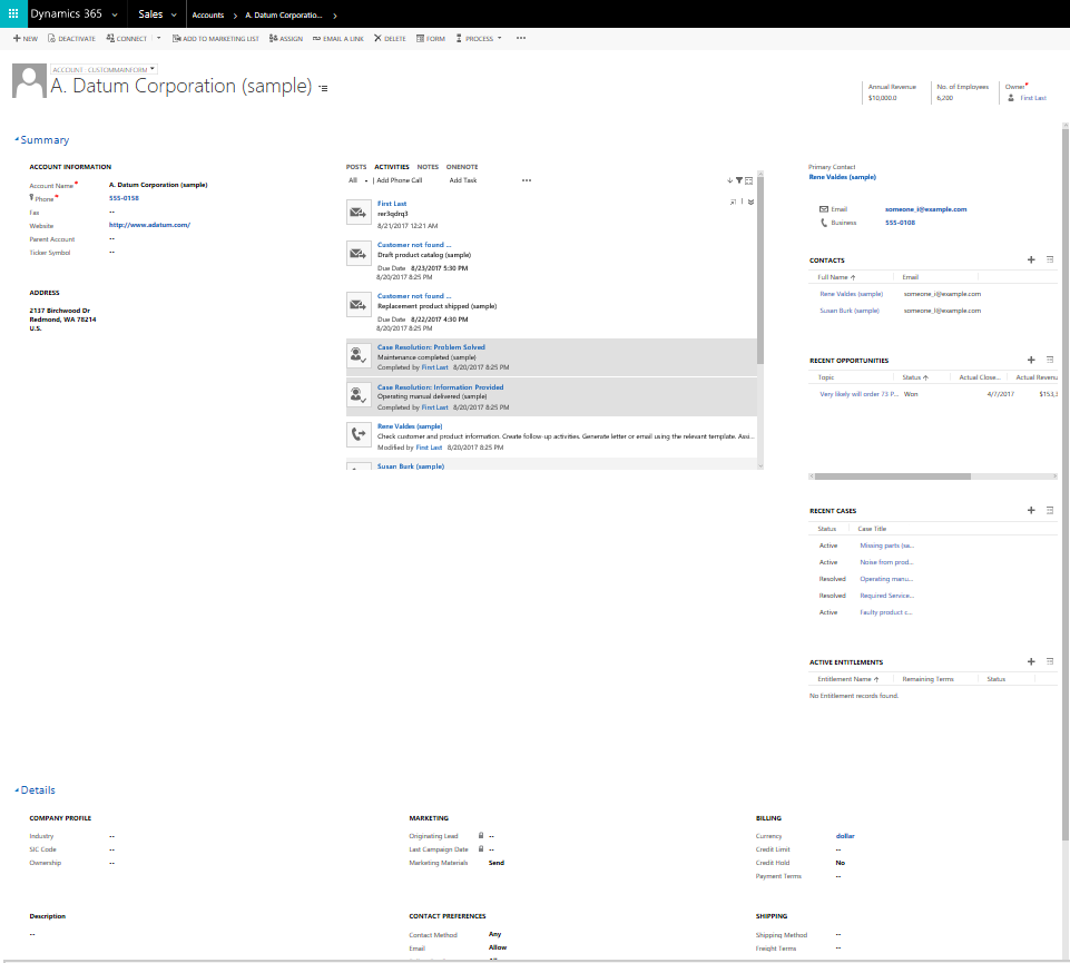
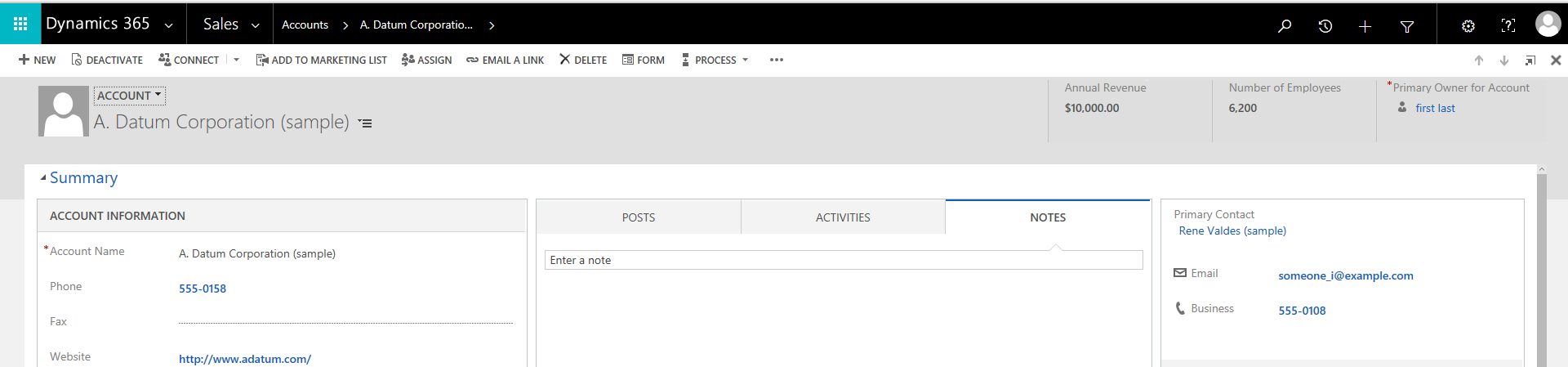
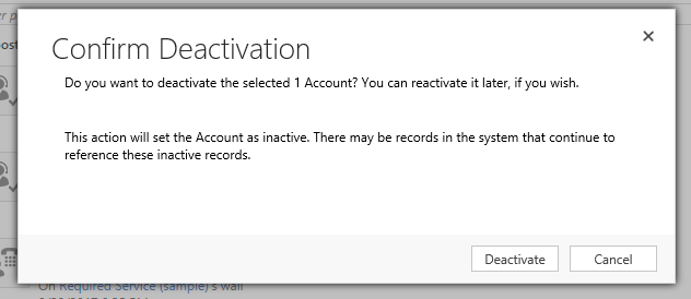
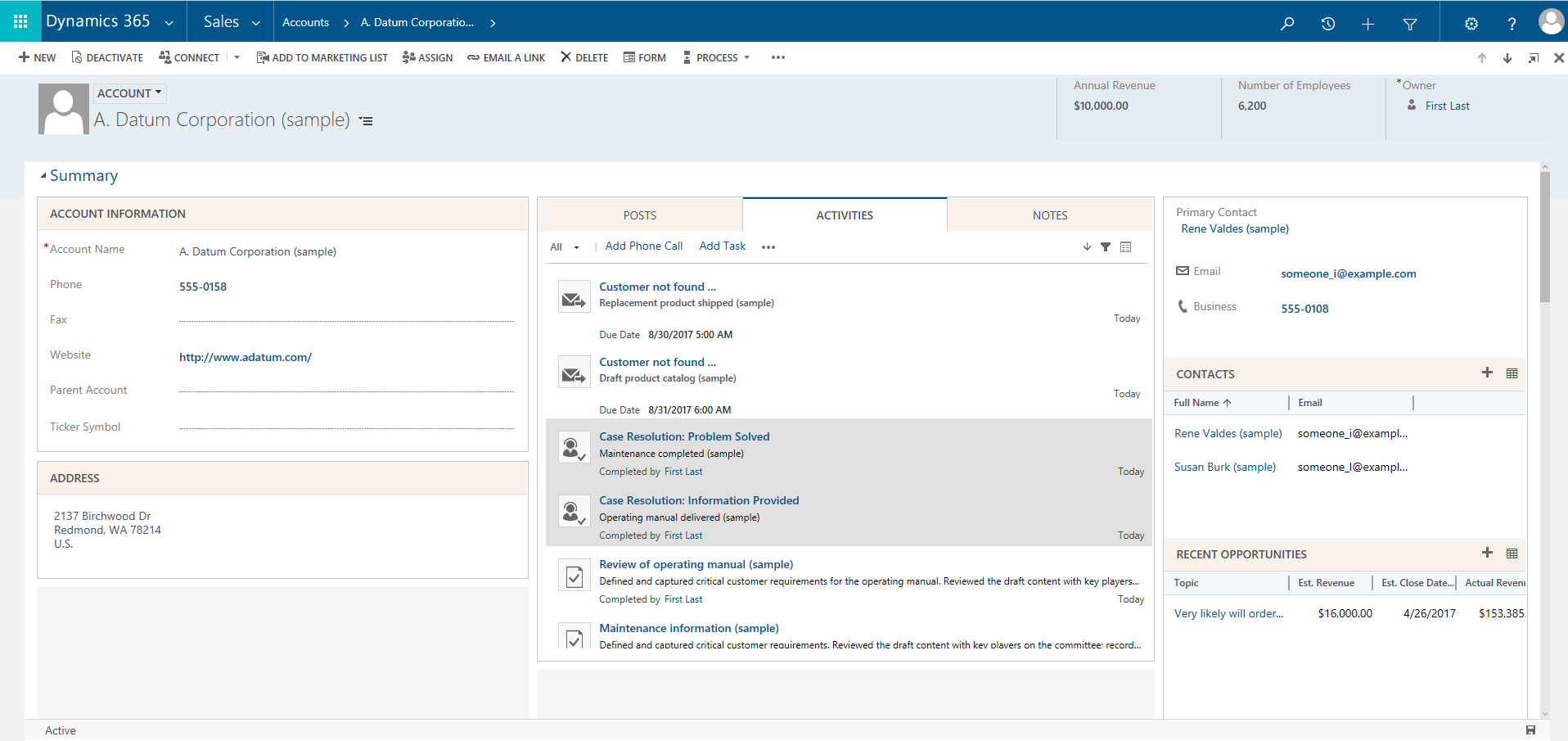
The old UI had a lot of whitespace between sections as you can see in the screenshot below. This made comprehension difficult for users as it was not clear if the whitespace corresponded to data missing or was by design. The whitespace also reduced readability.
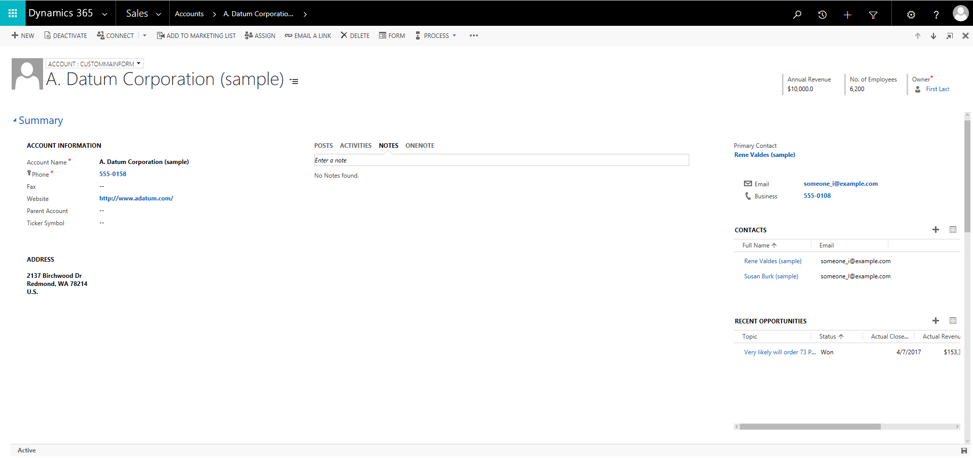
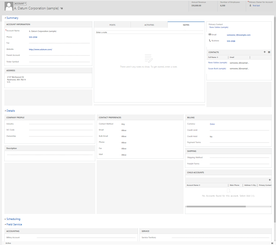
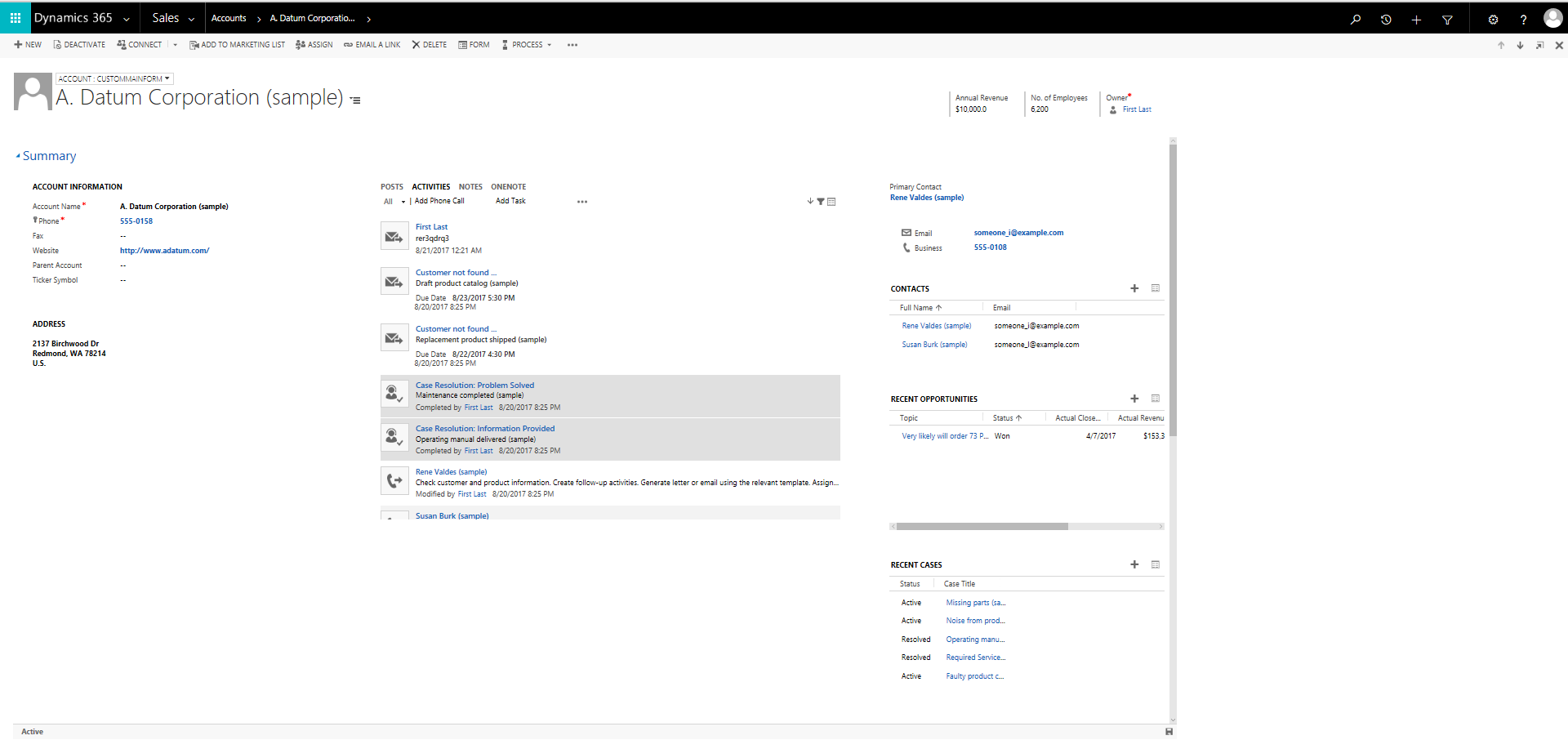
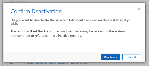
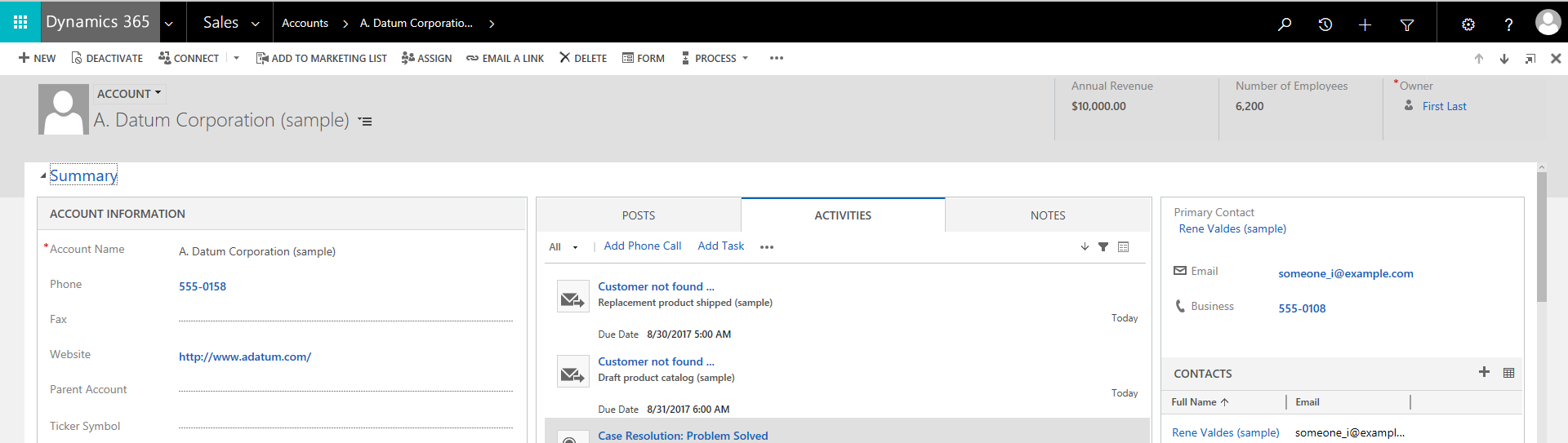
In the new refreshed UI we have made key visual changes to correct this issue.
- We have added borders around containers for a proper demarcation of section boundaries. The section headers are colored to make the demarcation of sections clearer.
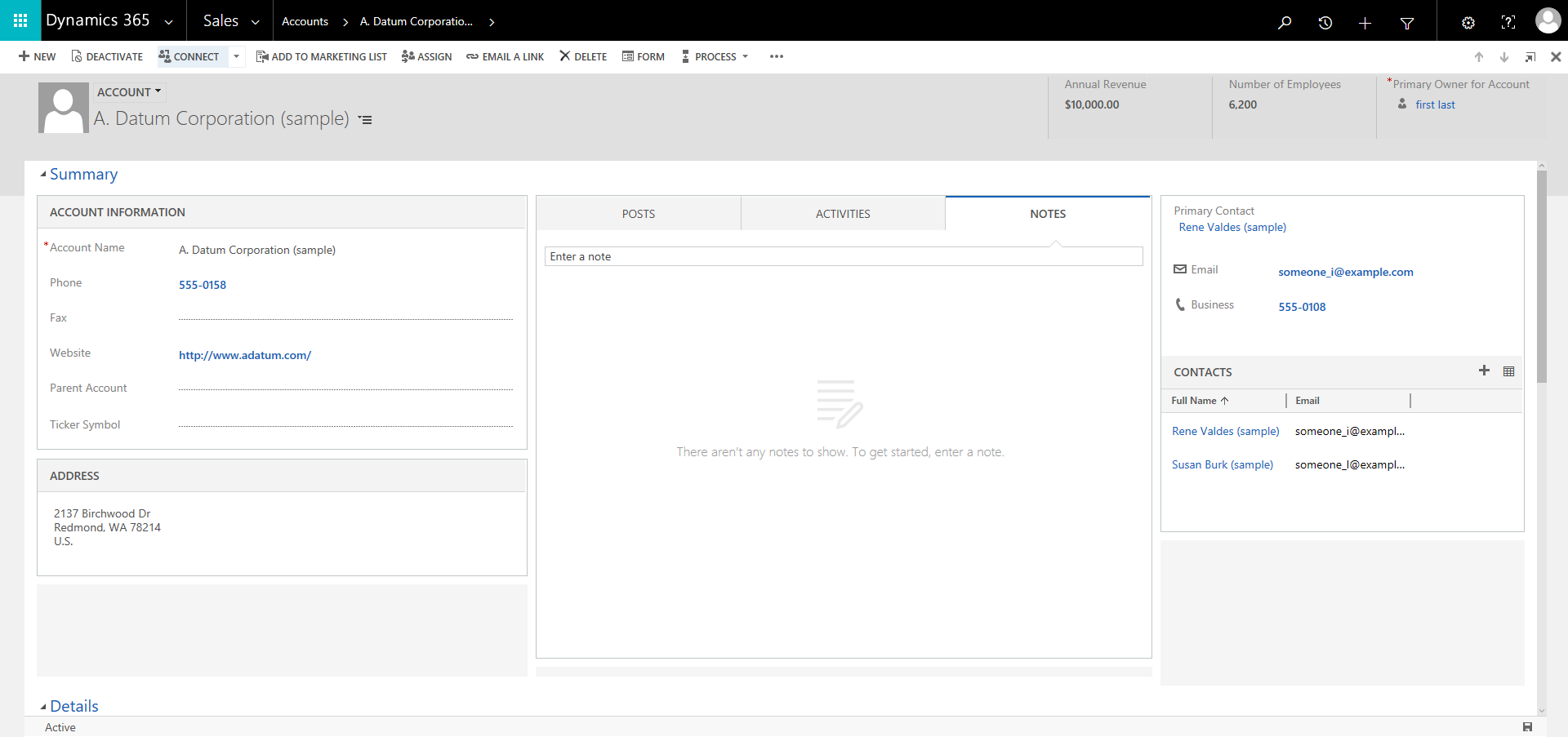
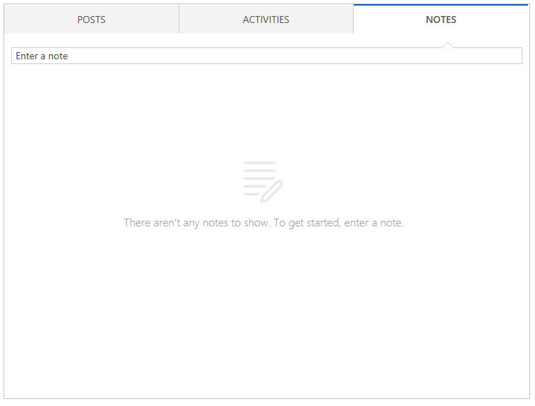
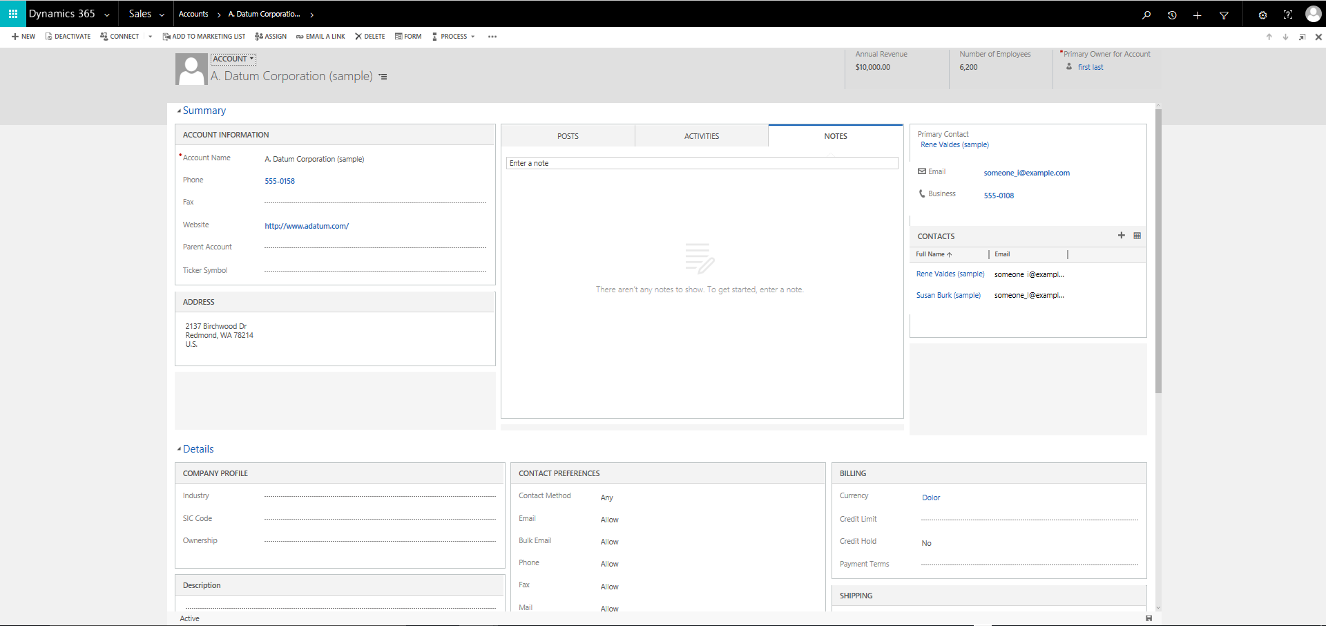
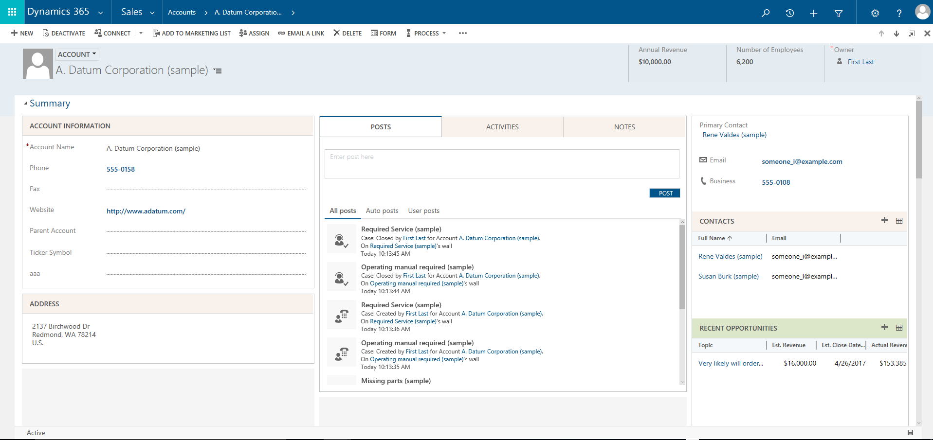
- The issue of whitespace was further accentuated in the old UI when there were no records present in sections as you can see in the screenshot below for the notes pane.
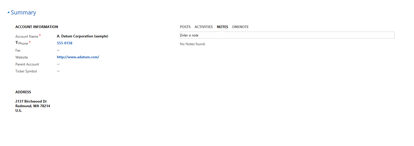
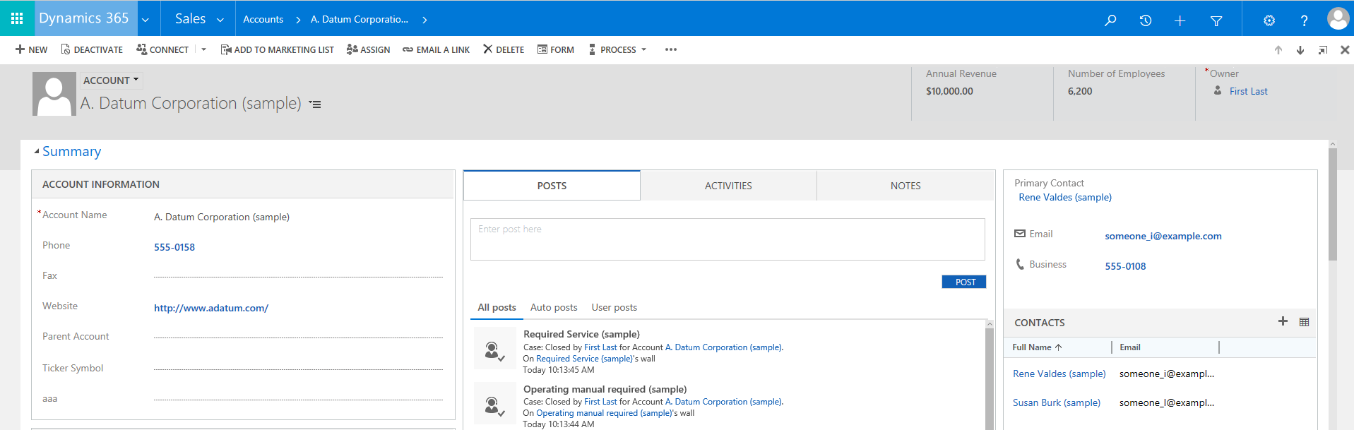
This issue has been addressed by adding a helpful message and icon in each container when there is no record. For the notes pane, it says- ‘There aren’t any notes to show. To get started, enter a note’. Empty states are shown for sub-grids, grids and charts as well when they don’t contain any records.
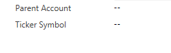
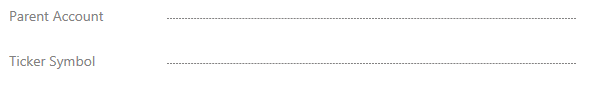
- Another case of whitespace on forms was when the different columns in a tab on the form were not of an equal height leading to whitespace. You can see this in the screenshot below.
These now have a grey shading indicating to the user that no content is expected to fill up these areas.
Proper visual hierarchy on pages in the application
The old UI had no demarcation of where the header of the page ends and the main content of the form starts. To tackle this issue we added a clipboard structure overlaying the header for various pages in the application. The main content is demarcated by a white mega container. This puts a clear structure around the header and the main body and helps users focus on the main body of the form.
Earlier, the screen had whitespace towards the right and bottom on high resolution monitors appearing like below
Now, the text has been center-aligned for it to appear like below:
The clipboard structure and alignment changes have been done across different pages like the forms, grids, dashboards and the search screen.
Word-wrap for long form field labels and values
This was one of the top voted customer asks for us on connect and we took user feedback into account while building this feature. It is now possible to wrap long field labels and values and header values making it easier for customizers to create forms without the need to look for shorter labels or increase label width.
Old UI with not enough space for values in the header.
New UI that allows wrapping up to 2 lines for long values in header and form body.
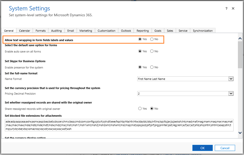
This feature is turned on by default for all new users. However, users who upgrade need to turn it on explicitly through settings -> administration -> system settings -> Allow text wrapping in form field labels and values.
Styling for UI components
We have added UI styling for various components to make the UI more intuitive.
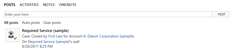
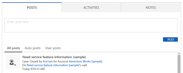
- Activity wall tabs styling rather than just plain text shown before.
Old UI
Refreshed UI
- Primary button on a dialog or form is now colored to highlight it for user action.
Old UI
Refreshed UI
- Input fields have a dashed line instead of 2 dots making it more intuitive for users editing information.
Old UI
Refreshed UI
Font standardization
The old UI had different font sizes across different components on the screen thus making it look inconsistent. We have standardized the fonts across different screens in the application for a more professional look and feel. The form field labels and values now have a font size of 14px instead of 12px for a better look and feel. The form field widths have been increased proportionately to accommodate for the increased font size.
Note – The font increase also increases the space between form fields for more breathing space and enhanced readability. The length of the form will be increased slightly due to this change.
Theming enhancements
The new UI allows enterprises to customize the newly added colors as per their company branding colors.
- The page header and the section header colors are customizable. E.g. the below visualization shows a different color chosen for the navbar header (#02558B) and panel header color (#f8f1ec).
The system auto-suggests colors for the application based on the navigation bar color selected while creating a new theme. Customizers can choose a different color than the system suggested colors. When users upgrade from a previous release to the new release, the UI theme is adapted as per the navigation bar color chosen by the organization. The customizers can choose to change the page and panel header colors that have been applied post upgrade.
- Sub-grid header color can be customized at a control level. Customizers can choose to add a different color to different sub-grids present on the form for users to be able to easily distinguish between data on the form. E.g. the sub-grid below for recent opportunities has been marked in green to allow the users to easily identify it on the form.
- We are shipping 3 new themes out-of-the-box that can be used by the customers if they don’t want to create a custom theme.
Default Theme
Blue Theme
Orange Theme
We hope that this post got you excited about trying out the new UI. Please send us your feedback and suggestions at https://ideas.dynamics.com/ideas/dynamics-crm.
– Neerja Rewal