UWP: New Controls (part 4 – Inking)
One more powerful control in Universal Windows Platform is InkCanvas. Thanks to this control you can enable inking anywhere in your application and you can use not just stylus but fingers and mouse as well. So, thanks to this feature you can bring inking functionality to any device based on Windows 10.
To enable inking you need to start with InkCanvas element and place it inside any container like StackPanel, Grid, etc. Like other UI controls based on FrameworkElement, InkCanvas contains a bunch of properties but in the simplest case you do not have to declare anything:
 <Grid Background="{ThemeResource ApplicationPageBackgroundThemeBrush}">
 <InkCanvas Name="ink"></InkCanvas>
</Grid>
In this case InkCanvas will fill all space inside the container and you can start make your notes or paint something. Pay special attention that by default InkCanvas accepts input from stylus (pen) only. So, if you want to use fingers or mouse you need to implement the following code:
ink.InkPresenter.InputDeviceTypes = CoreInputDeviceTypes.Mouse|CoreInputDeviceTypes.Touch;
In this code we are using the second important object – InkPresenter. InkCanvas is just a control which contains just one inking property – reference to InkPresenter but InkPresenter contains all information about input methods and lots of different settings there including collection of strokes. You cannot create InkPresenter directly but you can get reference to the object of this class using InkPresenter property of InkCanvas. Frankly speaking InkCanvas doesn’t contain any other properties or methods related to inking. But we still have something to discuss about InkCanvas and the most important question there is how to enable inking anywhere because usually you need to enable inking for images, videos, text rather than using inking inside a blank container. Let’s add several controls to the container and see what happens there.
 <Grid Background="{ThemeResource ApplicationPageBackgroundThemeBrush}">
 <InkCanvas Name="ink"></InkCanvas>
 <StackPanel>
 <TextBlock Text="Hello. Here is some text." Margin="20"></TextBlock>
 <Button Content="Click me" Margin="20"></Button>
 </StackPanel>
</Grid>
If you run this code you will see that all controls work fine and you can make any notes there.
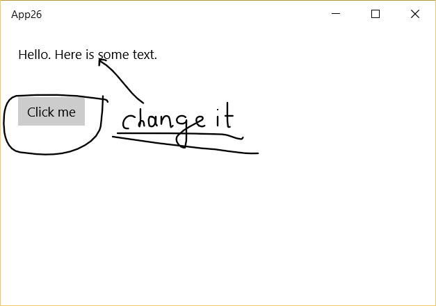
In our example we placed InkCanvas behind other controls but if you swap StackPanel and InkCanvas you can see that InkCanvas is placed above StackPanel and controls like Button don’t work at all. You can resolve it thanks to Canvas.ZIndex property.
 <Grid Background="{ThemeResource ApplicationPageBackgroundThemeBrush}">
 <StackPanel Canvas.ZIndex="1">
 <TextBlock Text="Hello. Here is some text." Margin="20"></TextBlock>
 <Button Content="Click me" Margin="20"></Button>
 </StackPanel>
 <InkCanvas Name="ink" ></InkCanvas>
</Grid>
Let’s talk about settings of InkPresenter and how to make different effects there. It’s all around InkDrawingAttributes class. You simply need to create an object of this class and set different properties like Color, PenTip, Size etc.
 InkDrawingAttributes attr = new InkDrawingAttributes();
attr.Color = Colors.Red;
attr.IgnorePressure = true;
attr.PenTip = PenTipShape.Circle;
attr.Size = new Size(4, 10);
attr.PenTipTransform = Matrix3x2.CreateRotation((float)(70 * Math.PI / 180));
ink.InkPresenter.UpdateDefaultDrawingAttributes(attr);
Code below shows how to use InkDrawingAttributes. In order to update attributes you need to call UpdateDefaultDrawingAttributes and pass InkDrawingAttributes object there. In code below I used PenTipTransform property as well. This is a very interesting property which allows to apply transformation to pin shape and get more natural look for strokes thanks to different height of strokes based on direction of pen (moving direction/angle).

You can check the image below where I tried to paint symbol “f” and you can see that the image contains strokes with different height. In fact I used the same settings but this effect was applied thanks to PenTipTransform.
Finally, you can paint anything but how can you erase some strokes if you make anything wrong? In order to do it you need to change mode of InkPresenter:
ink.InkPresenter.InputProcessingConfiguration.Mode = InkInputProcessingMode.Erasing;
The next important class which is related to inking is InkStroke. Anything what you paint on InkCanvas consists of InkStroke. In order to get access to functionality around InkStroke objects you can use StrokeContainer property of InkPresenter. Thanks to this property you can save existing strokes to file, add new strokes, get access to selected strokes etc. So, if you want to implement any functionality around strokes then StrokeContainer is your friend. Of course the most popular methods there are LoadAsync and SaveAsync.
Lots of applications require recognition functionality as well. In order to recognize text based on hand writing you can use InkRecognizerContainer class. In the simplest way you can use this class like this:
 InkRecognizerContainer container = new InkRecognizerContainer();
var result=await container.RecognizeAsync(ink.InkPresenter.StrokeContainer, InkRecognitionTarget.All);
string s=result[0].GetTextCandidates()[0];
This code will use default recognizer and convert the first text candidate from the list to text. Of course it’s not enough for more complex scenarios. For example, I spend 10 years at school to train my handwriting for Russian and Ukrainian but not for English. So, when I am trying to write something in English usually I can find the right result on the second or third place in the list of text candidates. Additionally, I can have several recognizers on my computer.
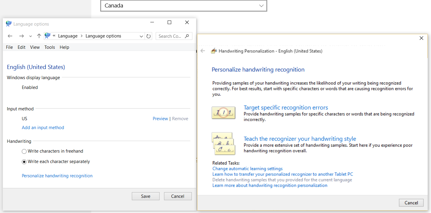
So, it’s better to allow to select the right recognizer. You can simply use SetDefaultRecognizer and GetRecognizers of InkRecognizerContainer object to do it. In case of non-native English writers I am not sure that you need to present full list of possible results. It’s better to ask users to setup recognizer using system settings. For example, I can setup the default recognizer to adopt to my writing style if I select “write each character separately” and make some “teach” settings:
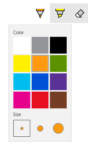
At the end of the post I want to draw your attention to Ink Toolbar control. It’s not a default UWP control and you need to install this control separately. Once you install the control it will be available in Extension tab of Add Reference dialog (close and open Visual Studio after installation) and it’s ready to use. You just need to add reference to the library:
xmlns:ink="using:Microsoft.Labs.InkToolbarControl"
Find a place for the control and make reference to the
existing InkCanvas:
 <InkCanvas Name="ink" ></InkCanvas>
<ink:InkToolbar TargetInkCanvas="{x:Bind ink}" VerticalAlignment="Top" HorizontalAlignment="Right"></ink:InkToolbar>
Below you can see the control itself which generates our code: