UWP: New Controls (part 1 – RelativePanel)
In the next posts I am going to discuss new controls which are available for Windows 10 developers. And today I am going to start with a new layout control RelativePanel. For better understanding of the control I will start my post with a short example:
 <Grid>
 <Grid.RowDefinitions>
 <RowDefinition Height="Auto"></RowDefinition>
 <RowDefinition Height="*"></RowDefinition>
 </Grid.RowDefinitions>
 <Grid.ColumnDefinitions>
 <ColumnDefinition Width="Auto"></ColumnDefinition>
 <ColumnDefinition Width="*"></ColumnDefinition>
 </Grid.ColumnDefinitions>
 <TextBlock Text="This is a header" Grid.ColumnSpan="2" Style="{ThemeResource HeaderTextBlockStyle}"></TextBlock>
 <Image MaxWidth="800" Grid.Row="1" Source="Assets\drone.jpg" VerticalAlignment="Top"></Image>
 <TextBlock Text="This is a text about drones." Margin="10,0,10,0" TextWrapping="Wrap" Grid.Column="1" Grid.Row="1"></TextBlock>
</Grid>
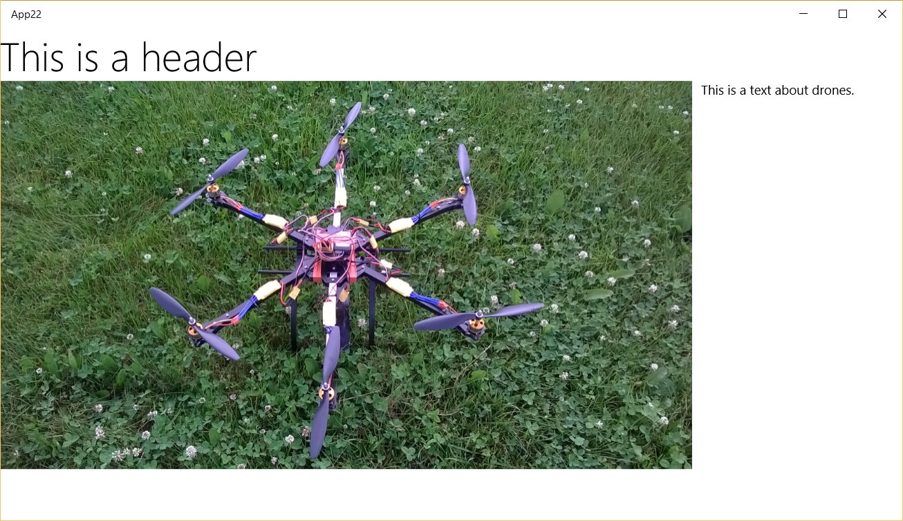
In this example I implemented a simple layout which uses Grid element to place two text blocks and an image. So, if you run this code you can see something like this:
But there is a problem, Windows 10 allows to change size of windows and additionally I can run this application on phones. So it’s easy to see that I don’t have enough space to show image and text if I have a smaller window. Because I want to create a universal interface I should change my layout dynamically if I don’t have enough space. Probably I simply need to place the text below the image and VisualStateManager is the best way to do this. But I used Grid container which has two columns and two rows and for smaller display I need a grid with one column and three rows which is virtually impossible to manage in VisualStateManager even for my example (but the real interfaces are much more complex). That’s why when developers build universal applications for Windows 8.1 they duplicate some parts of the interface and simply work with Visibility property inside VisualStateManager.
Starting with Windows 10, developers have a chance to use the new container which allows to avoid problems with Grid – it’s RelativePanel. Let’s see the same example but inside RelativePanel control.
 <RelativePanel >
 <TextBlock Text="This is a header" Name="header" Style="{ThemeResource HeaderTextBlockStyle}"></TextBlock>
 <Image Name="image" MaxWidth="800" RelativePanel.Below="header" Source="Assets\drone.jpg"></Image>
 <TextBlock Text="This is a text about drones." Margin="10,0,10,0" TextWrapping="Wrap" RelativePanel.AlignTopWith="image" RelativePanel.RightOf="image" Name="text"></TextBlock>
</RelativePanel>
You can see that in case of RalativePanel you can declare position of embedded controls using dependency properties. Because it's just properties, it’s easy to reformat layout using them in VisualStateManager. For example, you can use the following code to show the same interface in one row:
 <VisualStateManager.VisualStateGroups>
<VisualStateGroup>
<VisualState x:Name="Normal">
 <VisualState.StateTriggers>
 <AdaptiveTrigger MinWindowWidth="900"></AdaptiveTrigger>
 </VisualState.StateTriggers>
</VisualState>
<VisualState x:Name="Mobile">
 <VisualState.Setters>
 <Setter Value=""
 Target="text.(RelativePanel.AlignTopWith)"></Setter>
 <Setter Value="image" Target="text.(RelativePanel.Below)"></Setter>
 <Setter Value="" Target="text.(RelativePanel.RightOf)"></Setter>
 <Setter Value="0,10,0,10" Target="text.Margin"></Setter>
 </VisualState.Setters>
 <VisualState.StateTriggers>
 <AdaptiveTrigger MinWindowWidth="0"></AdaptiveTrigger>
 </VisualState.StateTriggers>
</VisualState>
</VisualStateGroup>
</VisualStateManager.VisualStateGroups>
Once the window is less than 900 pixels, the text is moved below the image. Pay special attention how to declare dependency properties in the Target attribute.
So, let’s use this powerful control, and according to my experience, Relative panel is the most popular control for creating universal interface now.