Don’t have a Fitt, size does actually matter (for mobile controls, that is)!
 By now, you probably are aware that when you’re building a mobile app or mobile website, trying to fit an existing PC-based app into a phone app isn’t the right answer. You have to be mindful of what you choose to put on a mobile app’s screen and where you lay it out. But that’s not the end of it. Understanding size of the various controls and which to show on the screen is also part of it. This post lays out the details of how to think about the size of your controls and some of the reasons why you should make certain controls bigger than others.
Designing the look and feel of your mobile app is clearly as much science as it is art. We have already discussed how rationalizing your UI for your app is a good thing and also how you lay out the controls and UI assets on each screen of your app. Now we will discuss the size of each control on your screen and what that really means to your app and how your user interacts with it.
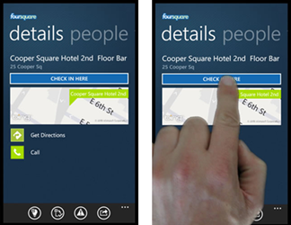 If you will remember from the previous post in this series, I showed you how the effectiveness of the earliest version of the FourSquare app on Windows Phone diminished the usability of the app because of where controls were placed on the screen. As a refresher, I have added them to this post as well. As you can see, by placing the Check-In button on the app near the top, the view of the screen and likely the most important UI asset of the page (namely the map) are obstructed by your hand when you check in. While this may seem like a minor detail and one that users might not even notice, subconsciously this makes the app harder to use which then adds friction to the user experience. And as previously discussed, friction leads to lost users. Lost users means less use of your app which in turn means less revenue or “eyeballs” on your product (or both). In other words, don’t do that.
But that is not the end of the scenario. Once you have have placed the Check-In button in a more appropriate place (my suggestion is at the bottom of the screen but above the app bar (which will be discussed at length in the next post), then you should start thinking about how much space those controls should take. Take the following change from the screens above:

Note how all I have done here is move the “CHECK IN HERE” button from the top to the bottom of the screen, thereby eliminating the finger-obstructing-the-screen issue. There is still a problem here and it lies in the size of the controls on the screen. To the point:
- The “CHECK IN HERE” button is the primary activity of this screen. As such, don’t you think it should have a more prominent surface area on the screen?
- The map is the primary visual component of this screen and yet it only takes roughly 1/6th of the screen’s size. Probably not a bad idea to give it more space to shine as well.
- The “Get Directions” and “Call” buttons, while not as important to this screen as the “CHECK IN HERE” button, are small and tough to tap, relative to the rest of the screen. As secondary control features to this screen with a fair amount of use by the average user, you might want to give those controls more prominence on the screen as well.
The screenshot below gives an example of how a better screen layout might be for the app itself. Specifically:

- Note how the “CHECK IN HERE” button is much larger than it was before. As the primary control on the screen, this is critically important to removing friction from the experience for the user.
- The map is larger, at roughly 1/4 the size of the screen compared to the 1/6th screen size. This makes it easier to show where the check in location is and a primary visual cue to the user on what to do on this screen. (and yes, I cheated on the map control as I just stretched it in this case, but the intent is that you you don’t do that and instead show more of the map)
- The “Get Directions” and “Call” buttons now span the width of the screen, making them more visible and easier to hit. An even better idea would be to have these two buttons larger in height and existing side-by-side rather than stacked as it makes it easier to tap the button with your finger.
Getting deeper into the last point I made above (i.e.: making buttons larger), there is actually some science behind it and it is known as Fitt’s Law:

Where:
- T is the average time taken to complete the movement
- a is the start/stop time of the device
- b is the inherent speed of the device
- D is the distance from the starting point to the target’s center
- W is the width of the target, measured along the access of motion
While I love math as much as the next person (anyone who is in the middle of or completed a computer science degree like I did will know that you don’t get through it without have an affinity towards mathematics), the only way this equation would destroy more of my brain cells is if it included some differential calculus. So let’s get to the point of what Fitt’s Law is really about:
Fitt’s Law: The bigger and closer a target is on the screen, the easier it is to hit.
Okay. This is easier to understand. And amazingly simple and intuitive when you think about it! Always remember this when identifying which controls and screen assets you want to put on your mobile app’s screen and adhere to the spirit of Fitt’s Law when designing the layout. The key here is to reduce the friction in usability for your app, so make it as easy as possible for your app to be used, then you will have happier users and the likelihood of them returning to your app often is higher as a result!
The last nugget of info I will leave with you in this post is understanding the size of the human finger and the various guidelines that mobile platforms provide for minimum sizes of controls to use on a phone. Make sure you follow those guidelines as they will lead to a better user experience for your users and your adherence to these guidelines may make the argument for having your app featured in the Marketplace for your platform stronger.
- Windows Phone (discussed in the Windows Phone UI Design and Interaction Guidelines): 34 pixels / 9mm minimum
- iPhone (as discussed in the iPhone Human Interface Guidelines): 44 pixels / 7mm minimum
- Ubuntu Linux (discussed in Ubuntu Designing for Finger UI’s): 16mm to 20 mm minimum
Bottom line: the sizes vary from platform to platform (which is to be expected as each platform supports various resolutions and pixel densities) but they all state that in order for a control to be usable, it’s best to make sure that the finger is able to interact with the control with relative ease (Fitt’s Law at work, but in the guise of Interaction Guidelines).