Like a Boss! Understanding the Difference between Panorama and Pivot in Windows Phone
 One of the great features of Windows Phone is the natural feel of the left-to-right (or right-to-left) scrolling of apps and hubs. There’s a good reason for this flow – the Windows Phone team looked into the behaviour of how users interact with the phone and figured out that the anatomy of the hand is such that its actually easier to scroll left and right vs. up and down (true story!).
To that end, the Windows Phone SDK contains two major controls that allow you to take advantage of the left/right interaction: Panorama and Pivot.
Panorama Control

The Panorama control is, as you might guess from its name, expansive in nature. Panorama is a UI asset that is meant to draw the user into the app and literally immerse him/herself in the experience you have implemented.
Panorama controls are artful and shallow. That is not to mean that Panorama controls are “eye candy” (although when properly implemented, the certainly are!). Think of the Panorama as a canvas for a beautiful work of art. They can be simple or complex, and they each have their own style. The intent of the Panorama is to allow you as an app creator the ability to create an experience that has some semblance of structure (like the tabs you see in the image to the right), but also something that will allow the user to explore, discover and ultimately delight in the artful implementation that you have created.
Some great implementations of Panorama can be found in the following apps: The Weather Channel, MTV News (this app actually uses both Panorama and Pivot), IMDb.
Panoramas are usually first implemented in the XAML of the screen (although like pretty much any UI asset in Silverlight, you can generate them equally via XAML or code like C# or VB). Below is the the vanilla structure of a Panorama control:
1: <!--Panorama control-->
2: <controls:Panorama Title="my application">
3: <controls:Panorama.Background>
4: <ImageBrush ImageSource="PanoramaBackground.png"/>
5: </controls:Panorama.Background>
6:
7: <!--Panorama item one-->
8: <controls:PanoramaItem Header="first item">
9: <!--Double line list with text wrapping-->
10: <ListBox Margin="0,0,-12,0" ItemsSource="{Binding Items}">
11: <ListBox.ItemTemplate>
12: <DataTemplate>
13: <StackPanel Margin="0,0,0,17" Width="432" Height="78">
14: <TextBlock Text="{Binding LineOne}" TextWrapping="Wrap" Style="{StaticResource PhoneTextExtraLargeStyle}"/>
15: <TextBlock Text="{Binding LineTwo}" TextWrapping="Wrap" Margin="12,-6,12,0" Style="{StaticResource PhoneTextSubtleStyle}"/>
16: </StackPanel>
17: </DataTemplate>
18: </ListBox.ItemTemplate>
19: </ListBox>
20: </controls:PanoramaItem>
21:
22: <!--Panorama item two-->
23: <!--Use 'Orientation="Horizontal"' to enable a panel that lays out horizontally-->
24: <controls:PanoramaItem Header="second item">
25: <!--Double line list with image placeholder and text wrapping-->
26: <ListBox Margin="0,0,-12,0" ItemsSource="{Binding Items}">
27: <ListBox.ItemTemplate>
28: <DataTemplate>
29: <StackPanel Orientation="Horizontal" Margin="0,0,0,17">
30: <!--Replace rectangle with image-->
31: <Rectangle Height="100" Width="100" Fill="#FFE5001b" Margin="12,0,9,0"/>
32: <StackPanel Width="311">
33: <TextBlock Text="{Binding LineOne}" TextWrapping="Wrap" Style="{StaticResource PhoneTextExtraLargeStyle}"/>
34: <TextBlock Text="{Binding LineTwo}" TextWrapping="Wrap" Margin="12,-6,12,0" Style="{StaticResource PhoneTextSubtleStyle}"/>
35: </StackPanel>
36: </StackPanel>
37: </DataTemplate>
38: </ListBox.ItemTemplate>
39: </ListBox>
40: </controls:PanoramaItem>
41: </controls:Panorama>
As you can see, every Panorama should include a title and a background image. You also add items (like the “family hike" item in the example image) via the PanoramaItem control.
Pivot Control
 If you were to look at the Pivot and Panorama controls side by side and tell me that they are basically the same thing, just looking a little different, I wouldn’t blame you. The differences to the user are fairly subtle, but to you as a developer/designer and to the experience your user has with your app (whether or not they realize it), those differences are both significant and ultimately determinant to the success of your app in many cases.
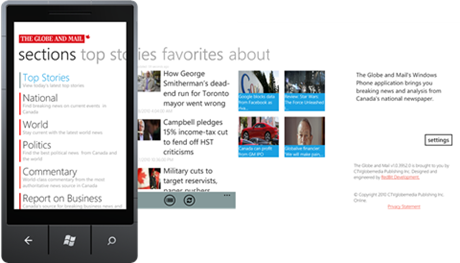
We have already discussed Panorama and its mission: Artful, Expansive, Immersive; basically it’s a canvas and you are the artist. The Pivot control shares the left/right behaviour of Panorama but the common experience to the two controls really ends there. The Pivot control is a deeper experience and meant to be data-driven. What is meant by this is the fact that Pivot controls are largely list-based and pivot along data points. Basically, if you have apps that are driven by list behaviours (for example, news articles in the Globe and Mail prototype example above), a Pivot control is much more suited to your needs than a Panorama.
Great examples of Pivot-based apps include: The Globe and Mail, Cocktail Flow, ScoreMobile.
Like Panorama, Pivot controls are most commonly implemented in XAML (but can also be generated via code):
1: <!--Pivot Control-->
2: <controls:Pivot Title="MY APPLICATION">
3: <!--Pivot item one-->
4: <controls:PivotItem Header="item1">
5: <Grid/>
6: </controls:PivotItem>
7:
8: <!--Pivot item two-->
9: <controls:PivotItem Header="item2">
10: <Grid/>
11: </controls:PivotItem>
12: </controls:Pivot>
As you can see in the XAML, Pivots are less complex in the structure of the actual control itself. The complexity of the control is left to the contents of the various PivotItem controls inside the Pivot, which more often than not contain lists.
So there you have it! In summary, here are the components and strengths of both Panorama and Pivot:
Panorama |
Pivot |
|
| Key Aspects |
|
|
| Good in Scenarios Involving: |
|
|