Multi-Platform Apps with HTML5 and IE9
 “We should make an app”, says your boss while playing with her new smartphone. This statement tends to can get very expensive and scary for developers since there are so many “app” platforms out there. Yet, it is a totally valid request from a product owner. Luckily for us, Microsoft has our back by giving us a solution that can make building multi-platform apps easier with HTML5 and Internet Explorer 9.
The goal with this article is to demonstrate how you can build multi-platform apps by building up a code base in HTML5 and JavaScript that provides different custom user experiences depending on the platform your user prefers. We won’t be going into the intimate details about each step, rather we will be looking at how we can combine a number of techniques discussed thoroughly on the web (see the links throughout the article) build cool “apps” with HTML5. This article comes to us courtesy of David Wesst
David Wesst has been working with web and user experience development for the past 5 years and currently works for Imaginet as a User Experience Consultant in Winnipeg, Manitoba. After finishing university, David has continued to follow his passion about the future of web development, experience design, technology, and game development both in and outside of the workplace. David has spoken at a number of conferences across Canada about HTML5 development and recently received his MVP award in the area of Internet Explorer.
Author’s Note: A completed version of the app this article talks about is available at https://appswithhtml5.codeplex.com for you to download and follow along.
Iteration 0: Ideation and Design Phase
Before starting, think about what multi-platform apps are, such as the Facebook or Twitter app that you use in your browser, your phone, or your desktop. On the technical side, they are very different since each platform uses a different technology (Silverlight, Objective-C, HTML), but to the user they are just different experiences of the same thing.
This idea that we will be able to build multi-platform apps with a single code base of HTML and JavaScript, making it easier to maintain and cheaper to produce. It will be easier to maintain because we’ll only need to know how to use one technology set (HTML5) and it will be cheaper because as we move forward to our other apps,we won’t need to start from scratch.
That’s enough talk. Let’s get started.
The app we are going to build is going to be an Expert Directory app that allows users to browse through contacts for a company, in my case the company is Imaginet. There will be a list of contacts displayed on screen, and when one is selected that contact’s details will appears.
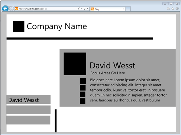
Here is a simple sketch to help visualize what we are going to build.
Keep in mind that this is only a sketch, which is really meant to demonstrate how things are laid out rather than how they will look in the end. The user will be able to select a name on the left and their details on the right.
With our idea clear and our design complete, let’s get to the code.
Iteration 1: The Web App (HTML)
Our first goal will be to build our web app, or web experience. To do this, we are going to use all of the tools in the HTML5 arsenal which consists of HTML5, CSS3, and everybody’s favourite language JavaScript (I’ll talk more about that later). By using HTML5 and starting with the web experience, we get our app out there to the public quickly. HTML5 is also supported a pretty much every modern device you can think of, from phones, to tablets, to your PC. With the multi-platform support of HTML5 and JavaScript we can easily extend that code to support further platforms outside the browser, but more on that later.
To start, we are going to use HTML mark-up with some CSS and get things laid out properly.
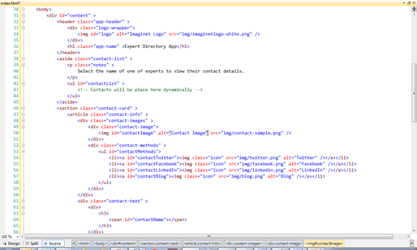
Our code is pretty straightforward HTML, except that we are using the new semantic tags like section and nav to provide some metadata to how our app is organized.
The semantic tags make it easier for screen readers to go through our web app and for some web crawlers crawl our site and understand what is what. With that laid out, we apply some CSS floating and positioning, and we are in business.
Author’s Note: This article is not focusing on backwards compatibility, but if you are worried about these new tags working in older browsers like IE7 or IE8, you can include use the Modernizr JavaScript library to make them work properly.
With our UI laid out, we are ready to move onto the logic side of things. For that, we are going to use JavaScript.
Iteration 2: The Web App (JavaScript)
This is the part where developers tend to shy away because they don’t think you can build a full application nothing but JavaScript. If you asked me two years ago, I would agree with you, but now I think it can really hold its own if you know what you’re doing.
Author’s Note: If you need some convincing, check out some articles by Julian M. Bucknall about JavaScript for C# developers , or if you like books on code check out JavaScript: The Good Parts by Douglas Crockford for a clear understanding of the language in a little over 100 pages.
We are going to use JavaScript for two things: our application logic and to create a contact object to encapsulate our contact data. In the src folder, you will see two files where main.js is the application logic and contact.js is the contact object. Let’s start with main.js.
main.js
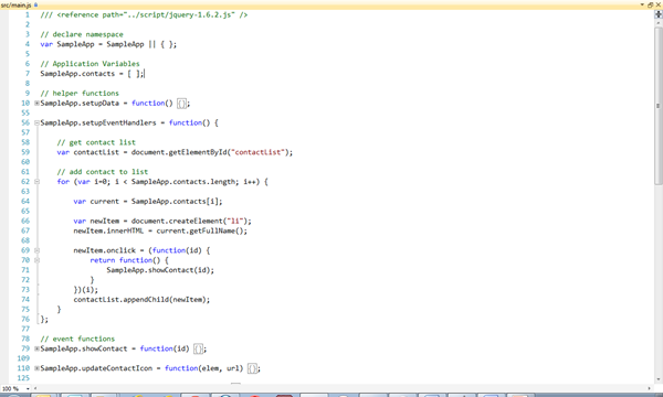 All of the JavaScript for the application is kept under a JavaScript namespace called SampleApp. By doing this we keep all of our functions and variables out of the global namespace and prevent our variable writing over something else, or someone writing over our own.
You might have also noticed that the images of code are from Visual Studio 2010. I tend to use VS2010 for my web development because: a) I’ve been working with VS since 2005, but not for web and b) the JScript Editor Extensions make the environment feel like my C# environment with code folding and intellisense.
All of the JavaScript code is kicked off with the SampleApp.initialize function (which is called on load because of the parentheses at the end of the function). The other function to check out is SampleApp.showContact which is the majority of our presentation logic, as it display the contact information stored in the second half of our JavaScript code, the contact object.
contact.js
Many developers believe that JavaScript cannot be an object oriented language. Fortunately for all us mutli-platform developers out there, they are wrong. I won’t get into the details here, but there are some great resources like this article from the MSDN or this one from Script Junkie that walk you through how to JavaScript to get things like public and private variables, or inheritance between objects.
For us, we only need one object, the contact object. Our object is pretty simple as it really just contains a number of getter functions and a couple of helper functions that fetch the private variables for us, which I do just like I would in any other OO application.
With our object created, you can see it being used extensively throughout main.js. We create new ones in SampleApp.setupData, and use the object’s functions in SampleApp.showContact.
With all our JavaScript written, and tied together with event handlers, we officially have an app!
…Unfortunately, it doesn’t look to hot, but we can fix that with a little CSS3.
Iteration 3: The Web App (CSS3)
CSS has really been the magic of the web for a long time, but for us it will be the magic for our multi-platform app (in more ways than one). For this bit of magic, we are going to make it look good with our traditional practices, but make some of that painful work easy with some of the new features, like Box Shadow.
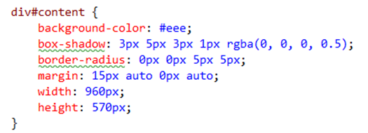
Generally, when it comes to implementing drop shadows or rounded corners developers tend to cringe, including me. With CSS3, the new box-shadow and border-radius property makes it easy-peezy lemon squeezy. Check out the class with this code:
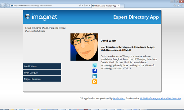
And with that, take a look at our app:
The JavaScript we are using on the presentation logic is displaying the contact and making the social media icons fade out if we don’t have that data (click on Ryan to see what I mean). The hover over effect is 100% CSS.
And there you have it! The Web Experience for our Expert Directory App is complete! We can push this out onto the web and get people using it ASAP. But that is only one platform, and one experience. Thanks to IE9, we can take our app experience beyond the web and go further by providing a desktop experience to our users.
Iteration 4: The Desktop App
Our next stop is the desktop experience, which if you think about desktop and web apps, they really aren’t all that different from the user experience side of things.
Web apps live inside of a web browser, which in turn, is a desktop app. One of the major differences in the experience is that when you use a web app, the window in which you view your app is part of the web browser experience, rather than your app’s experience. For example, the taskbar shows the web browser icon and provides web browser functions (in the case of Windows 7), and the look of browser window itself is branded for the developers of the web browser.
If we could change the web browser experience to better reflect our web app when it’s on screen, then we could provide our users with a custom desktop experience, and with Internet Explorer 9 Pinned Sites, we can do that with our existing code base.
I won’t go through the details of the implementation because there is a much better resource than this. Follow the first two steps at https://buildmypinnedsite.com/ and you’ll be done.
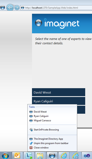 In our Expert Directory App, used the Imaginet sphere as my favicon, and added a bit of JavaScript to read query string arguments (see SampleApp.SetupUI to see the code in action). This allowed me to setup custom URLs based on their index in the SampleApp.contact array, and select the appropriate contact to appear when clicked on in the jump list.
Once the user pins the site to their taskbar, we not only get a branded window, but we also get some custom functionality in the taskbar. And with that, we have taken our existing code and expanded it to provide a custom desktop experience.
Author’s Note: I strongly recommend that you complete step 5 in the BuildMyPinnedSite tutorial as you’ll want to make sure your users know they can make your app a desktop app with no work at all.
Future Iterations: Mobile and Windows 8 [Hopefully]
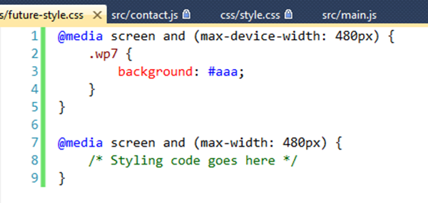
With the web and desktop experiences in the bag, we can take our code back to our boss’ smartphone by using Media Queries in CSS3. Media queries allow you to put some logic around your styling rules in CSS. If you check out the future-style.css you will these examples:
The first query will apply the style wp7 only to devices that have a maximum width of 480px (e.g. Windows Phone 7, iPhones, etc…). If you don’t want to be specific at the device level, you can apply your rules based on the browser width rather than getting device specific.
Microsoft has even announced the HTML5 and JavaScript apps will be able to run natively in the next version of Windows, which opens all kinds of new possibilities for the experiences we can provide for other devices.
In Conclusion…
I really hope that this post demonstrated that HTML5 and JavaScript have really come a long way from the days of Geocities and the infamous blink tag. If you have avoided JavaScript for this long, it just might be the time to start looking into again and see what experiences you can build with HTML5.
