CSS3 Gradients in IE10 PP1
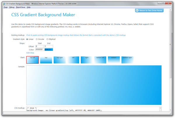
Recently, I’ve been playing around with IE10 PP1, which you can grab from the IE Test Drive site. So far, I really like what I see, especially the support for CSS3 gradients. In fact, if you care to see a sampling of this work, check out the CSS Gradient Background Maker:
So, how does this all work in IE10 PP1? From the IE10 Platform Preview Guide for Developers:
IE10 PP1 supports CSS3 gradients as background-image property values (plus the image value of the background shorthand property), as specified in the Gradients section of the CSS3 Image Values and Replaced Content Module, which, as of this writing, is in the Working Draft stage.
Gradients are images that transition smoothly from one color to another. IE10 PP1 supports linear, circular, and elliptical CSS3 gradients, each of which are specified by a gradient line and two or more stop points. Each point has its own color, and IE10 fills in the area between each set of points with a continuous color transition from one to the other.
Here’s how these rules break down:
- Linear gradient: -ms-linear-gradient( <starting point> , <stop color & offset> , <stop color & offset>… );
- Radial gradient: -ms-radial-gradient( <starting point> , <shape> <size> , <stop color & offset> , <stop color & offset, … > );
- Repeating linear gradient: -ms-repeating-linear-gradient( <starting point> , <stop color & offset> , <stop color & offset>… );
- Repeating radial gradient: -ms-repeating-radial-gradient( <starting point> , <shape> <size> , <stop color & offset> , <stop color & offset, … > );
If you check out the section on CSS3 gradients in the IE10 Platform Preview Guide for Developers, there are a few examples that demonstrate how they work.
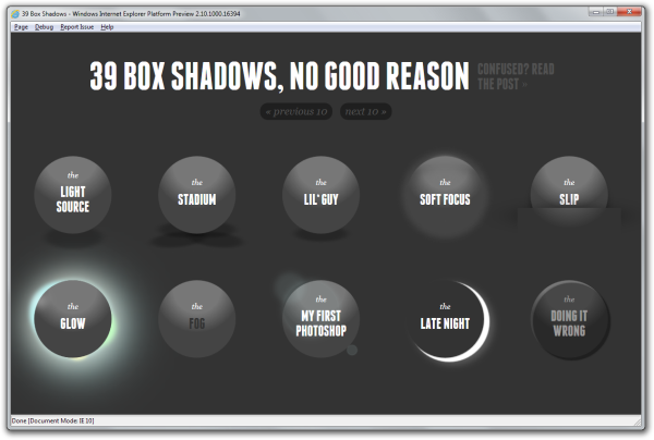
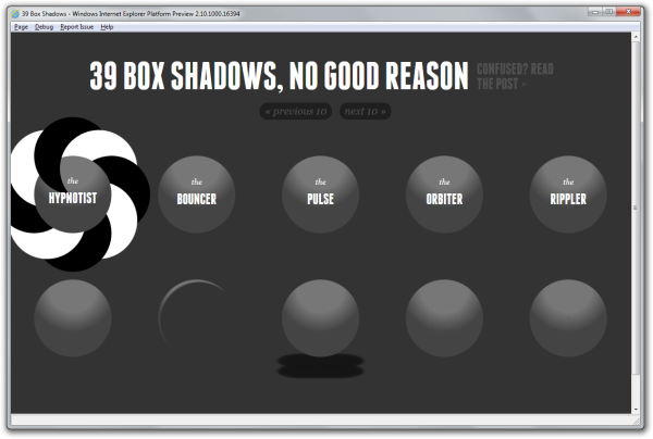
Currently, as part of a mental exercise, I’m in the process of getting Doug Avery’s (excellent) 39 Ridiculous Things To Do With CSS3 Box Shadows working in IE10 PP1. Although this demo focused largely on box-shadow (supported in IE9+), it also leverages CSS3 gradients, which I why I decided to try and get it supported on IE10 PP1. That, and the fact that’s it pretty cool. So far, I’ve had some success in just a couple of hours of work:
For each of these list items, there’s a CSS3 radial gradient applied. The original source used -webkit-gradient. (As progress is made by the CSS Working Group, it’s my hope that these vendor prefixes will be dropped in favour of a simplified syntax like linear-gradient.) For this work, I’m using -ms-radial-gradient. For the screenshot above, the text for “the SOFT FOCUS” is missing because text-shadow isn’t supported. I’m trying to get “the SLIP” to look a little better. I’ve almost got it looking just right.
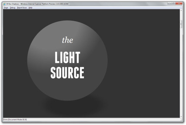
For “the LIGHT SOURCE”, the CSS3 gradient is applied dynamically via JavaScript. As you hover over the item, the radial gradient at the top of the item shifts to mimic a light source. The underlying radial gradient at the bottom of the item - representing the item’s shadow - moves in concert. Here’s a close-up of the behaviour in-action on IE10 PP1:
Here, I have my mouse cursor hovering on the left-hand side of the browser window. Notice that the radial gradient at the top and bottom of the list item are shifted to mimic a light source.
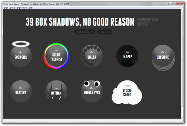
These list items are nearly pixel-perfect, except for “the DAZZLER”, which uses a CSS animation. Also, you’ll notice that there’s a border line that’s traced for “the IT’S SO CLOUD”. I’m confident that I’ll be able to figure out why this isn’t working properly soon.
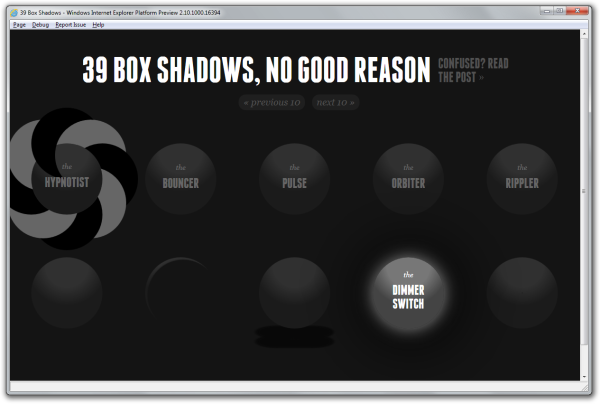
Without animations, it’s difficult to recreate the behaviour I’m looking for in CSS. However, it should be noted that hover event transitions are supported. For example, here’s “the DIMMER SWITCH”:
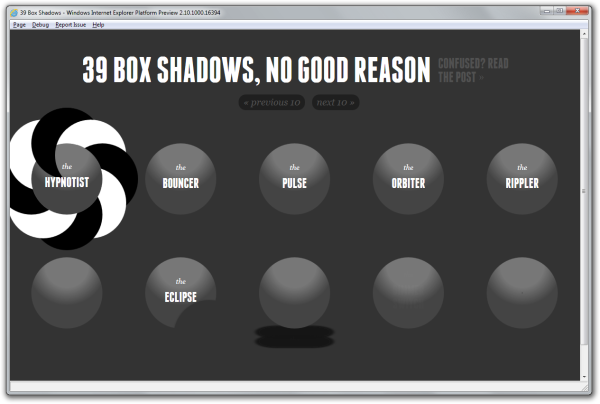
And, here’s “the ECLIPSE”:
Other items that work include “(the SECRET)” and “the WIPEOUT”. I’m having some difficulty with “the SHY GUY” but it’s mostly due to text alignment.
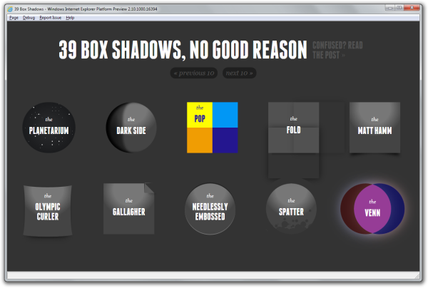
This page needs some more work but I’m mostly there. Items like “the FOLD” are a little trickier than I first thought.
For the most part, the conversions have been rather simple. For example, add -ms-transition rules with -webkit-transition rules. Or, include border-radius with -webkit-border-radius. That stated, the biggest challenge I’ve faced thus far is mapping -webkit-gradient to -ms-radial-gradient. CSS3 gradients aren’t the easiest things to translate between browser implementations. But, as you can see, many of them work well.
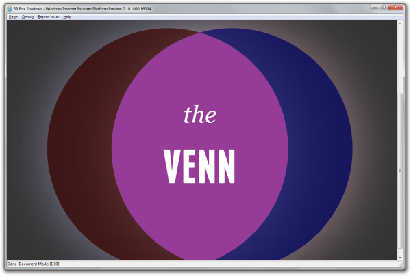
As a side note, I would like to point out the awesome work the Internet Explorer team has done around border-radius. In short, it’s wonderful. The team has nailed the implementation and it looks really good. For example, here’s a zoomed-in screenshot “the VENN” in IE10 PP1 (from above):
Check out the curves that are applied via border-radius. They are “buttery smooth” and look fantastic.
I’m tremendously excited by all the goodness added to IE10 PP1. You should check out it! You can download IE10 PP1 right now from the IE Test Drive site.
