Using Hadoop on Azure JS Console for Data Visualizations
In my last past I demonstrated a F# MapReduce program based on Hadoop Streaming. One thing that intrigued me was the possibility of using the JS Console for doing a quick visualization of the MapReduce output. So here is my first foray into the idea.
From the last example the data output was:
Android (00:00:06, 12:54:39, 23:59:54)
RIM OS (00:01:07, 13:52:56, 23:59:58)
Unknown (00:00:36, 10:29:27, 23:52:36)
Windows Phone (00:00:32, 12:38:31, 23:55:17)
iPhone OS (00:00:01, 11:51:53, 23:59:50)
proprietary development (14:29:20, 14:29:44, 14:30:17)
The data represents, for each mobile platform device, the min, average, and max query times. So if one wanted a quick visualization of the data, using the JS Console, the process would be as follows.
Firstly one would need to access the output of the MapReduce job and parse the data.
file = fs.read("/mobile/querytimesrelease")
data = parse(file.data, "device, querytime")
The output from these commands would be an array represented as:
[
0: {
device: "Android"
querytime: "(00:00:06, 12:54:39, 23:59:54)"
}
1: {
device: "RIM OS"
querytime: "(00:01:07, 13:52:56, 23:59:58)"
}
2: {
device: "Unknown"
querytime: "(00:00:36, 10:29:27, 23:52:36)"
}
3: {
device: "Windows Phone"
querytime: "(00:00:32, 12:38:31, 23:55:17)"
}
4: {
device: "iPhone OS"
querytime: "(00:00:01, 11:51:53, 23:59:50)"
}
5: {
device: "proprietary development"
querytime: "(14:29:20, 14:29:44, 14:30:17)"
}
]
Once we have the raw data in an array we would parse the “querytime” string into an integer representing the number of seconds for the query times. Picking the Average query time as an example one could write:
chart_data = $.map(data, function (e) {
average_label = e.querytime.substring(1, e.querytime.length - 1).split(", ")[1];
times = average_label.split(":");
return { device: e.device, average_label: average_label, average_secs: (parseInt(times[0]) * 360) + (parseInt(times[1]) * 60) + parseInt(times[2]) }
});
Again this gives us an array with an integer value that we can easily graph:
[
0: {
device: "Android"
average_label: "12:54:39"
average_secs: 7599
}
1: {
device: "RIM OS"
average_label: "13:52:56"
average_secs: 7856
}
2: {
device: "Unknown"
average_label: "10:29:27"
average_secs: 5367
}
3: {
device: "Windows Phone"
average_label: "12:38:31"
average_secs: 6631
}
4: {
device: "iPhone OS"
average_label: "11:51:53"
average_secs: 7073
}
5: {
device: "proprietary development"
average_label: "14:29:44"
average_secs: 6824
}
]
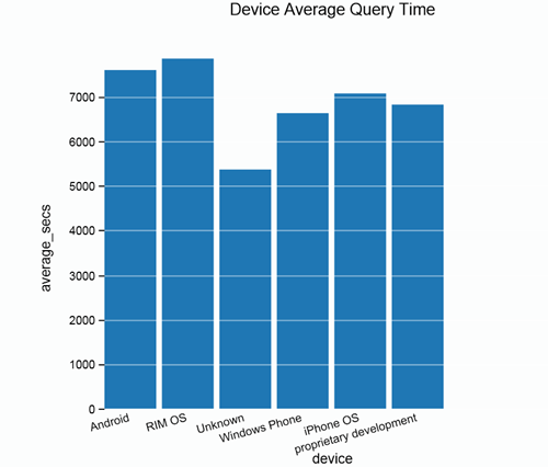
So once we have this array, plotting the graph becomes easy:
options = { title: "Device Average Query Time", orientation: 15, x: "device", y: "average_secs" }
graph.bar(chart_data, options)
This then renders the following graph:
Whereas this approach is very code based and dependant on a little JScript/JQuery knowledge, it can provide a quick validation of ones MapReduce.
