Design Story: Managing Human Capital for Large Organization
After joining Microsoft for almost a year and an half now, I'm still finding my way through the company organizational structure. Whenever I met a new person at Microsoft, I'd like to see the organizational tree they belong to and how their orgs relate to mine. A good visualization tool is definitely needed. :)
In this design story, we introduce you the R&D team at Nakisa. They are a Canadian software company who is specialized in building Visual Workspace Management Solutions. I asked their master minds who are the architects and designers behind their OrgManagement Series application to share the high level design challenges, process, and best practice with you.
 |
|


"Nakisa OrgManagement Series is a powerful web-based suite of enterprise software solutions used to access, visualize and model human capital and organizational directory information as well as enhance communication and collaboration company-wide. Nakisa’s goal is to help organizations make strategic decisions about how to better manage their global talent and optimize workforce performance by empowering them with a 360-degree view into their human capital data. " - Nakisa
What are some high level design goals for OrgManagement Series?
Charles : We wanted to deliver inaccessible HCM information to an entire organization in a very visual and easy to understand format. Surprisingly, if you talk to employees in large organizations, they generally have no idea where they actually fit in the organizational structure or understand how the corporate entity is organized!
HCM systems in large enterprises are very rich in information that can help information workers make better decisions each and every day. The problem is that this information is often stored in many different systems, in a format that is difficult to understand and difficult to access because of strict security requirements.
In the future, we want to, not only introduce a fresh new look and feel that is in tune with the current trends, we also want to bring a richer user experience to the thin client. It is critical for us to continue to improve the user interface while make our application as accessible as possible.
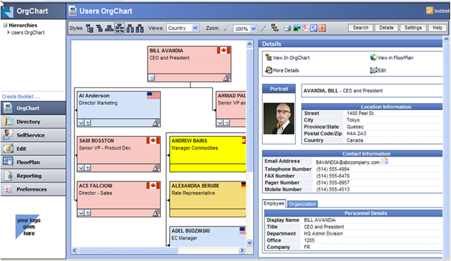
Farzin: Organizational information is difficult to visualize because it depicts the relationships between individuals within the organization. It is much easier to visualize as a ‘tree’ or ‘graph’, rather than trying to imagine it just by looking at flat text. Nakisa presents this information as an organizational chart, which is easy to understand, and very intuitive for any information worker, so that they not only have access to information they did not have before they are able to understand and use it.
How did you involve users throughout your design and development process?
Charles: Actually, inspiration for our orgchart solution came from a user who shared with us, the pain of trying to access and visualize organizational information. From that humble beginning, we realized that the end user was truly the person that needed to be happy with the solution. As a result, we always approached the product as an evolving entity, taking the user’s feedback to guide us.
The first iterations of the product provided users with a static orgchart that helped them solve their problem of visualizing organizational structure. The users looked at the static orgchart, and then asked about how they can see how the orgchart can be linked with other information within the organization, and we realized that the ability to navigate through the orgchart was a need that we had not foreseen! Taking that lesson to heart, we went through much iteration to add in functionality that included navigation and user customization, while always making sure that the application is easy to use.
What are some design challenges when you were designing the system?
Charles: Actually, just trying to make an application intuitive and easy to use can get really difficult. We try to balance offering many capabilities while keeping the interface simple so that the user doesn’t get confused!
We looked at many ways to create our design so that actions are very obvious, but at the same time, every function available that is not visible must be hidden in the user interface somewhere… sometimes making it difficult for the user to remember and use.
Farzin: Another design challenge we faced was to make the orgcharts customizable for any organization. The problem is that the requirements for displaying organizational information is very specific to each company, so we needed to develop a very customizable engine so that we can meet all the client’s requirements.
What’s your team’s design process and some best practices that we can learn from?
Charles: I think the most unique aspect of Nakisa’s design process is that we involve each and every developer in the user interface design. I find that there is this perception that developers don’t care about the user experience, and that they are perfectly to happy create bad user interfaces so long as it meets the requirements. I think that is actually very wrong! Developers are very in-tune with how the user experience is presented because they use a wide variety of software every day. They appreciate good designs, and can easily find flaws in the bad ones. The problem is that the industry puts a creative barrier around developers, saying that they are too technical, so they should not be involved with user interfaces.
In Nakisa’s case, we bring the developers together to critique the user design, they often leverage their own experiences with new and nifty user interfaces into our design, keeping our product design cutting edge. Sometimes, we need to put a brake on ideas that are too different because we need to ensure that we always maintain a clean, professional look. To achieve that look, we focus on small details to introduce a new and trendy UI (such as reflections, shadows, use of different palettes and icon design), while maintaining a strong consistent layout to achieve a clean and professional user interface.
Farzin: Yes, talking about focusing on details, that is one of the best achievements in our design process. We have several internal and cross team meetings where developers can share their ideas and reuse their experiences. Developers come up with new UI ideas in these meetings that we then have to capture and align together. Some ideas are ready to use right away, some of them have to be broken down and polished.
To solve this issue, we came up with UI design pattern. So before jumping into code, a dedicated team finalizes and documents the UI design. This process is an iterative process and the rest of the developers act as stakeholders. The outcome of this effort is a reusable UI design pattern that we can apply it on all of our products.
Technorati Tags: UI Design,Nakisa,Design Story,visualization,OrgChart