Logo Designs from EnergizeIT Demo Competition
EnergizeIT was a lot of fun and especially got the crowd energized during the demo competition after the keynote in the morning. I had the opportunity to design logos for all three demo competition teams in Expression Design 2. I've never had any graphics design training, but playing with the design ideas and drawing tools, I found myself really enjoying logo design. Although I had to keep secret about the designs before the competition, I can share my design concepts with you now and introduce my two favourite features in Design.
Team: Connected Road Warriors 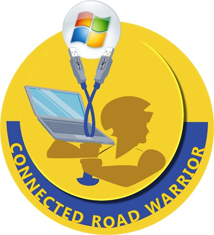 |
Team requests for the logo:
Design concepts:
|
Team: Shell Shocked  |
Team requests for the logo:
Design concepts:
|
Team: Code Ninja 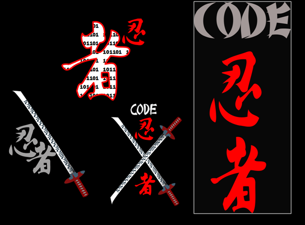 |
Team requests for the logo:
Design concepts: I had a few ideas for the design and the final logo went with the one on the right with white box outline. My favourite design is actually the one with single katana (one on the lower left). On the blade of the katana is a string of "1s" and "0s" to suggest "code." The one in the upper middle has an interesting placement of the two characters which represent "Ninja." I filled one of the character with "1s" and "0s" again to suggest "code." |
Throughout my designs for these logos, I really liked the "Colour Dropper" tool in Expression Design. Not only you can drop colours with existing colour swatches but I also used it heavily for capturing colours in real photographs then drop them into my drawing shapes. It's like magic. :) The second feature I found very handy is the "Selective Export" function. I was able to compose many alternative designs on one canvas and select any one or more components on the same canvas to export into different images types. No need to turn on or off layers to make sure you export the right objects.
Technorati Tags: Expression Design,EnergizeIT2008,Logo Design