Microsoft Download Center: Silverlight or not?
Thanks for Ben's comment to my last post and a reality check! :) The new download center with Silverlight is in its beta, there are a number of usability issues we need to improve on especially that there are no accessibility features in the current version. With that said, the comment got me thinking about the real value of Silverlight from a user experience perspective. I'd like to give my 2 cents and keep the discussion flowing.
I totally agree with Ben that we shouldn't do something just because we can. In the case of Microsoft Download Center, can we improve users' experience when they visit the center with Silverlight? First we need to understand user needs.
There are three main types of users come to use the download center:
- Searcher: know exactly what they want to download and want to find it as fast as possible
- Browser: know the general category or partial name and want to have a way to browse through and find it quickly
- Surfer: no particular target in mind and just want to find out what's new
For all three types of users, it's important to be efficient. The site needs to present the options clearly, so users know how to take the initial actions and find what they need quickly. For example, Searchers will go directly to search. With that in mind, I compared the Silverlight version (SV) with the original version (OV) of the download center to investigate what has improved and how Silverlight is and could be used.
| Microsoft Download Center Silverlight Version | Microsoft Download Center Original | |
 |
VS. | 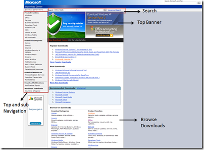 |
Less is more - efficient navigation and better use of screen real estate with smart Silverlight widgets
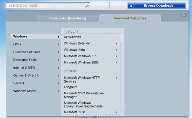
- The OV has quite bit of wasted screen space such as the gray area in the image above. There's a lot of information squeezed into the narrow content column. Since the page is static, many product links are forced to be present on the page and visible all the time, making the homepage became very long. For example, a user wants to browse the products in Windows category. In OV, the user has to leave the current page and go to a new page that has the complete list of Windows products (3857 in total!) to find what they want. In SV, the user can simply click on the "Browse Download" button on the homepage. A Silverlight overlay panel will appear for the user to choose either browsing alphabetically or browsing by categories. They can further narrow down the products they want in the category list and get a much more manageable list without leaving the homepage. See the figure below on the left.
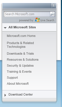
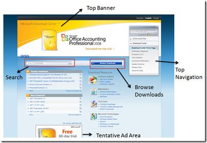
- The site navigation on the homepage is another example of using Silverlight to hide information and reduce complexity to help users navigate more efficiently. In OV, the top and secondary navigation are listed together in the left navigation panel and people may spend more time deciding whether they want to choose from "Product Family" or "Product Categories." The two terms have minimally different, and it's confusing to me to have them in the same navigation panel. More importantly, there's no easy to way to go to other parts of Microsoft.com site from the download center. Typically, users have to leave the Download Center and then either go to Microsoft.com homepage or go to the site map as their starting point to navigate from there. In SV, navigation options are all located at the top right Silverlight navigation panel (see top right image). Users can choose whether they want to navigate all Microsoft sites or just within the Download Center. Since the panel is collapsible, it didn't take more screen real estate to have the extra navigation options. Also, this panel exists in all parts of Microsoft.com sub sites, there's a consistent experience. Although one would argue that the overlay or collapsible panels can all be implemented in AJAX. The differences are how easy to create these elements and how reusable they are.
With Silverlight, it's easy to create dynamic banners. Instead of having several static images of new downloads in the top banner like in the OV, we can reduce the visual clutter by using animated banners. The current SV implementation uses a slideshow view. Another option is to use carousel display to focus on one item at a time while having other items in the background.
The overall layout in SV is much simpler and more attractive than OV. For instance, the Search option is more dominant. Since Search is probably the most important feature for the download center, it needs to be obvious. In the old design, Search is above the top banner, which is very hard to spot if you are not familiar with the site. This may have less to do with Silverlight but more to do with layout design, however, because the nature of XAML for UI mark-up. The canvas layout element allows very flexible placement for elements within. It's very easy to add and relocate elements to support updates for the site.
Take it even further - desktop like rich experience
In order for users to truly benefit from Silverlight's rich experience, we need to take the design even further than the current beta site into areas that are even harder to produce with traditional web technologies. I thought of couple of scenarios to illustrate my point:
- Wizard guide for downloading. For users that have trouble finding what they need or don't know where to start, a on-demand wizard type of help can guide users to narrow down their choices according to what they want. There could be video tutorials as well showing how to use the site most efficiently or the download procedures. Instead of reading the "Read Me" file, they can now simply watch/listen a one-minute video.
- Support organic growth and scalability of the site. As more and more products are available for download, Silverlight could be really used for creating effective visualization to help users find what they need. For example, in the browsing Windows products example I mentioned earlier, right now the navigation list is embedded in a scrolling panel which is not efficient for navigation. Some sort of visualization techniques implemented in Silverlight such as fisheye view could help users to navigate more efficiently.
Besides the business reasons, I do see the value of using Silverlight in Microsoft Download Center from a user experience perspective.The key is to use Silverlight's rich capabilities to serve user needs not for the sake of using new technology.
Technorati Tags: Silverlight, Microsoft Download Center, User Experience Design