DesignThinkers 2007 Thoughts I
Last week I attended Canada's largest Graphics Design conference, DesignThinkers 2007 put on by RGD. It was my first time attending the conference, apparently if it was your fifth time or more, you are a DesignThinker Master. I definitely hope to be a DesignThinker master one day since the conference was a lot of fun to go to. This year the conference theme is "What matters to you?" Before the conference, attendees can express what matter to them by an interactive visualization tool (see below left). I entered my answers, it was interesting to see how others think who have similar work experience as me.
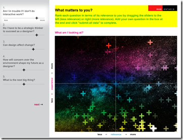 "The graph shows a visual representation of the last 100 responses submitted through the interface. Each '+' represents one person's response to the highlighted questions on the left. The position of the '+" on the vertical axis shows the number of years of experience, while the horizontal position represents the level of relevance. The level of transparency of each '+' is a visual representation of the length of time since the response was received, with the last response being the least transparent."
For example, I think graphics designers will be in trouble if they don't do interactive work because we are entering a digital age that static images may not be enough to tell a story from an visual designer perspective. Viewers and audience participation becomes more and more important. From the graph, you can see a lot of designers think the same (lower right quadrant).
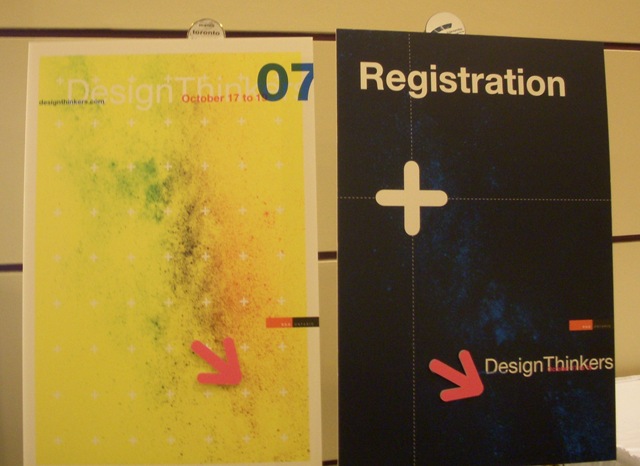
This is a fun pre-conference experience that the organizers are providing to the attendees. In addition, the experience links back to graphics design, which this particular crowd can really appreciate. The conference pamphlets and signs were also created based on the graph, which ties the whole conference brand and experience together. Good Job Design Thinkers!

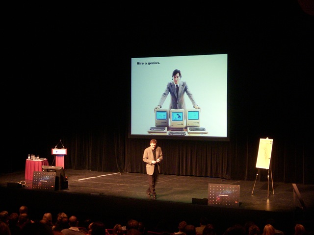
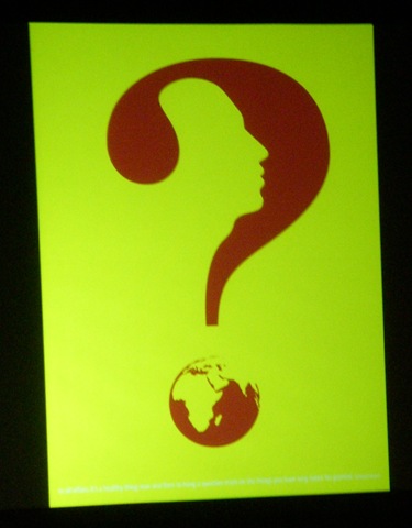
It's my first time going to a graphics design conference. I felt one of the biggest differences from other conferences I attended is in presenters' presentation style. Most of them have these image with little text slides, use powerful colors (e.g. the question mark poster by Chaz Maviyane-Davies), and integrate videos. It's probably easier for graphics designer to create image slide with little text because most of their work is visual. However, they have to think how these images tie together and tell a story. Some of them speak in a very poetic tone so that each image almost represents a line in a poem. A big eye opener to me!
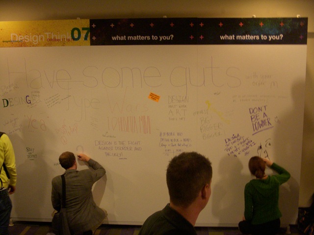
The conference organizers also placed a graffiti board outside of the keynote theatre. Attendees can use the board to express what matters to them and share design inspirations.Conference goodies are feasts for both mind and eyes. :-)
Technorati Tags: DesignThinkers2007, Graphics Design, Canadian Design Event