Inspiration for Information Visualization
Earlier this month, Smaching Magzine posted a great list on modern approaches to Data Visualization. More strictly speaking, these are the approaches for information visualization (InfoViz). There's a slight difference between the two. Here are the definitions from Wikipedia:
Scientific (or data) visualization deals with data that has a natural geometric structure (e.g. MRI data or wind flows).
Information visualization handles more abstract data structures, such as trees or graphs.
From user experience perspective, good InfoViz is such an important part to improve people's productivity and satisfaction. Couple of things stood out to me from the post:
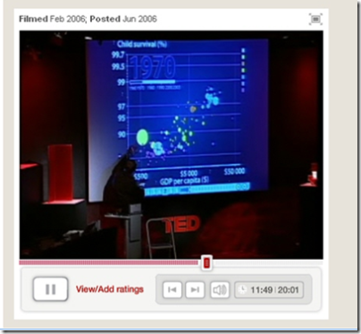
- Clever use of animation to indicate data trends, which brings static data charts to live and viewer can appreciate the change more. Check out Hans Rosling TED Talk.
- Very few visualization techniques use 3D visualization. It probably makes more sense to use 3D visualization to view scientific (or data) visualization such as analyzing a cancer cell. However, for more abstract data structures, often times 2D are sufficient and more effective. I especially like the following visualization examples.
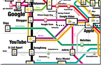
Trend Map 2007 Three Views
Enjoy, Qixing
Technorati Tags: Information Visualization