MIX07 Session Recap #2: Designing with AJAX: Yahoo! Pattern Library
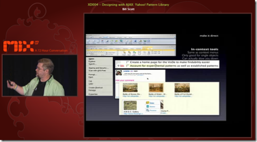
Bill Scott's presentation on Designing with AJAX: Yahoo! Pattern Library was one of my favorite sessions from MIX07. It was really nice to hear from someone that has so much experience in UI design pattern space. The presentation was filled with tons of examples from Web2.0 websites illustrating the design principles for Rich Internet Applications (RIA). It's a great overview of the Yahoo! Design Pattern Library for designing rich UX on the web and how they tie into design principles.
So, what do we really mean by "Rich" when we talk about Rich Internet Applications? Bill suggested Interaction + Feedback + Information = Richness. The key principles for each aspect of richness are:
- Interaction: prefer direct, lightweight, and in-page interaction
- Feedback: provide invitations beforehand, transitions during, and feedback after interaction
- Information: think in objects and tie information to interactivity
In addition to the key principles, I found some of the small tips Bill offered during his presentation to be particularly insightful.
- When visual presentation is created for showing off technology rather than solving problems, you know it'll be a poor use of design. He gave the simple example of an online rating system. One design is to let users drag items into a particular ranking. It's fancy interaction but quite heavyweight and not very efficient. The lightweight design is to just use star rating (i.e. checking from 1 to 5 stars to indicate how you like something).
- Rethink the user's mental model, not the page model. Every page jump is a mental speed bump. Thus, when displaying a search results, the scrolling model (i.e. users scroll down the page to see all the search results) does better than page model (i.e. search results are distributed into multiple pages, and users go from one page to another to view all the results) because users don't need to go through the delay of page loads. However, scrolling model suffers from architecture scalability problem because all the search results have to be loaded on one page. Live Search Web used to use a scrolling model but was replaced by a page model due to scalability problem. However, Live Search Image still uses scrolling model, and users can use a slider bar to control the size of image display (like a zoom feature).
- Showing transitions for user interactions helps users to understand the results of their interactions. The catch is that you only need to hint the transition and users can fill in the blank. For example, after deleting a photo, the photo fades away. The visual cue only needs to indicate the initial fading. Then, even if the the photo suddenly disappears, it's enough for users to understand what happened. This way, designers can design more efficient visual feedback.
With the early adoption of Silverlight, I think it's important that we take lessons from these well thought design patterns from web and desktop. Silverlight enables Zoom and Pan, but it doesn't mean we should use it whenever we can. "Great power comes with great responsibilities." Let's start to use it with caution and think about what design patterns we can create for Silverlight.
Useful Links