Top 10 Quick Tips for Building Great Mobile LightSwitch Apps
I’ve been building a lot of HTML clients using LightSwitch lately so I thought I’d share some quick tips that you can use to build great mobile apps. (You’ll need Visual Studio 2012 Update 2 to get the LightSwitch HTML client.)
#1 – Prefer Tile Lists for Browse Screens and utilize Rows & Columns layouts
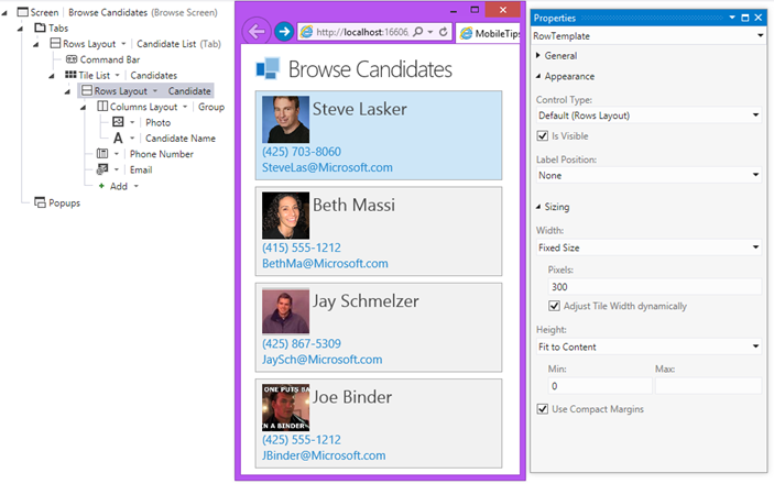
Because LightSwitch will automatically scale screens to fit different form factors, picking a Tile list instead of the default List control on your Browse Data screens can be a good idea, particularly if you have multiple fields you want to display on the tile. Utilize the Columns Layout control along with the Rows Layout to place data nicely on the tile. By default the tile width will adjust automatically to fill up the screen (but no smaller than the width you specify). If you always want a fixed with, select the Rows Layout and uncheck “Adjust Tile Width dynamically” in the properties window.
#2 – Show filters as Popups to conserve space
All screens have a Popups area at the bottom of the content tree that you can use to design “popup” dialogs specific to that screen. You can use them to display/collect additional or optional information on a screen. Prefer to utilize these popups on mobile devices when you’re designing your search screens. Your optional search fields won’t take up precious space which allows the important content to flow to the top.
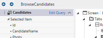
To quickly add an optional filter, select “Edit Query” in your View Model in the Screen Designer…
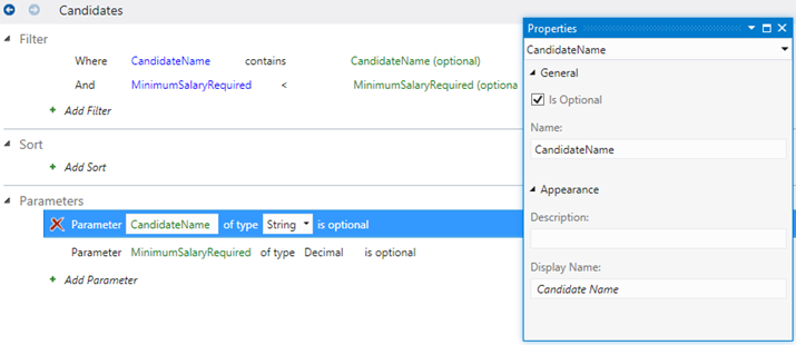
Add a filter with optional parameters….
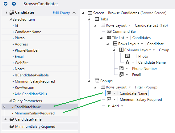
Select the Popup node in the tree and click “Add Popup”. Name the group “Filter”. Then drag the optional parameters into the popup group. This will automatically create local screen properties for you.
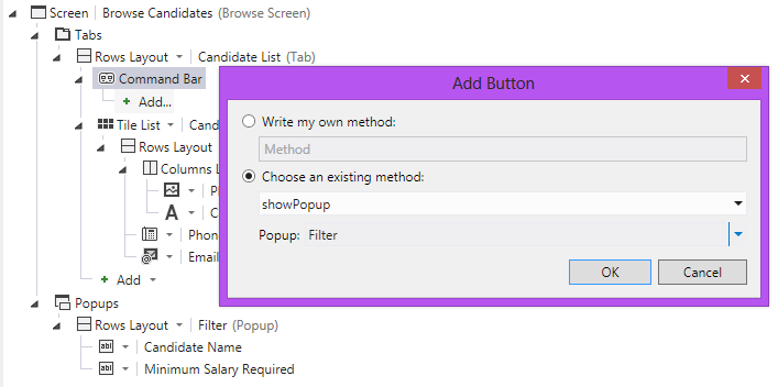
Finally add a button to the command bar and set the tap action to display the popup. Change the command bar icon to “Filter” in the properties window if you like.
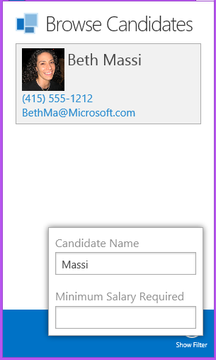
When the user clicks the button, the popup filter is displayed:
Note that you may prefer to create a global query instead so you can reuse the filtered query across screens – see tip #6 below.
#3 – Consider your Master-detail options
A little while back I wrote about the different ways you can display master-detail data on screens. If you missed it: Master-Detail Screens with the LightSwitch HTML Client
Here are some tips from that article to keep in mind:
- LightSwitch will automatically adjust the screen layout as necessary for different form factors.
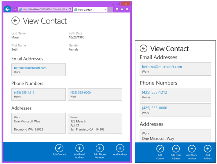
- Using Tab controls for master-details screens is a good idea when you will potentially have a lot of child data to display or you are targeting smaller mobile devices like phones. This limits the amount of information that a user has to view/edit at once. This is the default layout you get on screens when you select multiple sets of data to display.
- Showing all the data on a single tab works well for smaller sets of data where you’ll never have more than a handful of child data to view/edit at once (like in the following screenshot) or when your users are using larger devices like tablets.
#4 – Use Placeholder text to explain what the field is (like a short tool tip)
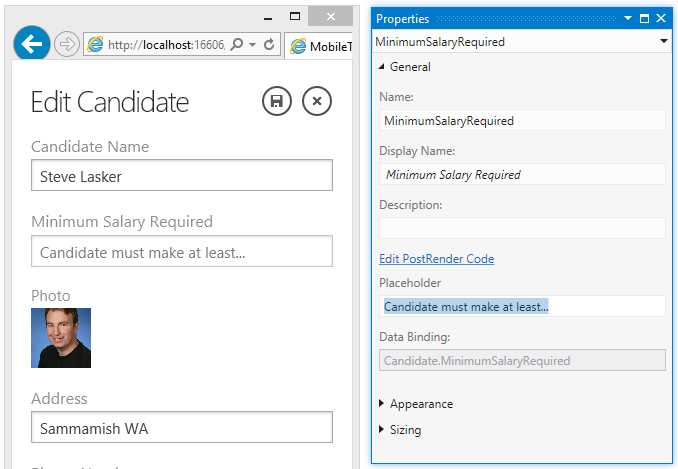
You don’t have tooltips on a mobile device (because you don’t have a mouse), so instead you can utilize the HTML5 placeholder text in input controls. Just set it in the property sheet and the text is displayed dimmed until the user enters some data.
#5 – Setting the fetch/page size
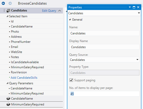
This tip applies to any client, not just mobile devices. LightSwitch automatically handles data loading asynchronously and in pages. For Browse Data screens the default page size is 45. On a mobile device, when users swipe to the end of a list the next page of 45 rows is dynamically loaded. You can set the page size in the screen designer. Select the Query in your view model and then set it via the properties window.
#6 – Sort your data sets using screen or global queries
This tip applies to any type of screen on any device. By default the data in your data sources are retrieved in the order they were entered into the data source (oldest to newest) and that’s usually not the order we want data displayed. There’s a couple ways you can use queries to provide a base sort. If you’re using a set of data only on one screen, you can click the “Edit Query” link on your view model of the screen designer, just like in tip #2, and provide a sort there.
However, if you’re using a set of data across screens then it’s better to create a global query and use that on your screens. In fact, queries can be “built up” so you can use a query as the source of another query. That way you can have a base query that sorts the data and then you can use that as the source of subsequent queries. (For more info on queries see: Filtering Data with Queries on MSDN)
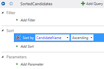
To create a global query, right-click on the Entity in the Solution Explorer and select “Add Query”, then define a sort using the query designer:
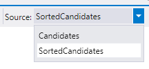
Now when you create additional queries you can use this sorted query as the source.
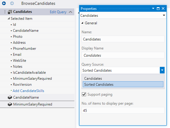
Once you have the global query set up the way you want, you can select the query as the screen data when creating screens. However if you already created a screen, you can change the source query by selecting the query in your view model in and setting the Query Source property.
#7 – Sort pickers using global queries
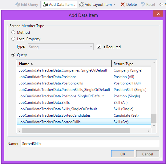
Similar to tip #6 above, you should also sort any data pickers on screens so that the list of choices are displayed sorted to the user. Create a global query that sorts the data like I showed above. Then to use the query as the source of the picker, first add the global query to your screen by clicking “Add Data Item…” button and selecting the sorted query you defined.
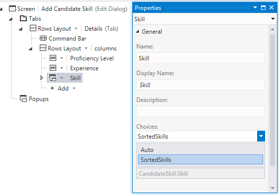
Then select the picker in the content tree and change the Choices property to the sorted query.
#8 – Use your own logo and splash screen images
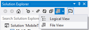
If you want to specify a logo that appears on the Home screen (the first screen) of your mobile app, simply replace the default one. Flip to File View in the Solution Explorer…
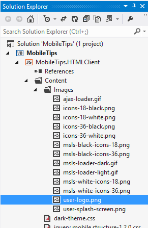
Then expand the HTML client project’s content\images folder and replace the user-logo.png with your own image. If you want to also change the splash screen that is displayed when the app is loading, then replace the user-splash-screen.png.
#9 – Customize the login page
If you’re using Forms Authentication then you probably want to change the login page to also show your logo. Andy showed us how to do this in: Signed-In Part 4 – Authentication and Branding
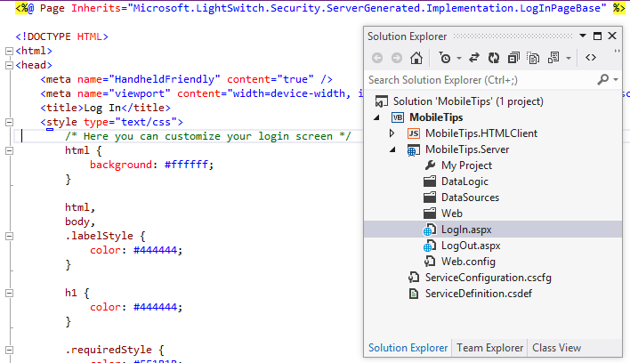
While in File View, expand the Server project and you will see the LogIn.aspx and LogOut.aspx pages. Feel free to customize these pages exactly how you want.
For more information on LightSwitch authentication see: LightSwitch Authentication and Authorization on MSDN.
#10 – Make your apps pretty with ThemeRoller for jQuery Mobile
The easiest way to style a LightSwitch HTML client is to use ThemeRoller at https://jquerymobile.com/themeroller/. First decide on whether you want to go for a darker theme or a lighter theme because depending on that, you’ll want to first pick the corresponding LightSwitch theme which defines either black or white button images (for save, home, cancel, loading, etc.) as well as default text colors. LightSwitch comes with two built-in themes, the light theme (default) and the dark theme. To change to the dark theme, first flip to File View in the Solution Explorer and expand the HTML client project.
Open the default.htm and change the stylesheets to the dark theme:
 <link rel="stylesheet" type="text/css" href="Content/dark-theme.css" />
<link rel="stylesheet" type="text/css" href="Content/msls-dark.css" />
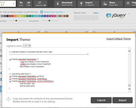
Next open the dark-theme.css (or light-theme.css if you are using that) and copy the contents into your clipboard. Then click the “Import” button on ThemeRoller and paste the css into the window to import the theme. This will be your starting place for customizations.
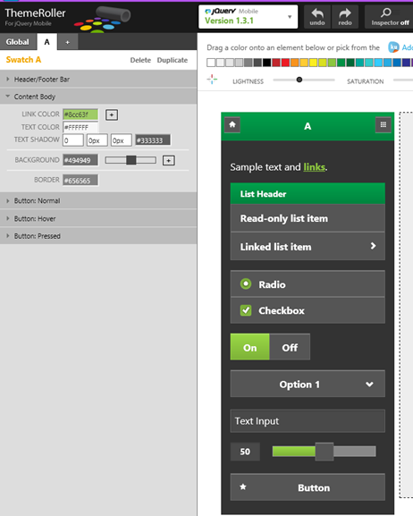
Then simply drag colors from the palate to areas on the swatch, or modify the properties on the left to design your perfect theme.
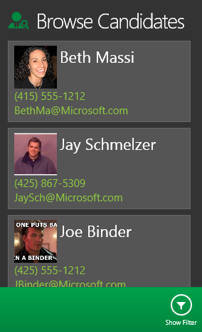
When you’re done, click the Download button to name your theme and download your new CSS. Extract the zip, and then copy your theme to the content folder and update the default.htm to use it.
<link rel="stylesheet" type="text/css" href="Content/green-theme.css" />
#11 BONUS TIP! – Use Edit & Refresh when designing HTML screens
There’s one last bonus tip that I should mention that makes designing HTML client screens very quick. When you make any visual change in the screen designer, CSS or even change your JavaScript screen code, you don’t have to stop debugging to see the changes. Simply hit “Save all Files” in Visual Studio and then refresh your browser to see the changes applied.
I could go on with a lot more tips and tricks but these were the most important ones that came to mind when designing HTML client screens. You should be able to use them immediately to quickly make your mobile apps that much better. Got more tips? Add a comment below!
Enjoy!
