Filtering Lookup Lists with Large Amounts of Data on Data Entry Screens
First off let me say WOW, it’s great to be back to blog writing! Sorry I have been away for a couple weeks – I’ve been working on a lot of cool stuff internally since I got back from my trip. And I know I have a loooooong list of article and video suggestions from all of you that I need to get to so thanks for bearing with me! Today I’m going to show you another common (and often requested) technique when creating data entry screens.
In my previous posts on data-driven lookup lists (or sometimes called “Pick Lists”) I showed a few techniques for formatting, editing and adding data to them. If you missed them:
- How to Create a Multi-Column Auto-Complete Drop-down Box in LightSwitch
- How to Allow Adding of Data to an Auto-Complete Drop-down Box in LightSwitch
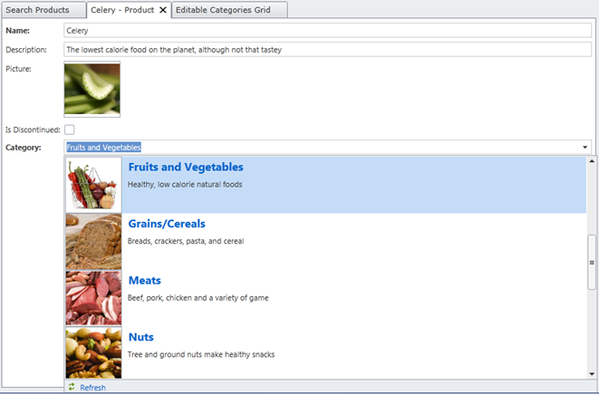
In this post I’m going to show you a couple different ways you can help users select from large sets of lookup list data on your data entry screens. For instance, say we have a one-to-many relationship from category to product so when entering a new product we need to pick a category from an auto-complete box. LightSwitch generates this automatically for us based on the relation when we create the product screen. We can then format it like I showed in my previous example.
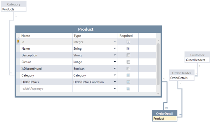
Now say we’ve set up our product catalog of hundreds or even thousands of these products and we need to select from them when creating Orders for our Customers. Here’s the data model I’ll be working with – this illustrates that a Product needs to be selected on an OrderDetail line item. OrderDetail also has a parent OrderHeader that has a parent Customer, just like good ‘ol Northwind.
In my product screen above there are only about 20 categories to choose from so displaying all the lookup list data from the category table in this drop down works well. However, that’s not the best option for the product table with lots of data -- that’s just too much data to bring down and display at once. This may not be a very efficient option for our users either as they would need to either scroll through the data or know the product name they were specifically looking for in order to use the auto-complete box. A better option is to use a modal window picker instead which allows for more search options as well as paging through data. Another way is to filter the list of products by providing a category drop-down users select first. Let’s take a look at both options.
Using a Modal Window Picker
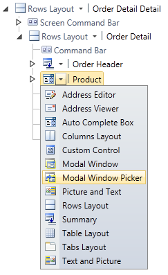
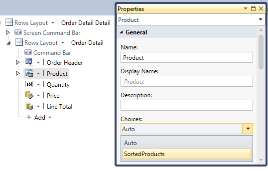
Say I have selected the Edit Details Screen template to create a screen for entering an OrderDetail record. By default, LightSwitch will generate an auto-complete box for the Product automatically for us. It also does this for the OrderHeader as well since this is also a parent of OrderDetail. On this screen however, I don’t want the user to change the OrderHeader so I’ll change that to a summary control. I’ll also change the Auto Complete Box control on the Product to a Modal Window Picker:
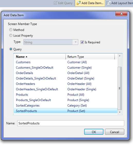
I also want the products to display in alphabetical order so I’ll create a query called SortedProducts and then at the top of the screen select “Add Data Item” and then choose the SortedProducts query:
Once you add the query to the screen, select the Product in the content tree and set the “Choices” property to “SortedProducts” instead of Auto.
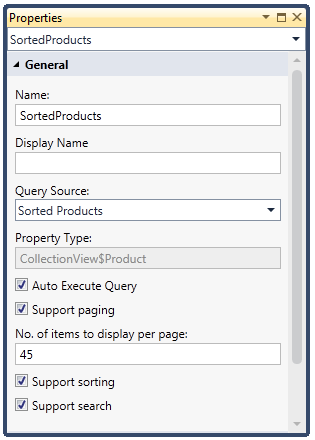
You can also fine-tune how many rows of data will come down per page by selecting the SortedProducts query and then setting the number of items to display per page in the properties window. By default 45 rows per page are brought down.
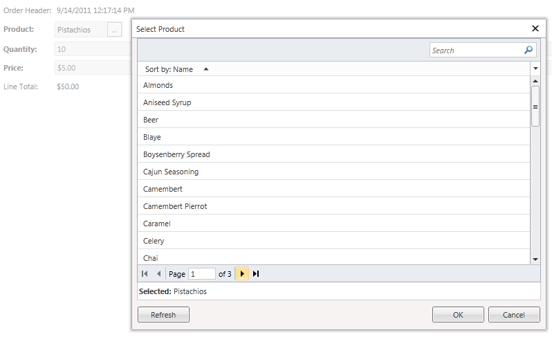
Now hit F5 to run the application and see what you get. Notice that when you run the screen you can now select the ellipses next to Product which brings up the Modal Window Picker. Here users can search and page through the data. Not only is this easier for the user to find what they are looking for, using a Modal Window Picker is also the most efficient on the server.
Using Filtered Auto-Complete Boxes
Another technique is using another auto-complete box as a filter into the next. This limits the amount of choices that need to be brought down and displayed to the user. This technique is also useful if you have cascading filtered lists where the first selection filters data in the second, which filters data in the next, and so forth. Data can come from either the same table or separate tables like in my example – all you need is to set up the queries on your screen correctly so that they are filtered by the proper selections.
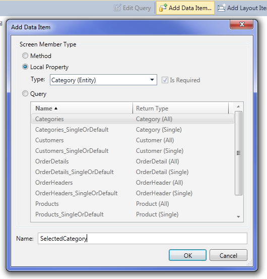
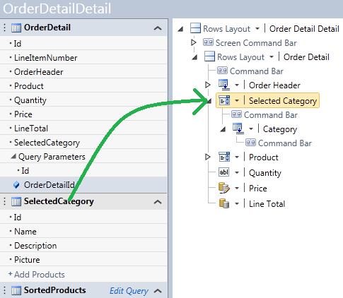
So going back to the OrderDetail screen above, set the Product content item back to an Auto Complete Box control. Next we’ll need to add a data item to our screen for tracking the selected category. This category we will use to determine the filter on the Product list so that users only see products in the selected category. Click “Add Data Item” again and this time add a Local Property of type Category called SelectedCategory.
Next, drag the SelectedCategory over onto the content tree above the Product. LightSwitch will automatically create an Auto Complete Box control for you.
If you want to also sort your categories list you do it the same way as we did with products, create a query that sorts how you like, add the data item to the screen, and then set the Choices property from Auto to the query.
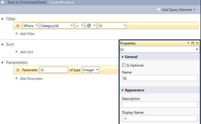
Now we need to create a query over our products that filters by category. There are two ways to do this, you can create a new global query called ProductsByCategory or if this query is only going to be used for this specific screen, you can just click Edit Query next to the SortedProduct query we added earlier. Let’s just do it that way. This opens the query designer which allows you to modify the query locally here on the screen. Add a parameterized filter on Category.Id by clicking the +Filter button, then in the second drop-down choose Category.Id, in the fourth drop down select Parameter, and in the last drop-down choose “Add New…” to create a parameterized query. You can also make this parameter optional or required. Let’s keep this required so users must select the category before any products are displayed.
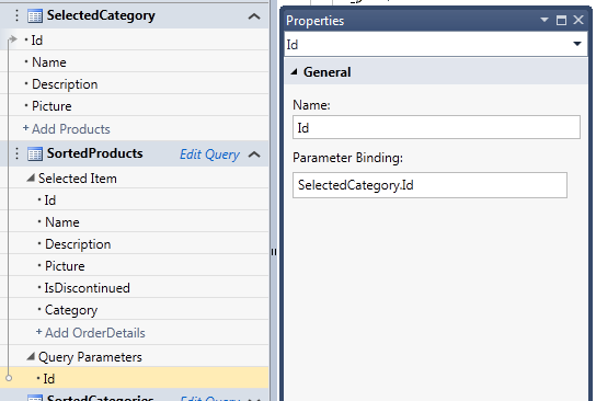
Lastly we need to hook up the parameter binding. Back on the screen select the Id parameter that you just created on the SortedProducts query and in the properties window set the Parameter Binding to SelectedCategory.Id. Once you do this a grey arrow on the left side will indicate the binding.
Once you set the value of a query parameter, LightSwitch will automatically execute the query for you so you don’t need to write any code for this. Hit F5 and see what you get. Notice now that the Product drop down list is empty until you select a Category at which point feeds the SortedProducts query and executes it. Also notice that if you make a product selection and then change the category, the selection is still displayed correctly, it doesn’t disappear. Just keep in mind that anytime a user changes the category the product query is re-executed against the server.
One additional thing that you might want to do is to initially display the category to which the product belongs. As it is, the Selected Category comes up blank when the screen is opened. This is because it is bound to a screen property which is not backed by data. However we can easily set the initial value of the SelectedCategory in code. Back in the Screen Designer drop down the “Write Code” button at the top right and select the InitializeDataWorkspace method and write the following:
 Private Sub OrderDetailDetail_InitializeDataWorkspace(saveChangesTo As List(Of IDataService))
 ' Write your code here.
 If Me.OrderDetail.Product IsNot Nothing Then <br> Me.SelectedCategory = Me.OrderDetail.Product.Category
 End If
End Sub
Now when you run the screen again, the Selected Category will be displayed.
Using Filtered Auto-Complete Boxes on a One-to-Many Screen
The above example uses a simple screen that is editing a single OrderDetail record – I purposely made it simple for the lesson. However in real order entry applications you are probably going to be editing OrderDetail items at the same time on a one-to-many screen with the OrderHeader. For instance the detail items could be displayed in a grid below the header.
Using a Modal Window Picker is a good option for large pick lists that you want to use in an editable grid or on a one-to-many screen where you are editing a lot of the “many”s like this. However using filtered auto-complete boxes inside grid rows isn’t directly supported. BUT you can definitely still use them on one-to-many screens, you just need to set up a set of controls for the “Selected Item” and use the filtered boxes there. Let me show you what I mean.
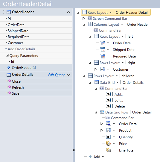
Say we create an Edit Detail Screen for our OrderHeader and choose to include the OrderDetails. This automatically sets up an editable grid of OrderDetails for us.
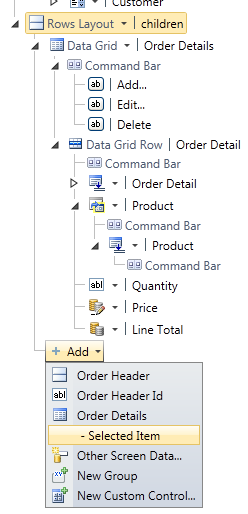
Change the Product in the Data Grid Row to a Modal Window Picker and you’re set – you’ll be able to edit the line items and use the Modal Window Picker on each row. However in order to use the filtered drop downs technique we need to create an editable detail section below our grid. On the content tree select the “children” row layout and then click the +Add button and select Order Details – Selected Item.
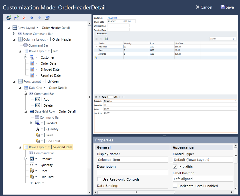
This will create a set of fields below the grid for editing the selected detail item (it will also add Order Header but since we don’t need that field here you can delete it). I’m also going to make the Data Grid Row read only by selecting it and in the properties windows checking “Use Read-only Controls” as well as remove the “Add…” and “Edit…” buttons from the Data Grid command bar. I’ll add an “AddNew” button instead. This means that modal windows won’t pop up when entering items; instead we will do it in the controls below the grid. You can make all of these changes while the application is running in order to give you a real-time preview of the layout. Here’s what my screen looks like now in customization mode.
Now that we have our one-to-many screen set up the rest of the technique for creating filtered auto-complete boxes is almost exactly the same. The only difference is the code you need to write if you want to display the Selected Category as each line item is edited. To recap:
- Create a parameterized query for products that accepts an Id parameter for Category.Id
- Add this query to the screen (if it’s not there already) and set it as the Choices property on the Product Auto Complete Box control
- Add a data item of type Category to the screen for tracking the selected category
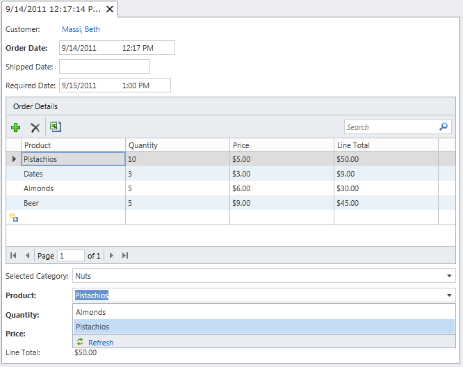
- Drag it to the content tree above the Selected Item’s Product to create an Auto Complete Box control under the grid
- Set the Id parameter binding on the product query to SelectedCategory.Id
- Optionally write code to set the Selected Category
- Run it!
The only difference when working with collections (the “many”s) is step 6 where we write the code to set the Selected Category. Instead of setting it once, we will have to set it anytime a new detail item is selected in the grid. On the Screen Designer select the OrderDetails collection on the left side then drop down the “Write Code” button and select OrderDetails_SelectionChanged. Write this code:
 Private Sub OrderDetails_SelectionChanged()
    If Me.OrderDetails.SelectedItem IsNot Nothing AndAlso<br> Me.OrderDetails.SelectedItem.Product IsNot Nothing Then <br> Me.SelectedCategory = Me.OrderDetails.SelectedItem.Product.Category
 End If
End Sub
Wrap Up
In this article I showed you a couple techniques available to you in order to display large sets of lookup list data to users when entering data on screens. The Modal Window Picker is definitely the easiest and most efficient solution. However sometimes we need to really guide users into picking the right choices and we can do that with auto-complete boxes and parameterized queries.
Enjoy!
