Data Cleansing Tools in Azure Machine Learning
Today, we’ll discuss the impact of data cleansing in a Machine Learning model and how it can be achieved in Azure Machine Learning (Azure ML) studio. It is an important part of the Data Science Process as I discussed in my previous blog post.
In this example, I’m using a credit scoring data set which has the following columns:
|
|
|
|
|
|
|
|
|
|
|
|
|
|
|
|
|
|
|
|
The Data Set also have a column Status which is the label, that is, the column that we want to predict.
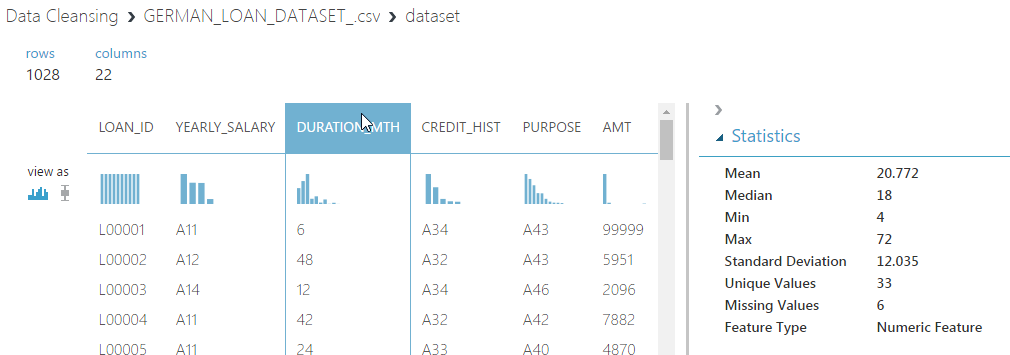
The first step is, of course, to explore the data in Azure ML studio.
By using the visualize feature of the data set, we can go through each column of the data set and view properties of each column such as Mean, Unique Values and Missing Values.
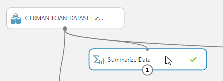
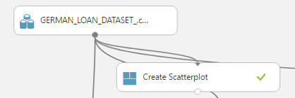
To have a global view, the summarize data module can be used. Add the module and connect it to the data set that needs to be visualized.
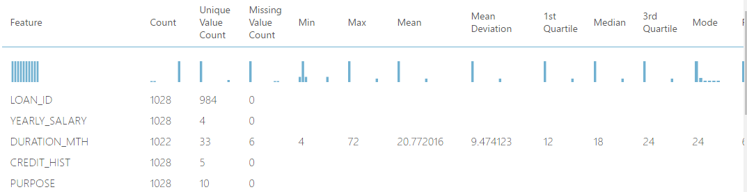
Here, at one glance, all the details about all the columns can be obtained. It is used to create a set of standard statistical measures that describe each column in the input table. The module does not return the original data set. Instead, it generates a row for each column, beginning with the column name and followed by relevant statistics for that column, based on its data type.
Before reading further, I suggest you download the Data Set here and do some exploration.
Observations
After exploring the Data Set, here are my observations:
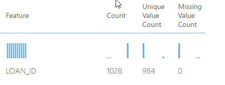
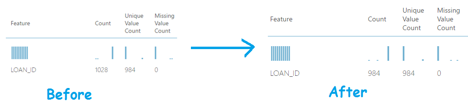
1. Duplicates Loan ID
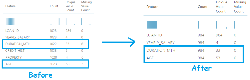
As shown in the screen shot below, the count of unique values is less than the number of values for the column LOAN_ID. This is an indication of duplicates!
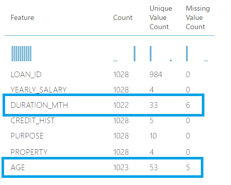
2. Null Values
As we continue to explore the output of the summarize data module, another anomaly which is easy to detect is the null values. The column Missing Value count indicate this and it can be identified just in one glance by using the summarize data module.
3. Explore the Data Types
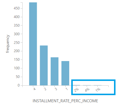
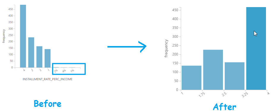
The next step is to scrutinize each column and check if the actual data type match the expected one. While doing so, we notice that the column INSTALLMENT_PERC_INCOME is of type string while a percentage should normally be of type numeric.
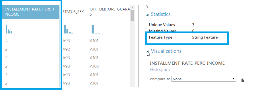
If we dig a little bit further and explore the values in the histogram, we’ll actually see that some of the values has “%” in it which makes the program interpret all the values in the column as string.
4. Outliers
An outlier is defined as an observation that lies an abnormal distance from other values in a random sample from a population; that is, values that are too low or too high compared to the mass volume of the data.
One way to quickly identify Outliers visually is to create scatter plots. In this example, I used the create scatterplotcustom module to plot AGE against AMT. This could also be achieved using R code, but the custom module is easier and faster in this case.
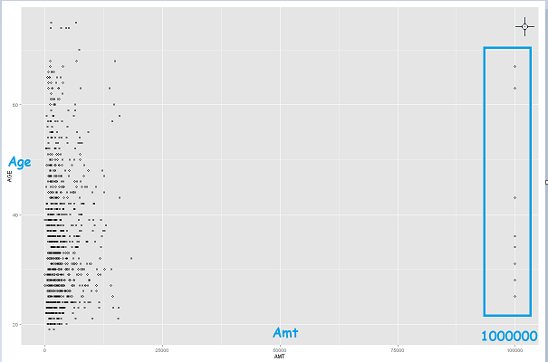
As we can see in the scatter plot, there are a few which are quite high and far from the “general population”. These are potential outliers!
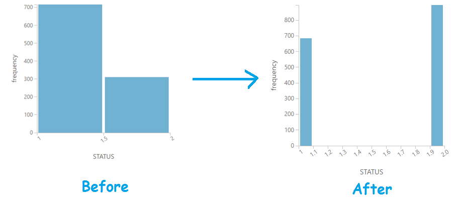
5. Is the data balanced?
The last item to check is to verify if out data set has the right amount/proportion of data to learn from. In this scenario, we are predicting the outcome of a loan (good or bad). So, is our model learning from more good or from more bad loans?
To get this answer, we just have to visualize the histogram of the column STATUS.
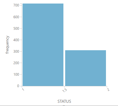
From this histogram, we notice that the model is learning more from “good” loans. Is this correct? From a cost perspective, it’s more risky to predict a bad loan as good than vice versa! So, it makes more sense to learn from the "bad" loans. We’ll see how to fix this below.
Initial Experiment
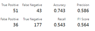
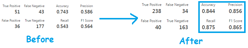
The initial experiment as described in the previous blog has an accuracy of 0.743.
Data Cleansing
We shall now use Azure ML to address the issues above and we’ll see how this can contribute to improve the performance of the machine learning model.
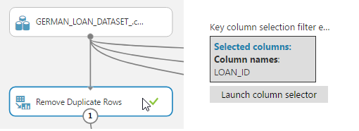
1. Duplicates Loan ID
It is very easy to fix this one, just bring the remove duplicate module on the canvas and select the column that has the duplicates.
If we examine the results again, you will see that the duplicates have now been removed. Very easy!
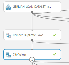
2. Treating Outliers
The easiest way to treat the outliers in Azure ML is to use the Clip Values module. It can identify and optionally replace data values that are above or below a specified threshold. This is useful when you want to remove outliers or replace them with a mean, or threshold value.
There are 3 methods that we can used to identify the outliers:
a. ClipPeaks - If you clip values by peaks, you specify only an upper boundary. Values greater than that boundary value are replaced or removed.
b. ClipSubpeaks - If you clip only by sub-peaks, you specify only a lower boundary. Values that are less than that boundary value are replaced or removed.
c. ClipPeaksAndSubpeaks - If you clip values by peaks and sub-peaks, you can specify both the upper and lower boundaries. Values that are outside that range are replaced or removed. Values that match the boundary values are not changed.
Once the Outliers are identified, the following can be used to replace the outliers using the Clip Values module:
a. Mean - Replace clipped values with the mean of the column values. The mean is computed before values are clipped.
b. Median - Replace clipped values with the median of the column values before clipping.
c. Missing - Replace clipped values with the missing (empty) value.
d. Threshold - Replace clipped values with the specified threshold value.
In this example, we are replacing the outliers with a threshold value. However, you may want to experiment with all the possibilities to identify the best solution to your problem.
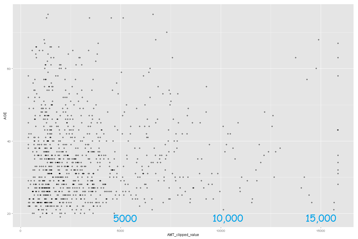
After running the experiment and creating the scatter plot again (using the clipped amount), the outliers have been removed and the plot looks as follows.
3. Treating the null values
To treat null values, the Clean Missing Data module can be used. It can be used to replace missing values with a placeholder, mean, or other value.
You can also completely remove rows and columns that have missing values.
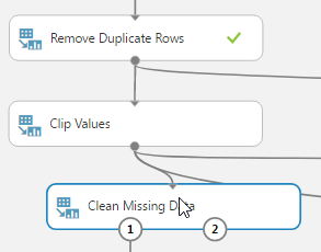
In this example, we are replacing the missing values for columns AGE and DURATION_MTH with a mean value. After running the experiment, you’ll see that there will be no missing value count and the missing data would have been replaced by the mean of the column.
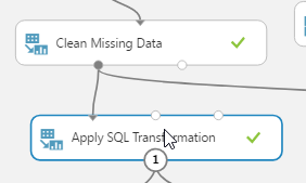
4. Custom data manipulations
The AzureML studio also allows you to write your own custom codes using SQL, R and Python. In this example, we’ll use SQL to fix the data type issues by removing the “%”INSTALLMENT_RATE_PERC_INCOME.
To proceed, start by adding the Apply SQL Transformation on the canvas.
Then, add the following SQL script to remove the “%” and convert the column to int data type.
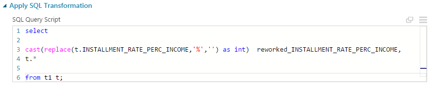
Below is the result if we compare the column INSTALLMENT_RATE_PERC_INCOME to the new column reworked_INSTALLMENT_RATE_PERC_INCOME.
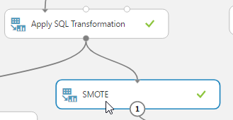
5. Using SMOTE to create a more “balanced” data set.
As discussed above, we want a model to learn more from negative results than positive ones.
You can use the SMOTE module to apply the Synthetic Minority Oversampling Technique to an input dataset.
This is a statistical technique for increasing the number of cases in your data set in a balanced way. You use SMOTE in data sets that are imbalanced. Typically, this means that the class you want to analyze is under-represented. The module returns a data set that contains the original samples, plus an additional number of synthetic minority samples, depending on the percentage you specify.
If we run the experiment and view the output now, you will see that the status label “2” has more rows.
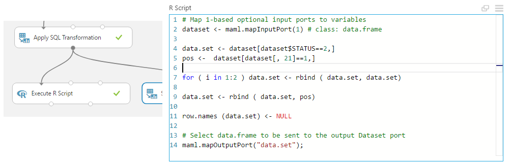
6. Using R to create a more “balanced” data set.
The same objective as SMOTE can be achieved using pure R code. Just add the Execute R module and add the following code to increase the number of rows having label “2” by 2 times.
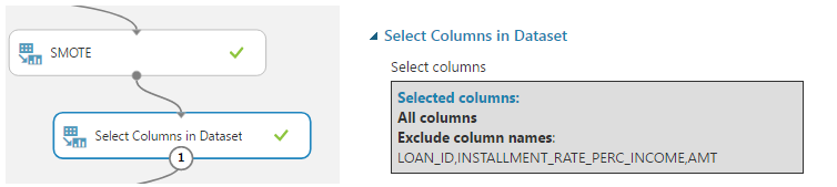
7. Selecting the columns.
In the process of cleaning the data, we created several new columns. Therefore, as the last step of the cleaning process, we need to discard the columns having the “bad data” and keep only the newly created columns. To do so, use the select column module as follows.
Evaluating the results
Finally, proceed by using the same algorithms and parameters as the described in my previous blog post and view the results of the evaluate module again.
p.s: hope this article brought back some good memories from mathematics classes!!
References