Getting new insights into your usage of Data Lake Analytics
Users of Azure Data Lake Analytics consistently ask for more insights about their usage for both monitoring jobs and also to understand how much they are spending on big data. Today, we are announcing some key updates to the ADLA account overview that addresses some of the most common requests.
Life after the new overview
As you can see, it's quite a visual update from the previous version.
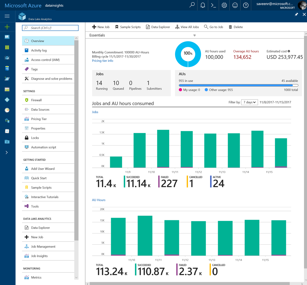
This topmost section shows you how you are spending money with Azure Data Lake Analytics and what's happening "right now" in your account.
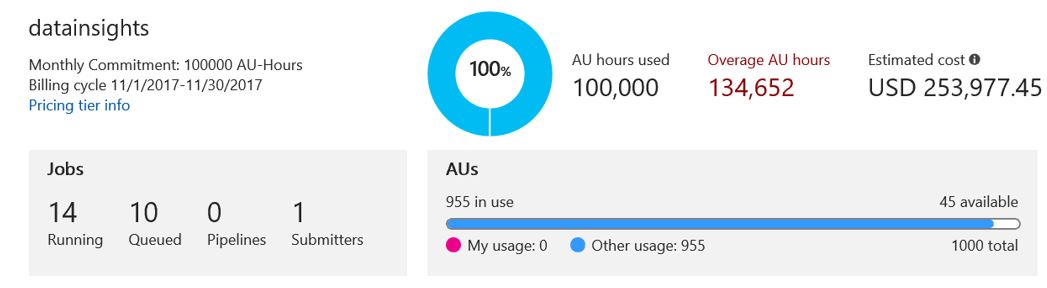
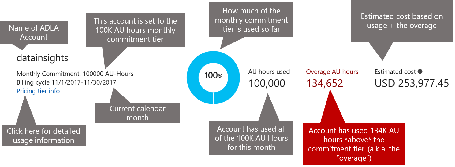
1. Understanding usage/cost
If you are using a commitment tier, you can see how much of your commitment you've been using and if you've gone beyond your commitment tier.
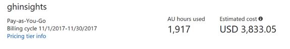
If you are using the Pay-as-You-Go billing model, then the experience will look slightly different. As shown in the account below, usage has gone through about 2K AUs in the current month. No "overage" is shown because "overage" only applies when commitment tiers are used.
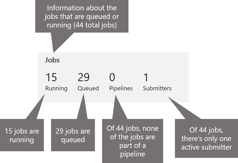
2. Getting a snapshot of current activity
The next section shows the current activity in the account in terms of the active jobs – those jobs that are running or are waiting to run.
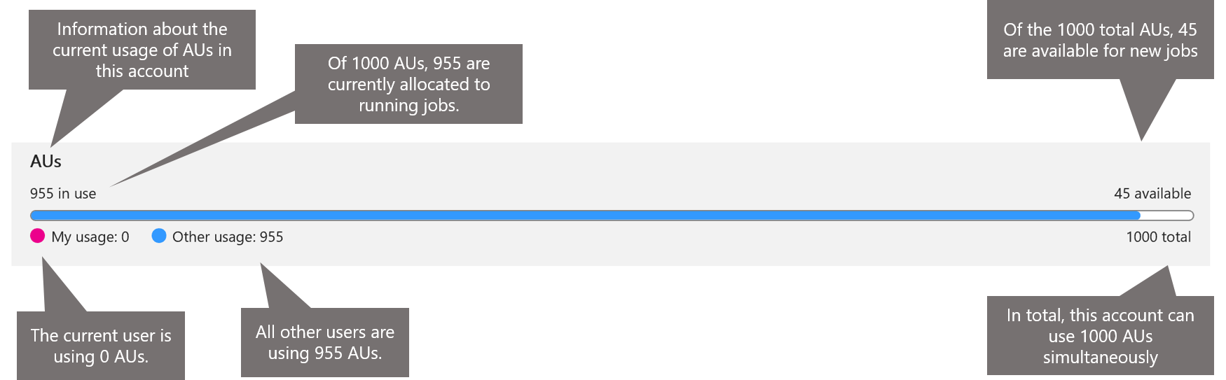
3. Quickly understand if your job will be queued or not
This section gives you Information about the current usage of AUs in this account and insight into whether or not there are enough AUs in the account to run your job. If you see that the number of AUs available are not enough to run your job, then your job will be queued.
Try it today!
Explore this new experience in the portal and let us know your feedback in the comments. Are there any other features/improvements you are looking for? Add them here: https://aka.ms/adlfeedback