Excel charts for Diabetic Blood Sugar Readings
A subscriber to the At Work newsletter sent me an email last month with an intriguing problem:
I and many other diabetics take a blood sugar reading on a 4 day cycle. Day 1 is Breakfast, Day 2 is Lunch, Day 3 is Tea, and Day 4 is Bed. This is a continuous 4 day cycle. The difficulty I have is producing a joined-up line graph that shows separate 4 lines per month. One line per measuring point: i.e. all Breakfast results per month.
 It sounded like exactly the sort of problem that Excel 2007 should take in its stride...
First of all the data. I did a tiny bit of research and got some rough numbers for blood sugar readings (apologies if these are way off the mark).
Then, create the chart!
In Excel 2007, this is an easy two-step job: select the data and then (from the Insert tab) click on the type of chart you're after.
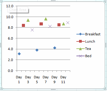
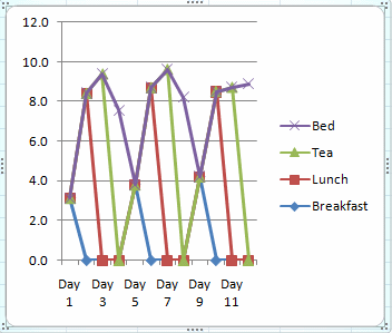
I quickly discovered that the type of chart you pick makes a big difference to the results you get. I hadn't really looked into the different types of charts before, but while the options might look very similar from the menu, I got wildly different results with the Line chart (below left) and the Stacked Line chart (below right).
Clearly, the first of these two options looks more promising...
 |
 |
Next you need to tell Excel to join the lines, but not to include the empty cells. This turned out to be remarkably straightforward:
1. Select the chart by clicking on it (this will make the Chart Tools tabs appear).
2. Click on the "Select Data" button (on the Design tab within Chart Tools).
3. Click on the "Hidden and Empty Cells" button.
4. Select the "Connect data points with line" option.
5. Choose OK twice to get back to the spreadsheet and update your chart.
And there you have it:
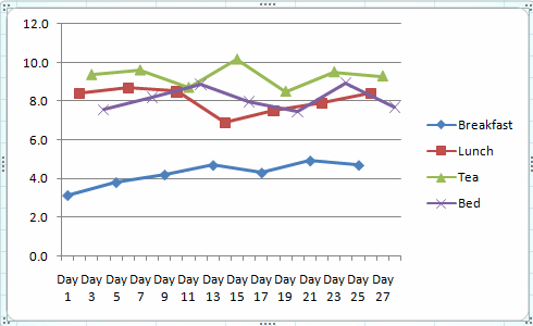
Problem solved! (I hope)