TreeListView: Show Hierarchy Data with Details in Columns
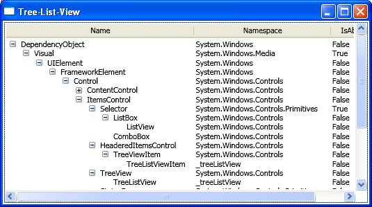
This is the first session of this topic. I’ll introduce the minimum steps needed to build a TreeListView. The TreeListView is able to present hierarchy data with details in columns. See the following diagram:
The main Avalon elements we are going to cover in this session are TreeView, TreeViewItem, GridViewColumnCollection, GridViewRowPresenter, GridViewHeaderRowPresenter and Binding of course.
Step 1. Sub-class TreeView and TreeViewItem
The key in this step is to override proper methods to make sure correct container is generated.
public class TreeListView : TreeView
{
protected override DependencyObject GetContainerForItemOverride(object item)
{
return new TreeListViewItem();
}
protected override bool IsItemItsOwnContainerOverride(object item)
{
return item is TreeListViewItem;
}
public GridViewColumnCollection Columns
{
get
{
if (_columns == null)
{
_columns = new GridViewColumnCollection();
}
return _columns;
}
}
private GridViewColumnCollection _columns;
}
public class TreeListViewItem : TreeViewItem
{
// copy the above two overrides here, they are same.
}
Step 2. Add a Level property to TreeListViewItem
Make the item be aware of the level it belongs to.
public class TreeListViewItem : TreeViewItem
{
public int Level {
get {
if (_level == -1) {
TreeListViewItem parent = ItemsControl.ItemsControlFromItemContainer(this) as TreeListViewItem;
_level = (parent != null) ? parent.Level + 1 : 0;
}
return _level;
}
}
}
Step 3. Write a data template for the 1st column
The keys in this step are:
- Bind Margin to item’s Level to mimic the indent;
- Write a converter to convert Level to proper indent space;
- Use ‘ancestor’ binding to find the TreeListViewItem;
- When there is no child in the item, trigger the expander’s (+ sign) visibility to Hidden but not Collapsed, so that the space is kept and all the item texts align vertically.
<DataTemplate x:Key="CellTemplate_Name">
<DockPanel>
<ToggleButton x:Name="Expander" Style="…" ClickMode="Press"
Margin="{Binding Level,Converter={StaticResource LevelToIndentConverter},RelativeSource={RelativeSource AncestorType={x:Type l:TreeListViewItem}}}"
IsChecked="{Binding Path=IsExpanded,RelativeSource={RelativeSource AncestorType={x:Type l:TreeListViewItem}}}"
/>
<TextBlock Text="{Binding Name}"/>
</DockPanel>
<DataTemplate.Triggers>
<DataTrigger Binding="{Binding Path=HasItems,RelativeSource={RelativeSource AncestorType={x:Type l:TreeListViewItem}}}"
Value="False">
<Setter TargetName="Expander"
Property="Visibility"
Value="Hidden"/>
</DataTrigger>
</DataTemplate.Triggers>
</DataTemplate>
public class LevelToIndentConverter : IValueConverter
{
public object Convert(object o, Type type, object parameter, CultureInfo culture)
{
return new Thickness((int)o * c_IndentSize, 0, 0, 0);
}
public object ConvertBack(…) {…}
…
}
Step 4. Write control template for TreeListViewItem
The keys in this step are:
- Instead of using ContentPresenter, we use GridViewRowPresenter to present the content in multiple columns
- Presenter finds content from item’s Header property
- Bind GridViewRowPresenter.Colums property to TreeListView.Columns property
<ControlTemplate TargetType="{x:Type l:TreeListViewItem}">
<StackPanel>
<Border …>
<GridViewRowPresenter x:Name="PART_Header"
Content="{TemplateBinding Header}"
Columns="{Binding Path=Columns,RelativeSource={RelativeSource AncestorType={x:Type l:TreeListView}}}"/>
</Border>
<ItemsPresenter x:Name="ItemsHost"/>
</StackPanel>
…
</ControlTemplate>
Step 5. Put it all together
The key in this step is: When setup the columns you want to show, the cell template for the 1st column is the one we just wrote that can do smart indent.
<Window …>
<Window.Resources>
<Style x:Key="ExpandCollapseToggleStyle">
…
<l:LevelToIndentConverter x:Key="LevelToIndentConverter"/>
<DataTemplate x:Key="CellTemplate_Name">
…
<Style TargetType="{x:Type l:TreeListViewItem}">
…
<Style TargetType="{x:Type l:TreeListView}">
…
</Window.Resources>
<l:TreeListView>
<l:TreeListView.Columns>
<GridViewColumn Header="Name" CellTemplate="{StaticResource CellTemplate_Name}"/>
<GridViewColumn Header="IsAbstract" DisplayMemberBinding="{Binding IsAbstract}"/>
<GridViewColumn Header="Namespace" DisplayMemberBinding="{Binding Namespace}"/>
</l:TreeListView.Columns>
<l:TreeListViewItem>
<l:TreeListViewItem.Header>
<x:Type TypeName="DependencyObject"/>
</l:TreeListViewItem.Header>
<l:TreeListViewItem>
<l:TreeListViewItem.Header>
<x:Type TypeName="Visual"/>
</l:TreeListViewItem.Header>
</l:TreeListViewItem>
…
</l:TreeListViewItem>
…
</l:TreeListView>
</Window>
We’re done!
I’ll introduce how to encapsulate the implementation details into a control in near future.