User Experience
The most important measure of a successful solution is adoption. Whether it’s an Internet application or an Enterprise application, if it’s not being used by anyone, it’s useless. There are a number of factors that contribute to adoption (above and beyond the actual ROI/value of the application): marketing/evangelism, training, migration, policy and user experience. There is no doubt that user experience is super important and often overlooked by solution developers. With hundreds of different options on the Internet, the “build it and they will come” mantra doesn’t hold true. And while corporate policy can make people “have to” use a specific solution, real success is when people “want to” use a solution and/or it comes very naturally to them.
A common misperception is the notion that user experience = look and feel. While L&F is an element of UX, it is just one factor among many:
1. Simplicity. Simplicity is super important. It’s an important tenet of system design and more affectionately referred to as KISS – Keep It Short & Simple (though I like the expansion Keep It Simple, Stupid more). While more features and knobs are good for power users, to really drive mass adoption it’s really important to make sure the product you are building targets the core scenarios in a very intuitive way. Apple iPhone/iPod and Microsoft Office 2007 are two examples of easy-to-use software. A simple test for simplicity: Can the average user be up and running on your application within a couple of minutes of setting up the technology? If the answer is no, rethink your design. Your solution must be intuitive for core scenarios and should not require a detailed manual to use.
Simplicity, ironically, is not simple at all. It’s half art and half science. The science comes from qualitative and quantitative research that helps you identify what the core scenarios are; how people react to different user experiences; what people value most. The art is coming up with different designs to test. In fact, in my own work, when I have to digest a lot of data and present a particular concept or strategy, I generally start with dozens of PowerPoint slides with a ton of detail and eventually get down to half a dozen slides after many, many iterations and after much socialization. Mark Twain once said, “I didn't have time to write a short letter, so I wrote a long one instead.“, which I think nicely sums up how hard it is to get simplicity right.
2. Familiarity, Accessibility & Visibility. Human beings are creatures of habit. It’s very difficult to get users to learn something entirely new; it’s easier to introduce it into an experience they are already comfortable with.
One of the examples I like to use to demonstrate this point is getting people to use something like a People Expertise system. The most difficult thing about a People Expertise system is getting people to keep their profile information up-to-date. People generally don’t keep their information up-to-date because they don’t perceive a ton of value for themselves. But as that information gets more and more used, as that data becomes more and more visible, human behavior changes and people start updating their information.
For example, at Microsoft we have SharePoint My Sites deployed and tens of thousands of users have been using their My Sites for years to store information and collaborate. The visibility of the My Sites went up even more 18+ months ago after someone internally developed a slick Outlook 2007 add-in that shows My Site information on the right hand side panel. Effectively, any time someone emails me, I can see their picture and other information about them in Outlook coming from their My Site profile. This adds tremendous value to me since I frequently email people in the company that I haven’t met in person. It also motivates all of us to make sure our picture and profile information is up-to-date. This is a good example that demonstrates how Outlook integration raises the visibility of a specific solution. In general, integrating with Office applications is a great approach to increase the visibility of any information system. At Microsoft, in fact, we call the category of applications that surface business data into Office (or SharePoint) Office Business Applications (OBAs).
Office & Windows are a great bet to make on the client side, another good bet is the mobile form factor. As Windows Mobile phones and iPhones gain even more popularity, there’s an increasing user appetite to have easy-to-use applications. The iPhone, for example, has a very slick Facebook application that allows users to quickly login and do some basic tasks very quickly – for example, update their status. Integration with different form factors and applications really helps drive adoption and popularity.
3. Performance. If your product doesn’t perform, people won’t use it. It’s that simple. From launching the application to every user click, the application must respond effortlessly. For web applications, a response time more than 2 seconds is too slow. It’s no surprise that AJAX & Silverlight are popular approaches for web development these days. It’s also no surprise that client applications like Word, Outlook and Live Mesh are more popular than their web counterparts. The PC offers a richer, faster and offline experience and when coupled with the cloud, it really provides a rich end-to-end story. The same goes with mobile devices. The Windows Mobile Outlook application provides a richer email experience than a browser only email application; same goes for the RIM Blackberry; iPhone applications are richer and faster than typical web applications because they run on the local hardware.
4. Visual. The more visual an application is, the more it will appeal to users ranging from individual contributors to CEOs. Office became successful because of its WYSiWYG (What You See is What You Get) UX. When someone bolded something, it appeared bolded; underlining was visual; even spelling mistakes with the red squiggle were visual. A visual, intuitive application reduces the training barrier and promotes a more engaging experience. For data rich applications, visualization also makes data easier to digest and more relevant.
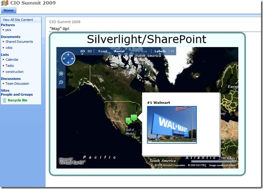
Here’s an example of a mashup that I showed at the CIO Summit this week. I showed a Silverlight solution on SharePoint Online that plots SharePoint list data on a map. You can essentially point to any SharePoint list with latitude and longitude information and it will show the pinpoints. Below is a screenshot where I show the Fortune 5 companies. Imagine using something like this to plot different customers in your CRM database on a map. You can find sample source code @ https://www.codeplex.com/sharepointsilverligh developed by Jon Flanders.
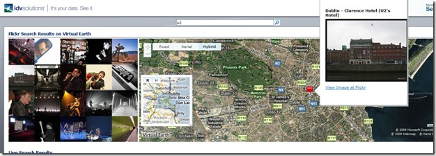
Another example of how powerful visual solutions can be can be found at https://esearch.idvsolutions.com/default.aspx. This partner solution is built with SharePoint Server 2007 and leverages the in-built federation features. In the screenshot below, you can see that I put in the keyword “U2” (my favorite band!) which returned pictures from Flickr. When clicking on a picture, a pinpoint shows up on the map. Very, very visual solution that takes the search experience to another level. I encourage you to play around with the application.
5. Basics. Colors, layout, drag & drop, no clutter – you have to get the basics right. Great UX people who understand technology are not easy to find, but they are out there! Carnegie Mellon, for example, has an HCI (Human-Computer Interaction) department where people can specialize on this very aspect of software. So if you’re looking to have a successful solution, make sure you invest in the right people! I, for one, am the biggest fan of Office 2007 SmartArt feature that has allowed me to design great looking docs and presentations. :-)

