Windows Server AppFabric Monitoring - How to create operational analytics reports with AppFabric Monitoring and Excel PowerPivot
One of the great (and major) features of Windows Server AppFabric is the out-of-the-box experience for monitoring WCF and WF based services. Gone are the days when an exception half way through a workflow instance could either 1) never be discovered or 2) take hours of creative efforts and ad-hoc debugging (not to mention the hair pulling that goes along with all this) to find out exactly what the issue was and why it happened. The AppFabric Dashboard does a pretty good job at exposing key execution statistics to the Administrator. But is it enough?
Since AppFabric went public with a Beta release back in early March I've been hearing from customers that although the AppFabric Dashboard is great to look at mostly the current state of the farm, it does lack some of the analytical, trend-focused aspects of monitoring a real-life environment. So, this article will explain what is involved in creating interactive analytical reports (or dashboards if you will) based on the monitoring data captured by AppFabric, and our old friend – Microsoft Excel…well, with its new addition, PowerPivot.
Now, is this going to give you the exact implementation – definitely not; the article is intended to present the solution design and shows a sample report to demonstrate the capabilities. In your implementation you may choose to report on different metrics, filter or aggregate the data differently, provide different pivots, or completely modify the layout to meet your specific requirements.
With that said, the key features of the solution presented in this article include:
- Visual presentation of the historical data stored in the AppFabric monitoring store
- Trend visualization and analysis of the WCF services load and call latency (average duration)
- Trend visualization and analysis of the WF services load, long-running state, and efficiency (end-to-end service lifetime)
- Error filtering and error trend analysis
- Interactive slicing and dicing per service, WCF service call result, and WF state
- Time-based analysis – granular down to the minute, or as coarse as yearly.
Surely the above is a compelling value prop to any IT pro!
Reporting Requirements
For the purpose of this article, let's define some basic operational requirements that demonstrate the solution approach - the report should provide analytical capabilities on top of the service tracking data captured by AppFabric, as follows:
- Provide interactive slicing and dicing of call statistics (number of calls and response time) over time, and by service and operation
- Report on success/failure statistics
Solution Design
At a high level the design of the presented solution is simple and is depicted in the following diagram:
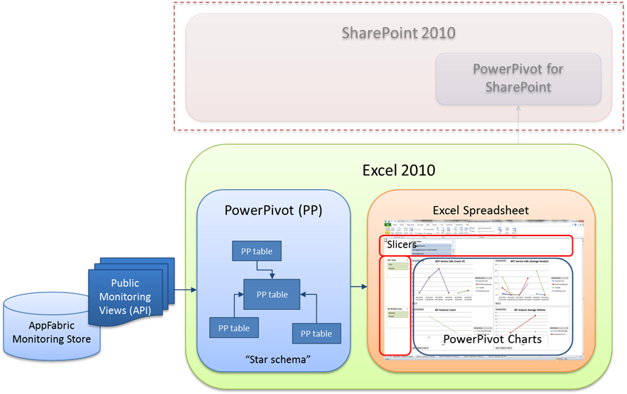
In summary, we create a star schema-like PowerPivot model based on the data exposed by the public AppFabric monitoring views, and then create a spreadsheet with a number of PowerPivot-based charts that visualize the AppFabric monitoring statistics. The PowerPivot analytical features allow the user to interactively and very flexibly work with the large amount of data available in the AppFabric monitoring store. Finally, the Excel workbook can be published to a PowerPivot-enabled SharePoint installation, for sharing with team members and business stakeholders.
The Implementation
A few words on the AppFabric monitoring subsystem
Before we jump into connecting PowerPivot and Excel to the AppFabric monitoring store, let's first cover some of the basics that will hopefully help us build a robust and supported solution. J
The AppFabric Monitoring API
In the AppFabric world, it's called database views – instead of exposing a programming API, AppFabric takes a light-weight approach of providing a number of public database views sitting on top of the physical tables. These views ensure a layer of abstraction from the physical data model, designed for direct consumption by the AppFabric Dashboard itself as well as any other application that needs to query the monitoring data. Here is a list of the key public views that we will use in this article:
- ASEventSources - This view stores metadata for the events to identify the source of events such a service name, site and virtual path
- ASWcfEvents - This view is created on all the analytic tracing events that are emitted when a WCF service is invoked
- ASWfEvents - This view is created on the tracking events emitted for WF instances
- ASWfInstances - This view is created on the active WF instances. There is one row per WF instance
The following entity model depicts the logical relationship between these DB views:
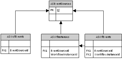
So, the interesting points here are:
- All records returned by the views refer to the source (service) that generated the event using the EventSourceId field
- The ASWfInstances view has a logical master-child relationship with the ASWfEvents view. So, we expect that a record from the ASWfInstances view would have a number of records in the ASWfEvents view, each representing an event generated from the execution of an activity inside the corresponding workflow instance.
WCF Event Types
The WCF runtime emits ETW tracking events for different types of execution events, such as a call to a WCF service, a call failure, WCF throttling activation, etc. These event types have IDs associated with them. A full reference of the different ETW event types applicable to WCF is available here. Later in the article, we will use the EventTypeId column from the ASWcfEvents view to filter out the events that don't make sense (or are too detailed) for our solution.
AppFabric WCF tracked events aggregation
In general, WCF calls are stand-alone units of work – the client calls a service operation, the operation performs some work (in code) and then completes. A single tracking event is sufficient to fully describe the outcome from the operation – success or error (along with other relevant information, such as exception details for example). This relative simplicity of tracking WCF service calls offered an opportunity to optimize the WCF monitoring logic in AppFabric by introducing an event aggregation feature. Based on a pre-defined sampling interval with a default value of 5 seconds, data from all WCF tracked events during the sample interval gets aggregated into a single tracking record by operation. For example, if in the last 5 seconds the GetCreditScore() operation was called 30 times, and GetUserDetails() was called 20 times, we will only see 2 tracked events in the ASWcfEvents view – one for GetCreditScore() and one for GetUserDetails() . The information in these two records will have aggregated statistics for the AggregateCount, AverageDuration, and MaxDuration columns, calculated from the multiple executions of the two operations over the sample interval. Of course, the AggregateCount value will have 30 and 20 respectively, while the other two metrics will be based on the performance of the service operations.
Why is this important? When we start looking at aggregating the monitoring data at a higher level (in our T-SQL queries and then in Excel), accurately calculating the double-aggregated data may not be trivial. So, before we start crafting our analytical report, we may want to first disable the native AppFabric aggregation of WCF events using the EventCollection service configuration. The steps for this task are:
Open the root web.config file located in C:\Windows\Microsoft.NET\Framework\v4.0.30319\Config for the x86 platform, or C:\Windows\Microsoft.NET\Framework64\v4.0.30319\Config for x64
Search for the following section:
<collectors>
<collector name="" session="0">
<settings retryCount="5" eventBufferSize="10000" retryWait="00:00:15" samplingInterval="00:00:05" aggregationEnabled="true" />
</collector>
</collectors>
- Update the aggregationEnabled attribute to false
- Save the file and restart the EventCollection service using the Services console
By now I'm sure you're wondering what the performance impact is of having aggregation turned off. It is not that significant on the runtime, and in the range of 2-3% loss in throughput. However, if you are processing more than 3,000-4,000 WCF calls per second, the per-call tracking approach (with aggregation off) may lead to bottlenecks in the monitoring data staging job earlier than otherwise. Luckily, the techniques to mitigate these bottlenecks are also described in detail in my previous blog article.
Building the Report – Step by Step
The first step towards our goal is to write the T-SQL statements that will get us the right data using the AppFabric Monitoring views. I am using four queries that we will later copy/paste into PowerPivot. Let's however spend a few moments on the T-SQL itself.
The "Dates" Query
The first query will give us all unique date/time values that have associated WCF and/or WF events. These values will be used to build our "time dimension" in PowerPivot. Note that in order to limit the number of distinct dates and times, we will trim the values to the minute. So, for a 24 hour period we will have a maximum of 1,440 values, if there was constant activity in the environment. Here is the query:
SELECT
DISTINCT
LEFT(CONVERT(varchar, DATEADD(minute,DATEDIFF(minute,GETUTCDATE(),GETDATE()),E.TimeCreated) , 20), 16) as Date
FROM
ASWcfEvents E
WHERE
EventTypeId IN (214, 222, 223)
UNION
SELECT
LEFT(CONVERT(varchar, DATEADD(minute,DATEDIFF(minute,GETUTCDATE(),GETDATE()),E.TimeCreated) , 20), 16) as Date
FROM
ASWfEvents E
JOIN
(SELECT MAX(WfE.Id) as Id
FROM ASWfEvents WfE
WHERE ActivityName IS NOT NULL
GROUP BY WfE.WorkflowInstanceId) as T
ON (T.Id = E.Id)
Interesting points about the query:
It selects distinct values (see highlighted above)
For WCF events, for the purpose of this article we are only interested in event 214 (Operation completed), 222 (Operation Failed) and 223 (Operation Faulted). This will give us the dates for all successful service call completions and errors
We use a UNION to then merge (still under the DISTINCT clause) WF events generated by the latest activity for each workflow instance – this is achieved by selecting the MAX Id record for each workflow instance, in the JOIN part of the query
Since AppFabric stores the data in UTC format, we need to calculate the local data and time, for display purposes in Excel/PowerPivot. I used this formula to get the right result:
DATEADD(minute,DATEDIFF(minute,GETUTCDATE(),GETDATE()),E.TimeCreated)
The date values are trimmed to the minute, so we will have the year, month, day, hour and minute data.
The "Event Sources" Query
The next query will be used to get a list of all data sources (services) that generated event records into the AppFabric monitoring store. Here is the query:
SELECT
ES.Id,
ES.Name
FROM
ASEventSources ES
WHERE
ES.Name IS NOT NULL
Very simple so I'll just skip to the next one J
The "WCF Events" Query
This query takes care of returning WCF service call data to PowerPoint. The T-SQL for this task is as follows:
SELECT
E.EventSourceId,
E.OperationName,
CASE
WHEN E.EventTypeId = 214 THEN 'Success'
WHEN E.EventTypeId IN (222, 223) THEN 'Error'
END as EventType,
LEFT(CONVERT(varchar, DATEADD(minute,DATEDIFF(minute,GETUTCDATE(),GETDATE()),E.TimeCreated) , 20), 16) as CallDate,
E.Duration / 1000.0 as Duration,
1 as Count
FROM
ASWcfEvents E
WHERE EventTypeId IN (214, 222, 223)
ORDER BY CallDate ASC
Again, some interesting facts about this query:
- We are only querying Operation Completed/Failed/Faulted events – 214, 222 and 223 respectively. Event 214 gets mapped to "Success", while event 222 and 223 both get mapped to an "Error" string
- Date is trimmed to the minute, so that it can be later joined (in PowerPivot) to the Date column from the first query
The "WF Events" Query
The last of the four queries will be providing us with WF events data, based on the ASWfEvents and ASWfInstances views:
SELECT
WfI.LastEventSourceId as EventSourceId,
LEFT(CONVERT(varchar, DATEADD(minute,DATEDIFF(minute,GETUTCDATE(),GETDATE()),WfI.StartTime) , 20), 16) as InstanceStartTime,
CASE
WHEN WfI.LastEventStatus IN ('Completed', 'Terminated', 'Canceled', 'Aborted') THEN WfI.CurrentDuration
ELSE DATEDIFF(second, DATEADD(minute,DATEDIFF(minute,GETUTCDATE(),GETDATE()),WfI.StartTime), GETDATE())
END as CurrentDuration,
WfI.LastEventStatus,
WfE1.ActivityName,
COALESCE(WfE1.State, WfI.LastEventStatus) as State,
LEFT(CONVERT(varchar, DATEADD(minute,DATEDIFF(minute,GETUTCDATE(),GETDATE()),WfE1.TimeCreated) , 20), 16) as LastActivityTime
FROM
ASWfEvents WfE1
JOIN
(SELECT MAX(WfE.Id) as Id
FROM ASWfEvents WfE
WHERE ActivityName IS NOT NULL
GROUP BY WfE.WorkflowInstanceId) as T
ON (T.Id = WfE1.Id)
JOIN ASWfInstances WfI
ON WfI.WorkflowInstanceId = WfE1.WorkflowInstanceId
This is the most complex of the four queries. J The only notable point here is that we are using the same technique as in the first query – a sub-query gets the event record for the latest activity from each workflow instance, then joins to the same source view (ASWfEvents), and also to the ASWfInstances view in order to get the current state of the instance.
Setting up the PowerPivot tables
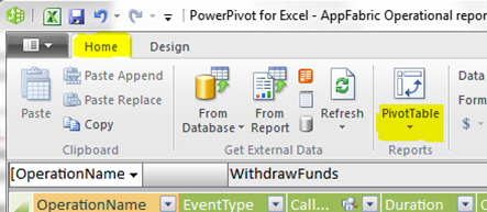
PowerPivot shipped with the release of Excel 2010. So, for the next steps you must have Office 2010 (ha, who doesn't anyway…J). If your machine meets this requirement, when you start Excel you will notice a new ribbon called PowerPivot:
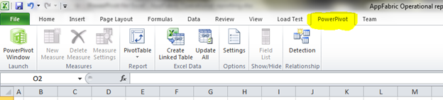
Click on the PowerPivot Window button – the first button on the left hand side. This will open the PowerPivot for Excel window. We will need to create a new data source, pointing to the AppFabric monitoring store. From the ribbon, select the "From Database -> From SQL Server" button.
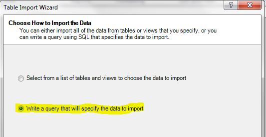
In the Table Import wizard window that will open, provide the details to connect to the AppFabric monitoring store, and then click Next. Select the option to write a query:
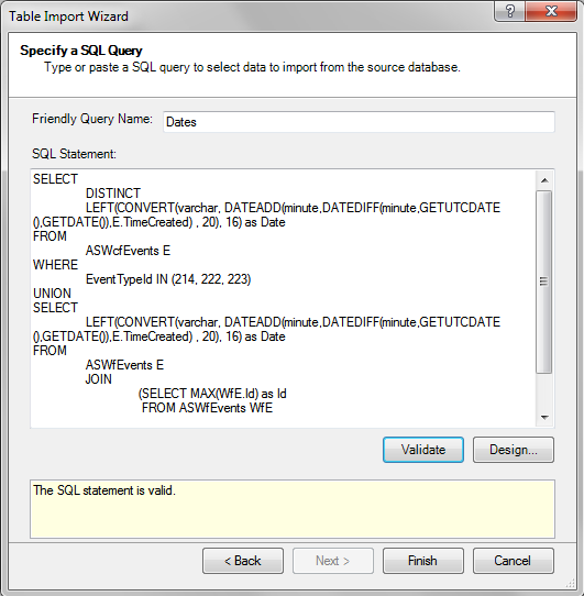
For the friendly name of the query, type in "Dates", and then copy/paste the "Dates" query from earlier in the blog and click the Validate button. The window should look like this:
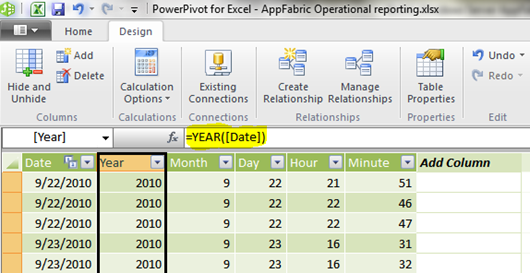
Click Finish. For increased reporting flexibility, I like to break date/time fields down to individual components – year, month, date, hour, and minute. To do this, add a new calculated column to the Dates table, with the formula set to " =YEAR([Date]) ". Repeat the same for the remaining four columns (month, day, hour, and minute), this time using the MONTH(), DAY(), HOUR(), and MINUTE() functions respectively. The window should looks like this:
We now have one of the PowerPivot tables that we need – the "Dates" table.
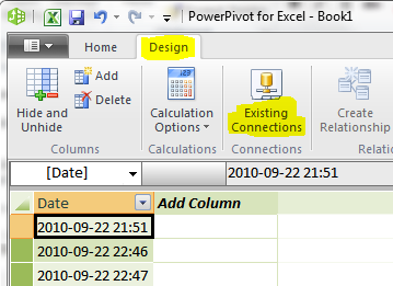
Next, in a very similar way, we will have to create PowerPivot tables for the remaining three queries. I won't cover this in detail as the process is almost identical to what we just did. I will give you a hint though – for all subsequent tables, use the "Existing Connections" button from the "Design" ribbon, and reuse the data source that we defined a bit earlier in the article:
Also, when you create the other PowerPivot tables, you can use the same naming as in my sample:
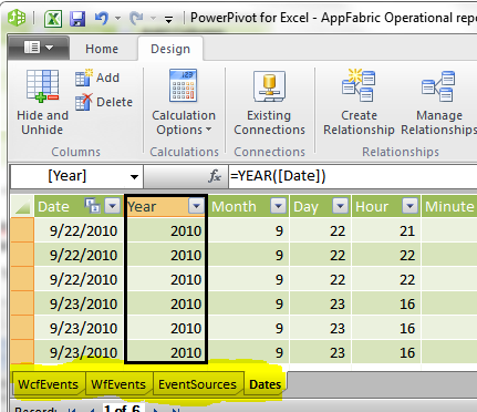
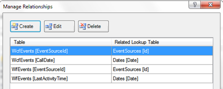
I am pretty sure that you will figure out which table corresponds to which query. J We are almost done with the creation of the PowerPivot tables. The last thing we need to do is create some relationships between the tables – think a star schema. You can use the "Create Relationship" button from the "Design" ribbon. The details for the relationships are as follows:
- WcfEvents table: Relationship to Dates (as a lookup table), based on the CallDate and Date columns respectively
- WcfEvents table: Relationship to EventSources (as a lookup table), based on the EventSourceId and Id columns respectively
- WfEvents table: Relationship to Dates (as a lookup table), based on the LastActivityTime and Date columns respectively
- WfEvents table: Relationship to EventSources (as a lookup table), based on the EventSourceId and Id columns respectively
After you setup the relationships, if you click on the "Manage Relationships" button from the ribbon, the "Manage Relationships" window should look like this:
BTW, I think I got carried away with all these instructions and forgot to say that by now you should have saved your spreadsheet a few times already! But you already knew and did that, right? J
The Pivot Charts report
I won't even dare giving step-by-step instructions for configuring pivot tables and pivot charts – if I went into this, the length of the article would become unbearable. Besides, this topic is covered in the Excel documentation. Instead, I'll give a few hints and pointers specific to PowerPivot-based charts and tables:
To insert a new pivot chart or table based on PowerPivot, in the PowerPivot for Excel window, click on the "Pivot Chart/Table" button from the "Home" ribbon:
Once you have an empty pivot table or chart in your Excel sheet, PowerPivot-based objects act very similar to standard Excel pivot tables and charts. One thing worthwhile mentioning though, is that PowerPivot has the concept of Slicers. Slicers allow you to interactively and visually filter, or slice the data based on your needs. In my sample, I use slicers for the "top-level" filters – services, WCF success/error status, and WF instance state. Here is what Slicers look like:
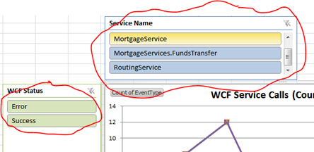
(I'm not great at circling things on the screen with a mouse, am I?)
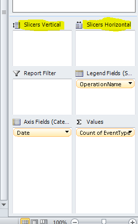
When you select a PowerPivot-based chart or table, slicers can be configured similar to the standard legend, axis, and values settings – via the Pivot table/chart field list and properties pane. Just drag fields from your data model onto the Slicers areas:
One more thing on Slicers – you can configure a single slicer to filter multiple pivot charts or tables. To achieve this, select the Slicer, right-click on it, and then click on the PivotTable Connections menu:
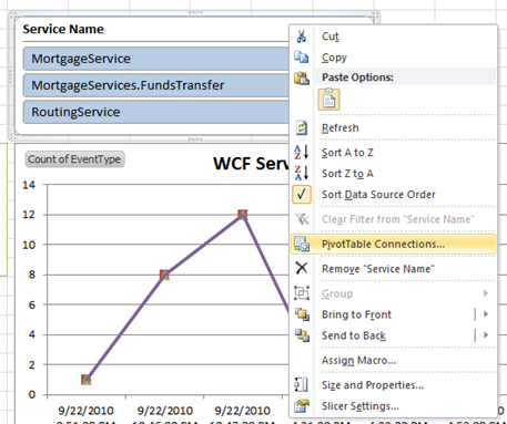
The rest is not difficult to figure out – you use the checkboxes representing your pivot tables and charts to choose which ones you want the Slicer to interact with. This feature comes useful when you want to slice and dice two or more charts together – for example, if you have one chart showing the number/count of calls over time, and another chart showing the average call duration over time, having a single slicer interacting with both charts will provide a "correlated" view between the two charts; filtering by service using a slicer, will give you both the number of calls (chart 1) and the average duration (chart 2) for just this service.
The Result
So, after all this, here is a screenshot of the sample report I created:
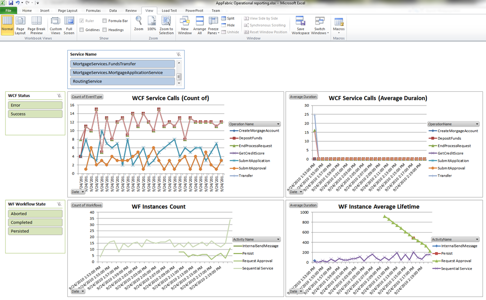
Once again, I want to highlight the key features:
- Visual presentation of the historical data stored in the AppFabric monitoring store
- Trend visualization and analysis of the WCF services load and call latency (average duration)
- Trend visualization and analysis of the WF services load, long-running state, and efficiency (end-to-end service lifetime)
- Error filtering and analysis
- Interactive slicing and dicing per service, WCF service call result, and WF state
- Time-based analysis – granular down to the minute, or as coarse as yearly.
The last piece in the puzzle, which is out of scope for this article, is to publish the PowerPivot spreadsheet to a SharePoint site, to make it available to all interested parties (secured appropriately through SharePoint, of course). Instructions on publishing a PowerPivot workbook to SharePoint are available here.
On a somewhat related topic, I should probably also mention that PowerPivot, when used directly within Excel, does not provide any data auto-refresh features such as a background refresh or refresh on open – data updates must be performed manually. Once uploaded to a SharePoint site however, the PowerPivot data connection can be configured to auto-refresh. Scheduling an auto-refresh within SharePoint is described in detail here.
Conclusion
The AppFabric monitoring store, combined with the flexibility, scale, and analytical strengths of PowerPivot, provide a solid foundation for operational reporting and analysis. Understanding the trends in the load and usage pattern of a system has proven critical for early mitigation and successful prevention of costly downtimes. For long-running workflow-based services, identifying the steps in the process that take the longest to execute, can also easily lead to significant optimizations and improved efficiency of the business as a whole.