Reporting on Test Management Data
You have been following along the innovative set of features and capabilities that we are providing with the Test product in the VSTS 2010 release. In this post, I want to explore with you the rich and flexible options you have for reporting on various aspects of test data and test results, and its management.
The richness and flexibility really comes from the fact that our test offerings are architected on top of the Team Foundation Server (TFS). One of the major value propositions of TFS has always been rich reporting across a broad set of data. In the 2005 and 2008 editions of VSTS we only included a minor set of data around your test artifacts, which primarily enabled you to report on the test results that you had run as part of your build. However, in the 2010 release, all of the great features you have read about in Microsoft Test and Lab Manager (earlier referred to with the code name “Camano”) are backed by the new Test Management services on Team Foundation Server 2010 and we have enabled you to report on the very rich set of data that you both capture and create during your testing.
One of the best ways to harness that data is to use the powerful features in Microsoft Excel in combination with SQL Server Analysis services to mine it. In this post I will help you get started with a couple off basic reports that you can view on a daily basis to track your testing effort.
Test Plan Progress
I will call the first report we will build, the Test Plan Progress. It will enable you to track the progress of one or more test plans across a period of time.
To get started you will need to insert a pivot table into a worksheet and connect it to your data warehouse. By default the warehouse will be installed on our TFS data tier.
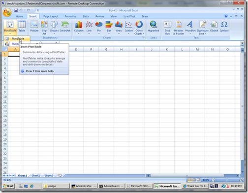
Start by clicking on the Insert tab and selecting the PivotTable button:
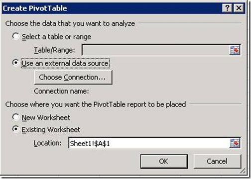
In the Create PivotTable dialog you will select “Use an external data source” radio button and click on “Choose Connection”
From the “Existing Connections” dialog you will click the “Browse for more” button and from the “Select Data Source” browser you will select “New Source” at the bottom and will be presented with the “Data Connection Wizard”
Select “Microsoft SQL Server Analysis Services” as the type of data source you want and follow the wizard.
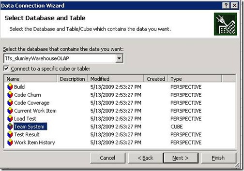
After you have entered the name of your analysis services server (which is a typical installation will be the same as your data tier), you will have the option to select the OLAP data base and cube that you want to connect to:
If you are using SQL Enterprise you will have the option to pick which perspective you want to use, however, if you are using SQL Standard edition you will only have the option to connect to the Team System cube. If you have the option to use a perspective you should select the Test Result perspective.
Once you have established the connection to the server you will need to add the following fields from the Pivot Table Field List to the Report Filter section of the Pivot Table editor.
- Team Project.Team Project Hierarchy
- Test Result.Iteration Hierarchy
- Test Result.Area Hierarchy
- Test Plan.Test Plan Name
(Also take the time to browse and view the rich set of fields that are exposed in pivot table field list!)
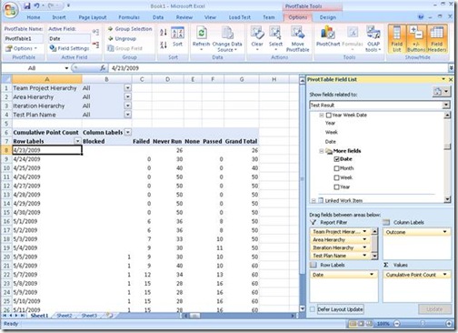
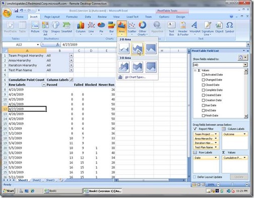
After you have added those fields to the Report Filter section, you will want to add the Test Result.Outcome field to the Column Labels section, the Cumulative Point Count measure to the Values section and the Date.Date field to the Row Labels section. After you initial setup your sheet will look something like this:
Once you have the basic data setup you can filter it down so it makes sense for you. In this example we are going to start by filtering out some of the Outcome’s that we don’t need to report on. In addition you might want to filter to only show results for a single iteration.
Select the dropdown next to the Column Labels field in the PivotTable and un-check the “None” and “Unknown” values from the dropdown.
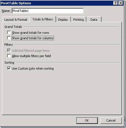
Next right-click on the PivotTable and select “PivotTable Options” from the menu. In the “PivotTable Options” dialog select the “Totals & Filters” tab and un-check the “Grand Totals” options and press “OK”.
After you have setup your PivotTable with the data you want and the filters you want you can easily create a chart for our data.
Select your PivotTable and select the Area chart from the “Insert” tab
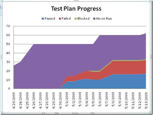
Excel will automatically generate a chart based on the style you have selected and after adding a title you have something that can be easily read by a variety of people
In the chart above we can see the progress of all of the test plans in our project collection. In an ideal trend we would see a steady increase in the number of Passed tests and a steady decrease in the number of Failed, Never Run or Blocked tests.
The data is organized in such a way that you are always looking at the most recent outcome for a given test case on a given day.
For example: If I run Test Case 1 on 4/30 and it passes and I don’t run it again, when I look at the data on 5/13 it will still show Test Case 1 as passing.
Test Results by Build
Another graph that you may be interested in seeing is your test results on a build by build basis.
To start out you will create a new worksheet in your workbook and insert a PivotTable with a connection to your warehouse in the same way you did at the beginning of this post.
For the Test Results by Build report you will select the following fields:
For the Report Filter, choose the following:
- Team Project.Team Project Hierarchy
- Test Result.Iteration Hierarchy
- Test Result.Area Hierarchy
- Build.Build Definition Name
For the Column Labels, select:
- Test Result.Outcome
For Row Labels, select:
- Build.Build Name
And finally for Values, choose:
- Cumulative Build Result Count
Once again you will want to filter out the “None” and “Unknown” outcomes by click in the “Column Labels” dropdown and un-checking the values.
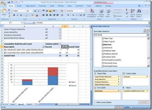
After you get your PivotTable setup you are ready to generate your chart. For this particular report I think a stacked column chart works best.
In this report we can see the outcomes for the tests that were on a given build. In this case we have the full set of builds for a build definition. If this was our nightly build we could compare the results side by side to make sure we are not seeing any regressions.
Conclusion
Creating reports by simply dragging and dropping values into the PivotTable let you quickly explore your data. You can try different way for grouping and filtering the data as well as applying different type of charts to see what works best for you.
In my next post on reporting, I will discuss the dimensions we provide in greater detail so you can better understand the types of scenarios you can report on.
