Better control(s) with Visual State Manager
We had talked about Visual States very briefly when we were discussing how we handle different views and orientation in a Windows Store App. Let’s go a step further and understand the concept of Visual States and how we can leverage this to create better styles for the existing controls.
To understand why this is important, let me ask you – have you ever faced this scenario?
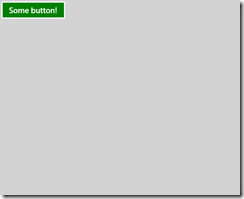
You want to create an app with a custom theme – have a nice light gray background (inspired by VS2012, perhaps?) and green buttons (assume, for some reason, your users like this!), and so you set the background of the button to green and you get something like this:
So far, so good. This is what your users asked for.
But…
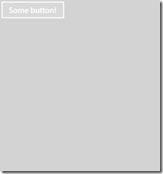
This happens when they do a pointer-over on the button!
They asked for GREEN buttons, and this is certainly not one! They want a lighter shade of green when there is a pointer-over. (Or cornflower blue, perhaps? Fight Club?)
This is probably an overly simplified scenario, but is a good place to start. So let’s see how Visual States can help, and why it’s a good idea to create a style for this instead of just setting the background to some color and call it a day.
Blend is good at handling Visual States!
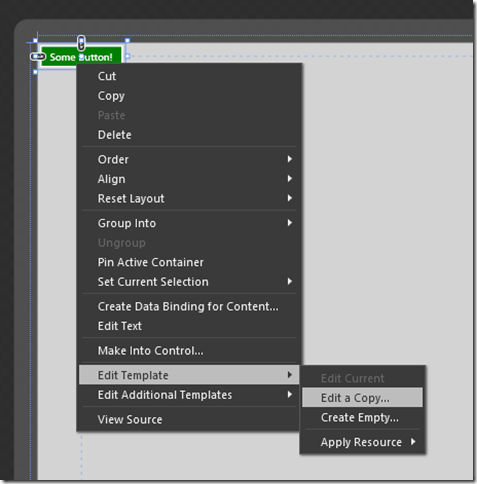
Open the project in Blend for Visual Studio 2012, and right-click on the button, go to edit templates, and select “Edit a copy”.
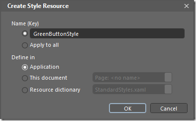
Go ahead and give it a name that makes sense, and you can choose where you want this Style to be created – i.e., at an application level, at a page level, or as a resource dictionary. I’ll select Application for now – so that we can use it in different pages in the app.
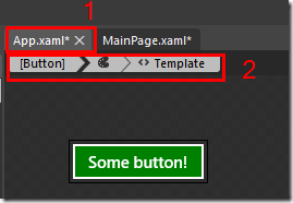
Once this is done, you should see something like this:
1. You see that you are now working in App.xaml, and
2. You see that you are editing the template of the button.
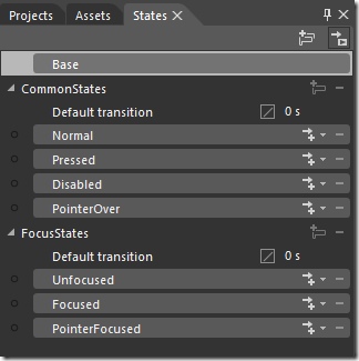
Now, head over to the “States” panel in Blend, and you should see something like this:
Notice that we have all the states that a button can be in – normal, pressed, disabled, pointer over.
Notice that the button also has 2 state groups. A state group is a group of mutually exclusive states that a control can be in at a given time. In other words, a button can be in a “Normal” state OR a “Pressed” (or other) state at a given time, but NOT both. However, the control can be in “Focused” state AND “PointerOver” at the same time, because they are in different state groups.
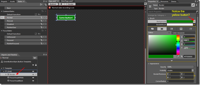
Great – it should be fairly obvious what we should do next, but a quick note on the color in the normal state. Notice that you had set the background of the button to green? That shows in the “border background” when you click on the “Normal” state.
Notice the yellow button next to the Background? Whenever you see that little button next to a property turned yellow, it means it’s bound to something. It could either be a data binding or a template binding. In this case, as we’re editing a template, the border’s background has template binding to the “Background” property of the button. So when you set the background of the button, it also sets the background of the border, which is part of what the button is made up of. (You can also see that the border’s “Border Thickness” is also template bound to the border thickness of the button.)
Since we’re creating a “GreenButtonStyle”, let’s not have this template binding on the border’s background!
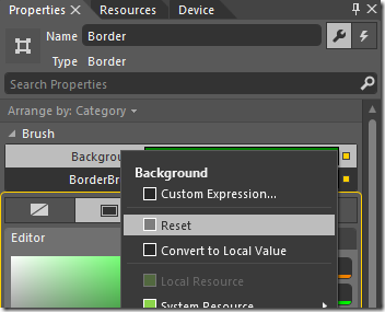
Click on the tiny yellow button and click on reset to remove the template binding. That should throw a nice, scary message like this!
Oh no oh no oh no!!
Nah, don’t worry about it – we’ll deal with these animations soon enough.
Let’s go ahead and select that nice green color we chose earlier.
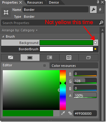
Notice that this time around, the tiny button is not yellow! (It used to be called Advanced Options, but calling it tiny button is more fun!) When it’s not yellow, it’s a local value and does not depend on a binding.
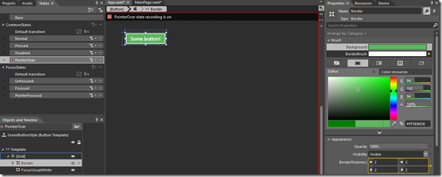
Now, select the “PointerOver” state and change the border background to a lighter shade.
And that’s pretty much it. Let’s run this app:
That’s a lot closer to what the customer wants!
Hey, what about all those “animations” Blend warned me about?
If you switch over to the “Code” view in Blend, you’ll see that all the states which has some property change is actually part of a Storyboard and is of type ObjectAnimationUsingKeyFrames. This is what Blend was warning us about when we reset the value of the border’s background.
I guess now it makes a lot more sense when you look back at what we did to handle the different views and orientation. All we did was manipulate Visual States that correspond to the actual state of the page!
Go ahead and try handling the different Visual States of the different controls that you use and would like to have a custom theme applied to them!
As you can see, Visual States give a much better control over the controls we want to customize! :)
Thanks for reading and happy coding!
Amar
PS: You can follow me on twitter at “_amarnit”, where I share some quick tips/learning at times!
