Creating 'small' charts with Microsoft Chart Control
Designing a chart when you have limited space available or when it's size can be dynamically changed usually requires additional planning. I've been playing with a way to display sample data in a 300 by 500 pixels chart and here what I came up with:
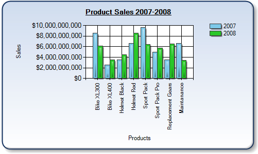
Figure 1: Chart size 300 by 500 pixels.
I was pretty happy with the results until I resized the chart to the actual required size of 200 by 220 pixels. So how can I fix that? I thought about that for a while and come up with the best practices below...
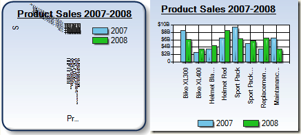
Figure 2: Chart size 200 by 220 pixels. Best practices applied to the right chart.
Best Practices of Creating Small Charts
You can apply this to a small chart you want to integrate into your application or use same approach 'dynamically' if you need to support the chart which may change it's size dynamically. There is no single solution that will work in all cases, so you need to understand what you can do and what is the best for your application.
Don't panic! Will fix it!
Chart Legend
Legend displays important information in the chart but it also may require significant amount of chart space. Here is what you can do to optimize for space:- Hide legend if it is not essential for your chart
- Restrict how much size legend may possible take. This can be achieved using Chart.Legends[0].MaximumAutoSize property. The default value is 50 and it means that legend can take up to 50% of chart size. You can set this value to 25-30%.
- Change the position and layout style of the legend. By positioning Legend on the bottom in one row we can defiantly save some space in the chart.
- Make sure legend text is auto-fitted IsTextAutoFit and set AutoFitMinFontSize property of the legend to 5, to reduce the smallest possible font used by auto-fit algorithm.
Series Data Points
Consider removing borders, shadows and visual effects which will make it harder to read small chart. Replace data point labels with tooltips.Chart Titles
Consider which titles are essential for your chart and make a decision to remove them or to reduce font. This applies to chart, legend and axes titles.Axes Labels
Axes labels can be too long, font too big or there can be just too many of them. Here what you can do:Make sure axes labels auto fitting is enabled IsLabelAutoFit=True. You can also adjust LabelAutoFitStyle property to achieve a specific label behavior.
Show numeric values in thousands, millions and so on. You can do that by specifying the labels format string in your code. If you do not know what will be the range of your data, the best approach is to use Customize event and check Maximum property of your axis. Here is a sample format string you can use:
Chart1.ChartAreas[0].AxisY.LabelStyle.Format = "$#,,,.B;($#,,,.B);0"; If there are too many labels you can change the Interval property of the axis or switch to the dynamic interval using the IntervalAutoMode property of the axis.
Truncate categorical strings. Using Customize event you can get access to the automatically generated chart labels and customize them. Code below will truncate all labels larger than 10 characters. Full text of the label will be shown in the tooltip.
protected void Chart2_Customize(object sender, EventArgs e) { foreach (ChartArea area in ((Chart)sender).ChartAreas) { foreach (Axis axis in area.Axes) { if (axis.Name.StartsWith("X")) { foreach (CustomLabel label in axis.CustomLabels) { if (String.IsNullOrEmpty(label.ToolTip)) { label.ToolTip = label.Text; if (label.Text.Length > 10) { label.Text = label.Text.Substring(0, 10) + "..."; } } } } } } }
Visual Border
If you are using the visual rounded border around the chart consider disabling this feature.
Hope this was helpful!
Alex.